- Group 2 (and anyone who didn’t present last week) should present an app map and a wireframe
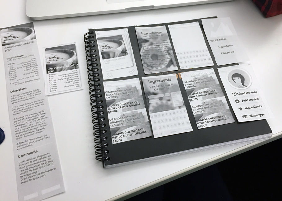
- Group 1 (and anyone who didn’t last week) should bring paper prototypes to test. For your design presentations to get full credit, you will need to clearly point out things that you learned from prototyping.
Month: February 2015
First wireframe
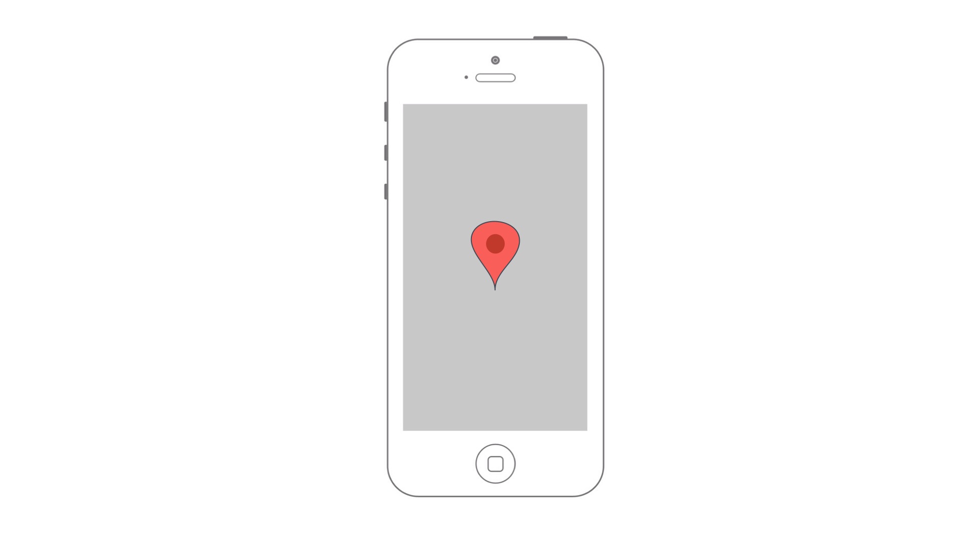
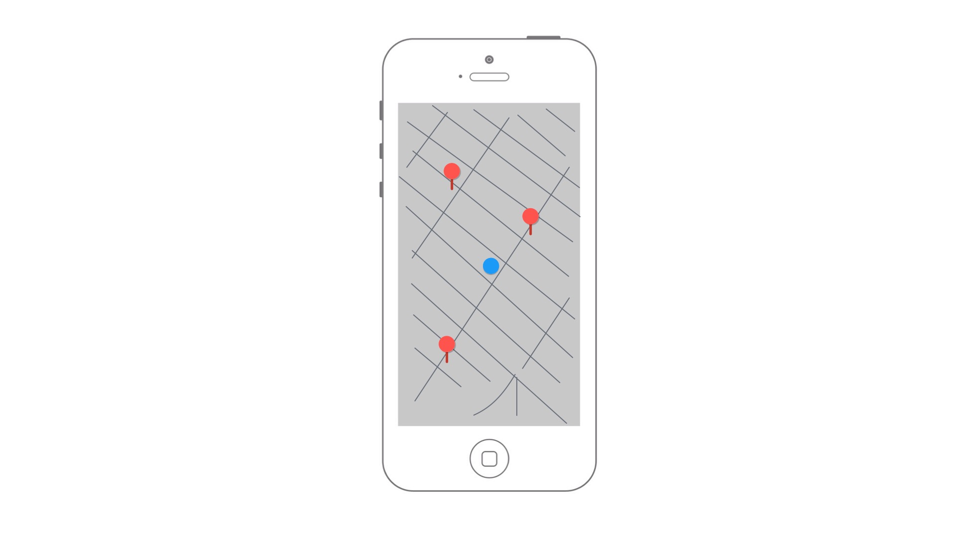
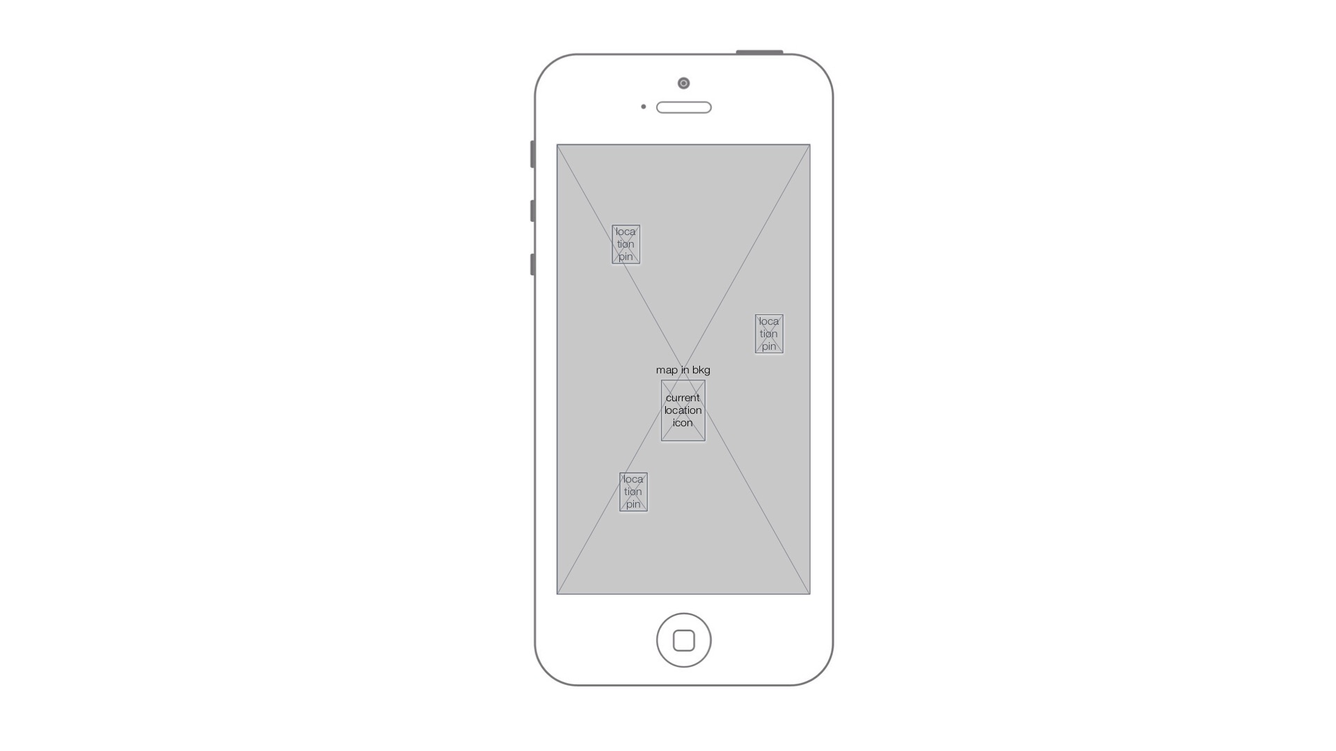
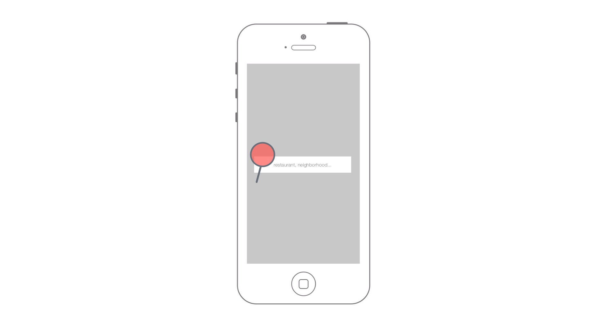
This is an app of voice rating for restaurants. This sketch demonstrate the key screens.
Three things I didn’t realize until reading the Apple HIG-Feng
- The Font
I have thought about the font size and image size of the iOS system. In my idea, developer have to and must to follow the default setting of the ios system, which means we need to use the same typeface. But in this sentence, “. iOS system fonts automatically adjust letter spacing and line height so that text is easy to read and looks great at every size. Whether you use system or custom fonts, be sure to adopt Dynamic Type so your app can respond when the user chooses a different text size”, it claim there is a possibility to customize the fonts.
- Start and Stop.
Before I read this documentation, I didn’t think about how important it is to delay a login page. I do use some apps which allow users to use their function before login or sign in, this strategy really change how I feel about this app.
- Always preserved user’s work unless they cancel or delete it.
This design is not only applied in iphone app, but also the web app, and the web site (especially the shopping website). They always save the people’s work or chosen products.
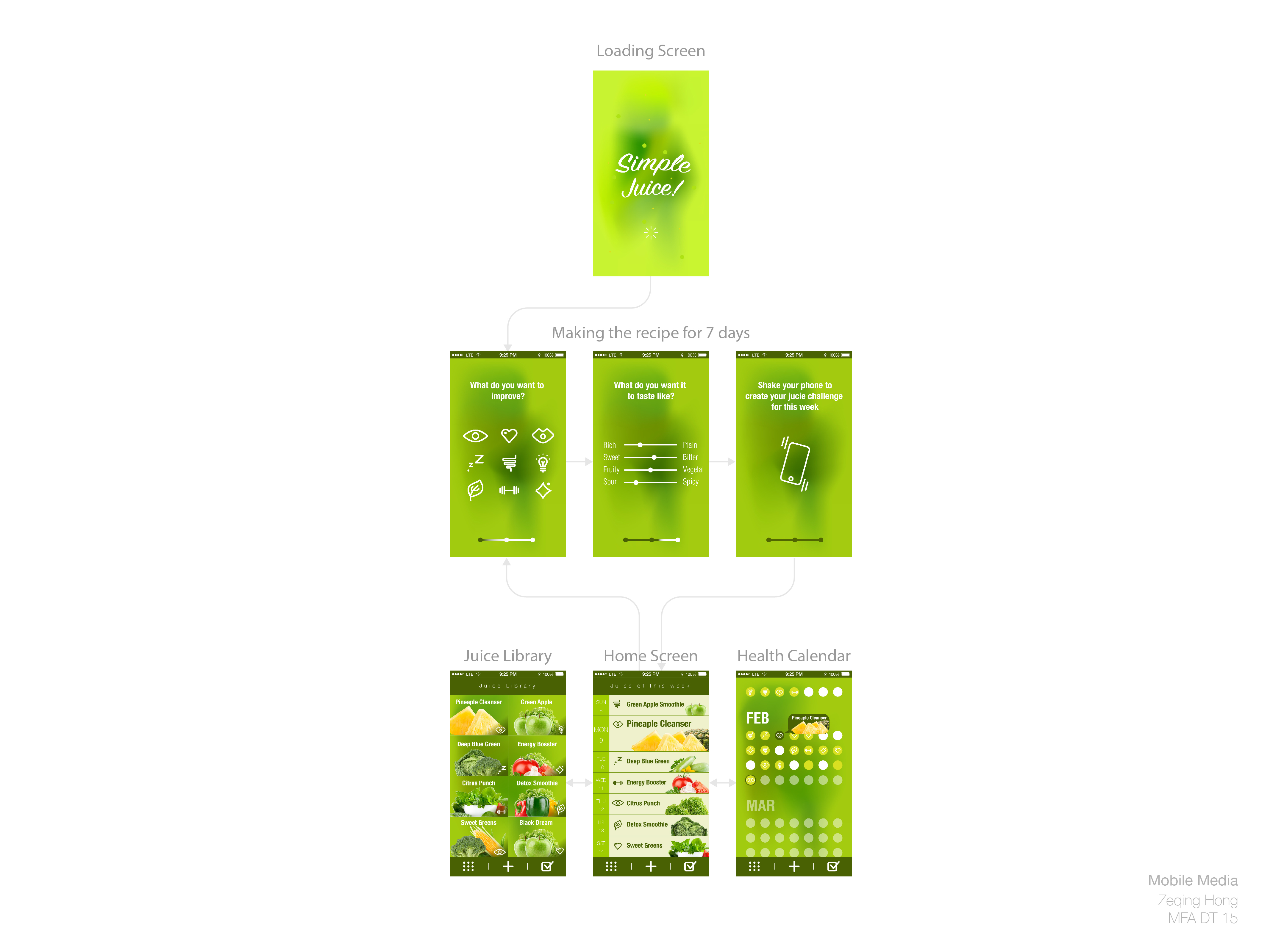
Food App- Prototype#1_Yihan Zhou
APP MAP
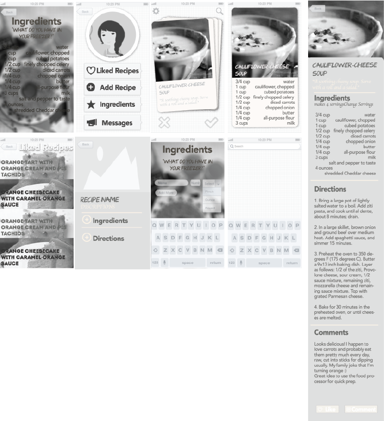
User Test
Things I learned from first time paper prototype
-Reconsider the hierarchy so the user can know better why they are on this app.
-Instead of showing the simple version of recipe, just directly lead users to the full version of recipes.
-Simply “Ingredient-input” as much as possible, do not create more pain points while solving the problems.
-Think deeper with the essential logic of “Tinder design”
Food app wireframes V1
Link to pdf
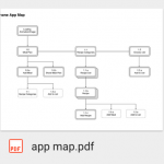
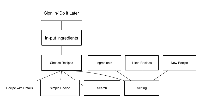
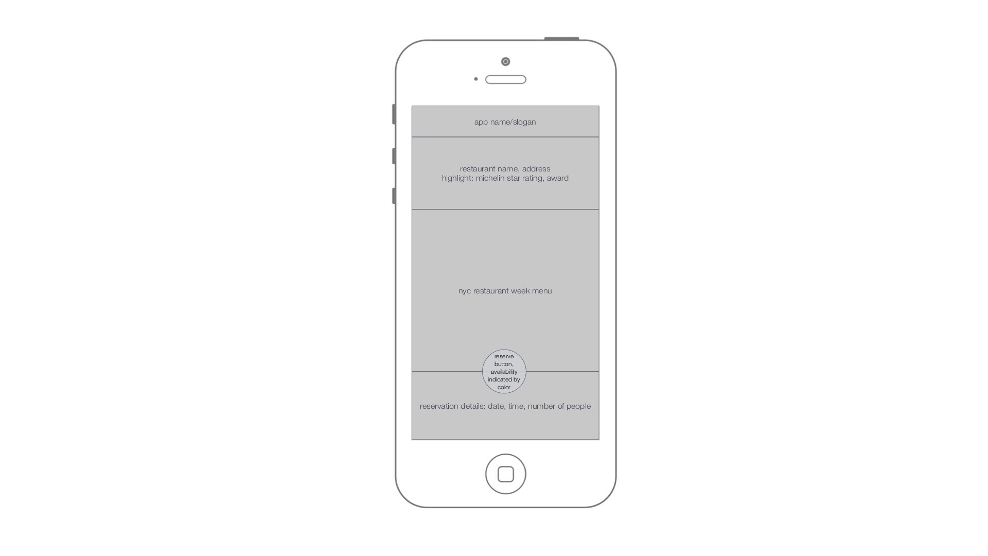
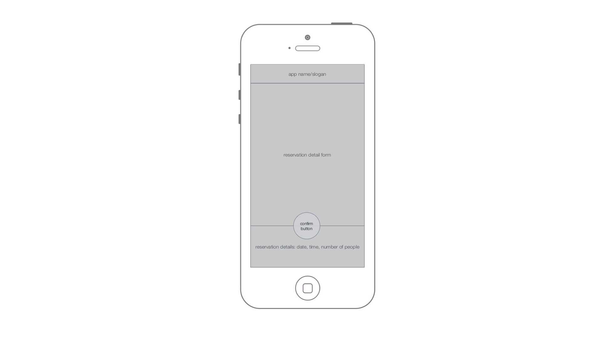
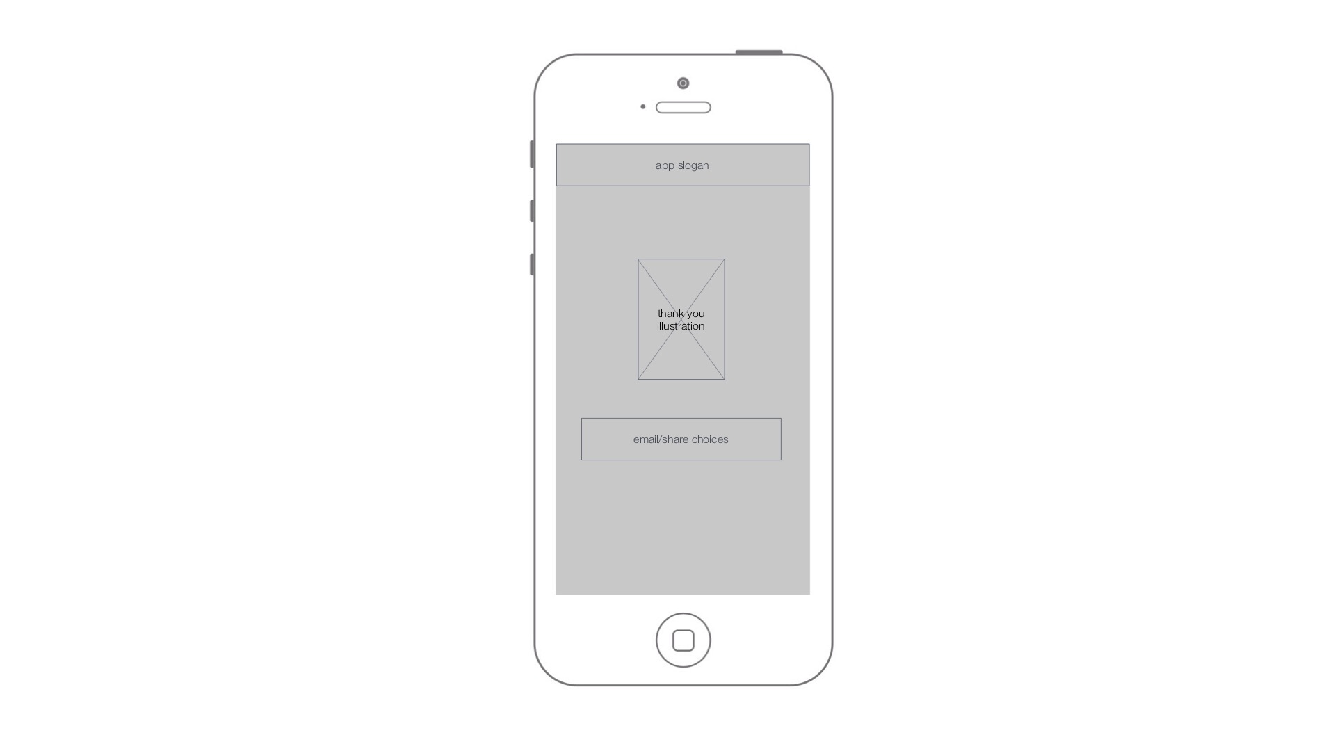
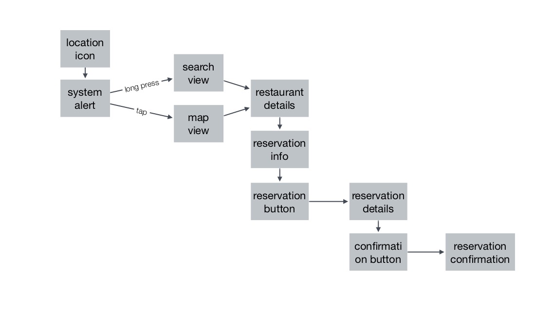
App Map + Wire Frame- Ning Sui
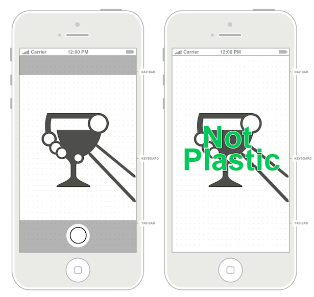
PETPET adopts everyday leftover plastic packaging by taking picture of users’ food ,and then convert to a virtual pet in their personal mobile devices. It’s like a tamagotchi, the original digital pet, that your cares toward the pet have effects on the pet, instead, in Petpet, the breakdown process shows impact on users’ devices.It’s designed for school teachers who want to teach children sustainability in an interesting way or environmental organizations for public campaigns.


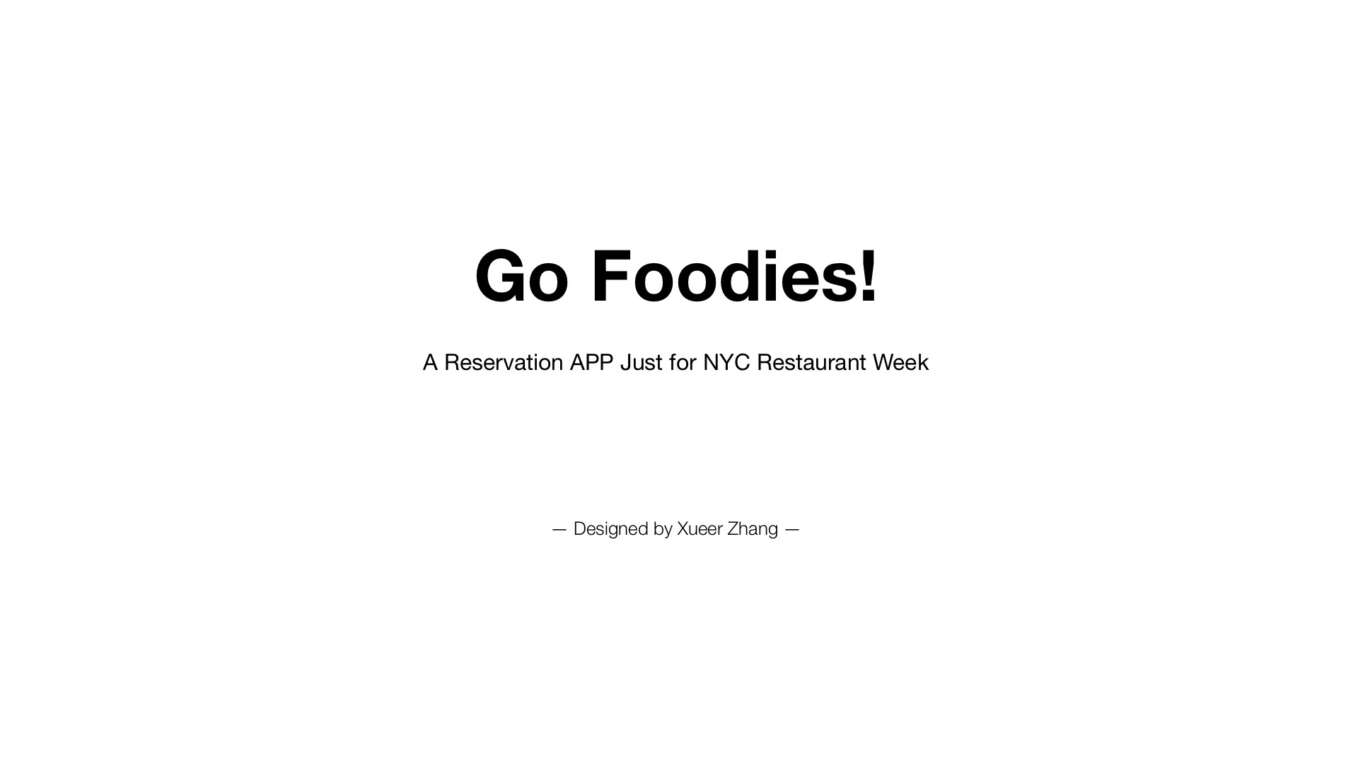
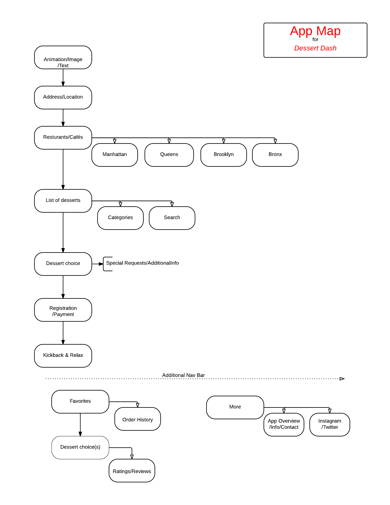
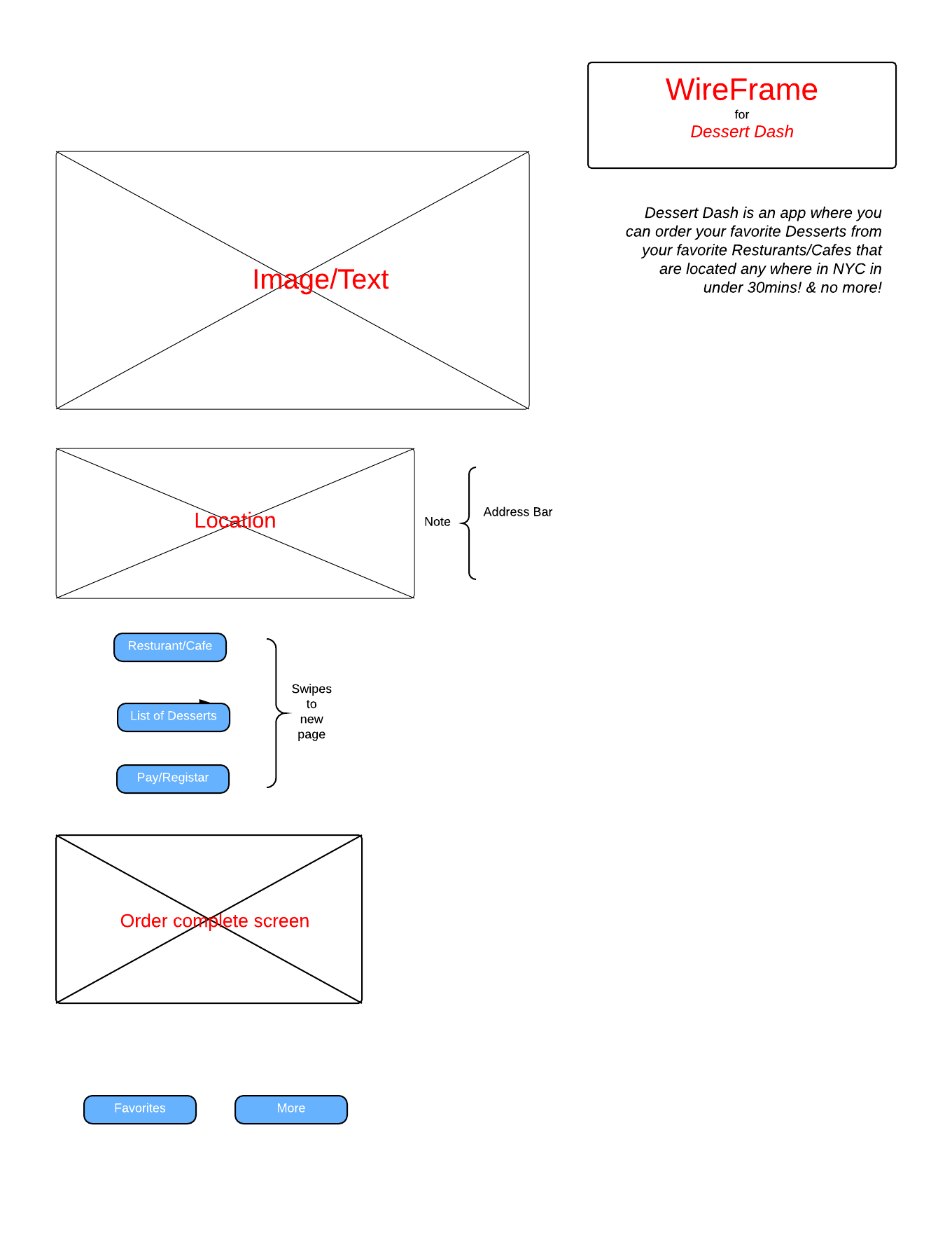
Go Foodies! – App Map and Wireframe

App MapApp & Wireframe
A very rough wireframe for my app, Dessert DASH
Three Things I Did Not Know About Apple HIG
Firstly, I would not consider the following practice is good before I read Apple HIG. It seems hard to get the main point of what the article is about, and it certainly does not showcase the identity of the subject matter. But Apple says, “Incorporate a brand’s assets in a refined, unobtrusive way.”
Secondly, I have always wondering why music apps did not incorporate Shake gesture to switch to the next song in a playlist. But Apple says, “Avoid associating different actions with the standard gestures.”
Lastly, I really loved some of the loading animations and tutorials. But Apple says, “Start instantly.”
3 Things I learned from Apple’s HIG – Ning Sui
Think like a newspaper editor, and watch out for redundant or unnecessary words. When your UI text is short and direct, users can absorb it quickly and easily. Identify the most important information, express it concisely, and display it prominently so that people don’t have to read too many words to find what they’re looking for or to figure out what to do next.
Use a page control when each app screen represents an individual instance of the same type of item or page. A page control is good for showing users how many items or pages are available and which one is currently displayed. For example, Weather uses a page control to show how many location-specific weather pages the user has opened.
In general, avoid defining new gestures unless your app is a game. In games and other immersive apps, custom gestures can be a fun part of the experience. But in apps that help people do things that are important to them, it’s best to use standard gestures because people don’t have to make an effort to discover them or remember them.