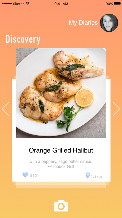
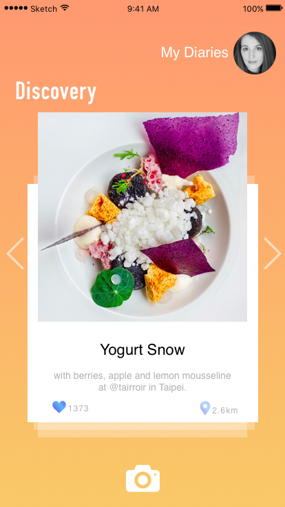
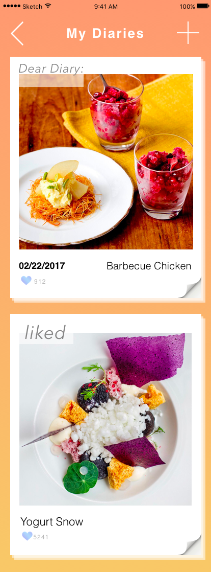
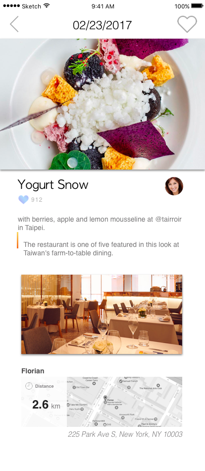
Based on more user test and feedback, I changed the theme color since blue is too cold for a food app. I add more navigation text to make it clear, which view is the user’s profile and which view is the discovery channel. I also deleted the function that can change background color in post edit view.
Here is the link to interactive prototype on Marvel:
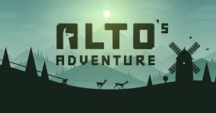
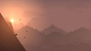
After hearing many positive reviews about Alto’s Adventure I ended up buying it. The plot takes place on top of a mountain, where you as the player glides down the mountain on a snowboard to rescue runaway llama. Personally I found this game beautiful in all aspects. Not just the interface but the precedents that Alto’s Adventure used as references. Such as Tony Hawks Pro Skater 2, Monument Valley, and Journey. The core mechanics of Alto’s Adventure 2d Platformer consists of collecting points that your obtain by landing tricks and retrieving coins as you make your way down the endless slope.
Overall I had a great experience and appreciation for playing this game because the color pallet, functionality and setting creates a relaxing experience for the user. I highly recommend this game.
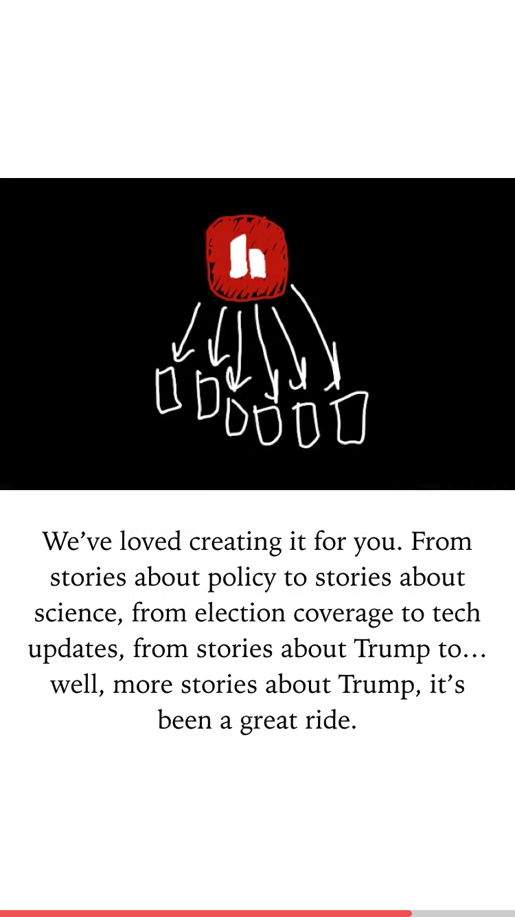
Hardbound is a new, unique format of storytelling that’s visual, interactive and designed for mobile. Comparing with the traditional news app which provides many texts in content, Hardbound uses lots of illustrations and graphics to help you digest the information. Most of the story takes about 5 minutes to finish. It is appropriate to read a story during the waiting time. The simple gesture (swipe← →) makes the reading experience smooth and comfortable.
In my perspective, Hardbound creates an innovative way to read the news and make the information clearer and easy to consume.
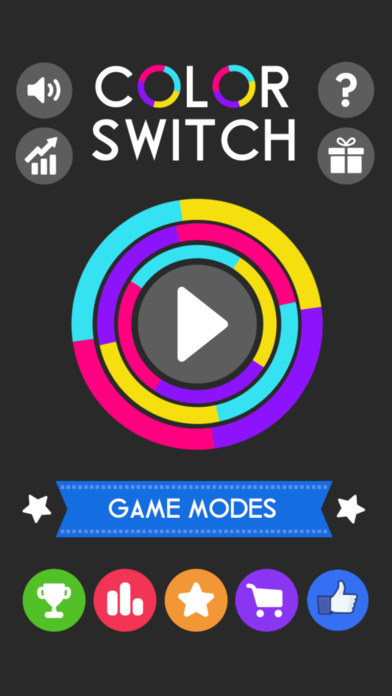
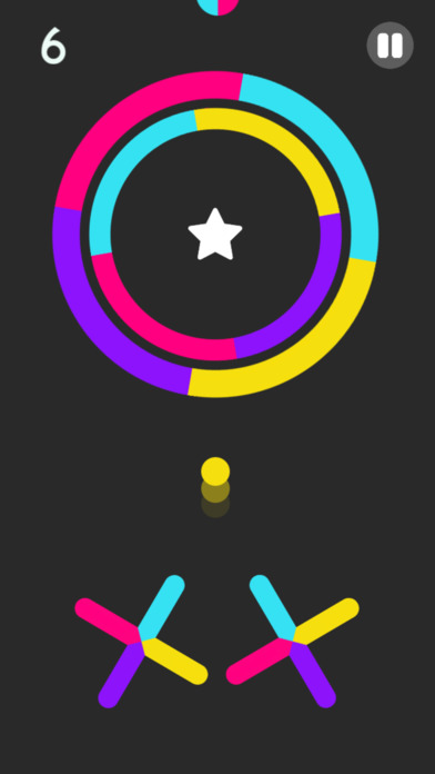
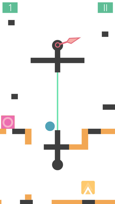
Color Switch is a challenging game where you tap a ball and must follow the color pattern to cross or move forward.
The game is interactive and changes colors every second. It consists of many levels which you unlock as you go.
This challenging game reminds me of my favorite game – Bounce.
Bounce is a very challenging game that I’ve loved and mastered with time. It helps me concentrate and relieve stress. You climb to the top, take down enemies and grab powers! My high score is 63. What is yours? Download both apps now!
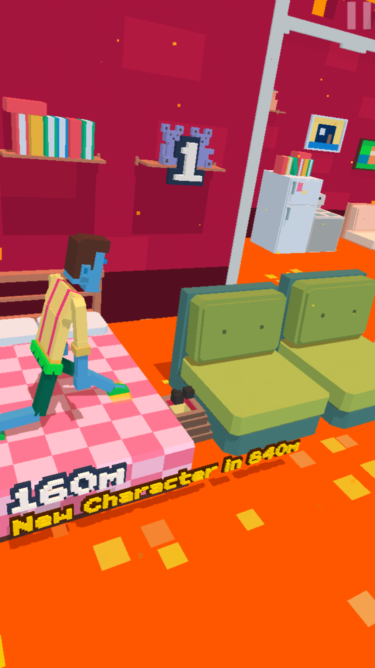
This is a very interesting game! I have been playing this for 2 weeks during my commuting time. Basically, you press on the screen to move the character’s leg. The longer you press, the bigger step you take. There are some barriers and gaps which you can’t step on.
The reason I love this game is the graphic style. The character has dramatic movement and the game uses humor conversations. The user can share the falling down GIF to social media. I think this is very fun. Moreover, because there is no limitation of the life, you can keep playing until you feel tired!
Compared to regular games, there are no dialogues or explanations. They are not dynamic action games, but the style and delivery of gameplay are deeper and stronger than other games.
The game basically consists of three steps and proceeds to Look-Listen-Speak.
On the train, a character sees the woman sitting opposite him and has an out-of-body experience. And it opens the “Lost tracks” prelude. And since the characters’ souls get out and enter the world, the dreamy atmosphere of the game begins.
When the stage starts, you will see the specific actions you need to use on that stage on the screen.
<Look>
You must help the train stationed on the railroad leave. When the lever is operated, the train starts and you can follow the route.
<Listen>
It is the most novel stage.
The color and tone were scary. Without knowing where to go, you have to move to where the sound is coming from. Every time you walk, you will realized that your footprints disappear and feel like you are wandering the same way. Afterwards, you will see a tree hanging from the telephone and when you pull one, the phone goes up and laughter comes out of it.
<Speak>
If the character stand in front of the microphone and make a noise (the user have to make a real sound), the eyes watching from all directions are shaking. After that, You will walk along the road and found your soul again.
When the game is over, you will return to the train situation what you’ve seen on the first screen.
Earphones are essential for this kind of atmosphere and I recommend you to play in the dark. By my standards, the gameplay time was 30 minutes. During those 30 minutes, I was immersed in a great amount of immersive and unique sound and graphics. I think it has a very important impact that the game is designed by using unique mechanics, and senses what the general games do not usually use and is trying to express the way in which the individual moves in order to do something.
While I was reading the Direct Manipulation, I have realized I did not pay much attention to this point before. By knowing it now, I think there will be a lot of opportunities to make the design around it and make the app more appealing by making the users feel physically manipulating the user interfaces.
The Feedback is another part I feel I ignored in the past when I did user interface design. In my understanding, the Feedback is meant to keep the users informed about the status of the actions they made. I definitely see this will make an app more user-friendly.
The third thing I learned is from the User Control. When I did user interface design in the past, I tended to think more about my concept and more from my own perspective instead of from the users’. Definitely, in the future, I should think more from the users’ perspective and make designs that are for the users.
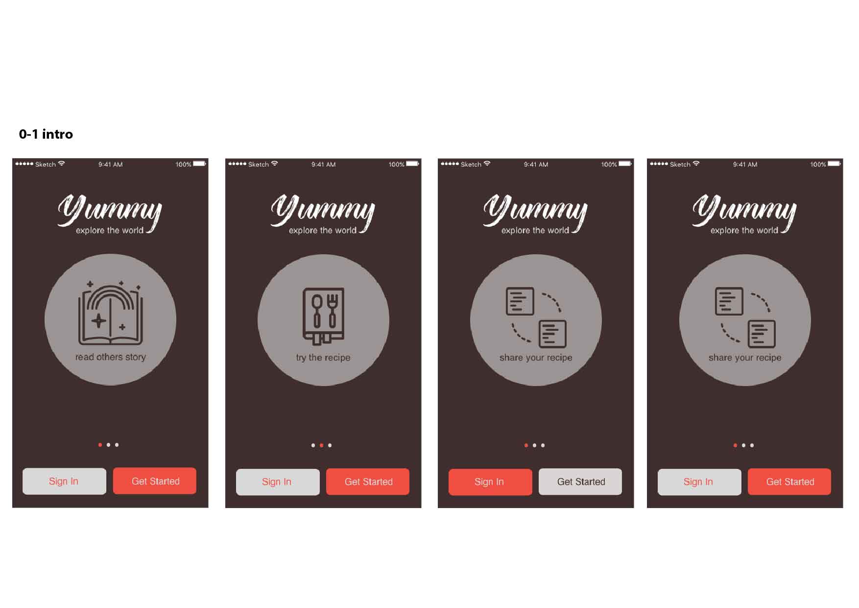
Thanks to the comment that I have got in class, I organized the flow a lot. And in this prototype I made design with the color and layouts.
This is the prototype I upload on Marvel: https://marvelapp.com/7g7gfhj/screen/25563852
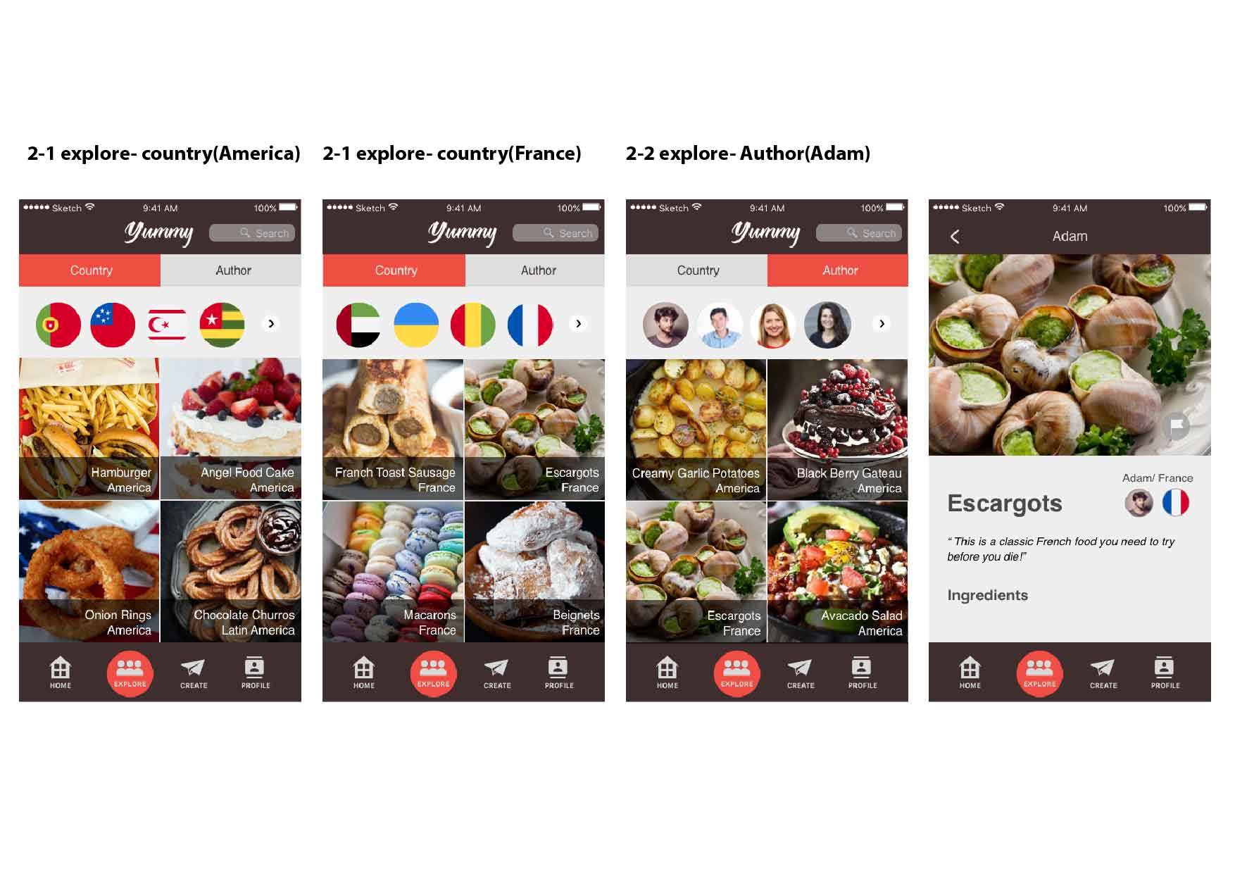
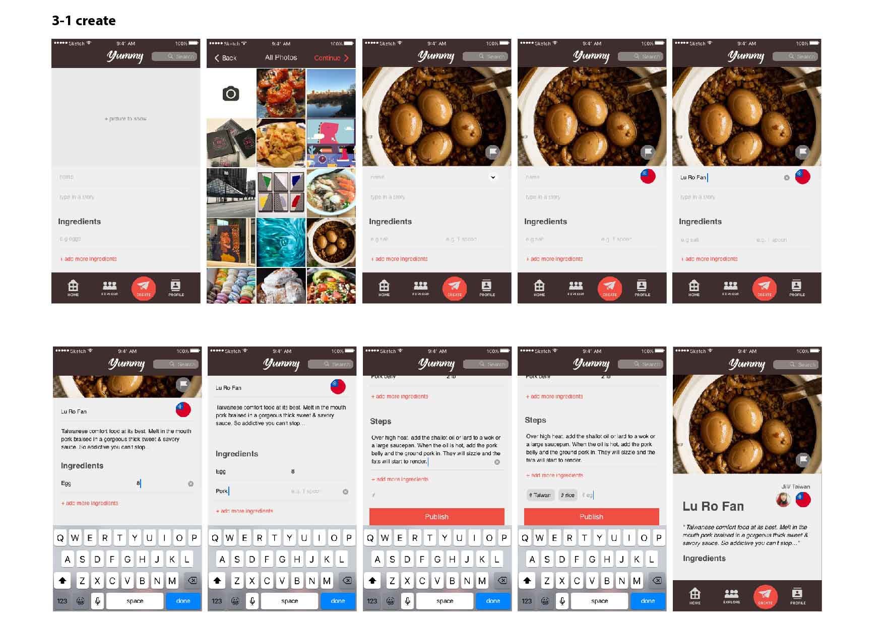
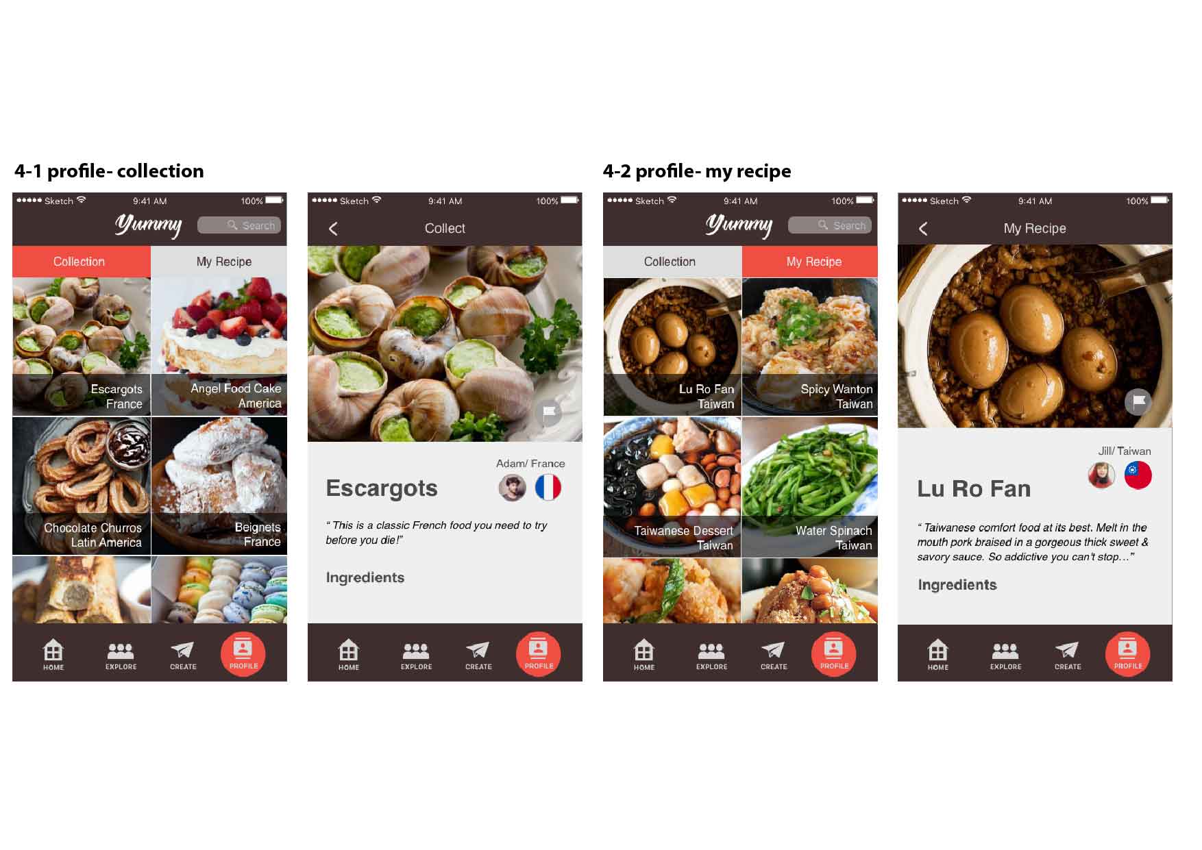
I take most of the suggestions in class, and then modified this “Yummy App”. The most different thing is I added a quick introduction before getting into the main page. This is the idea I want people to know my app better, that is, I hope people be excited and want them to use this app to know others’ cooking stories and also explore the food around the world.
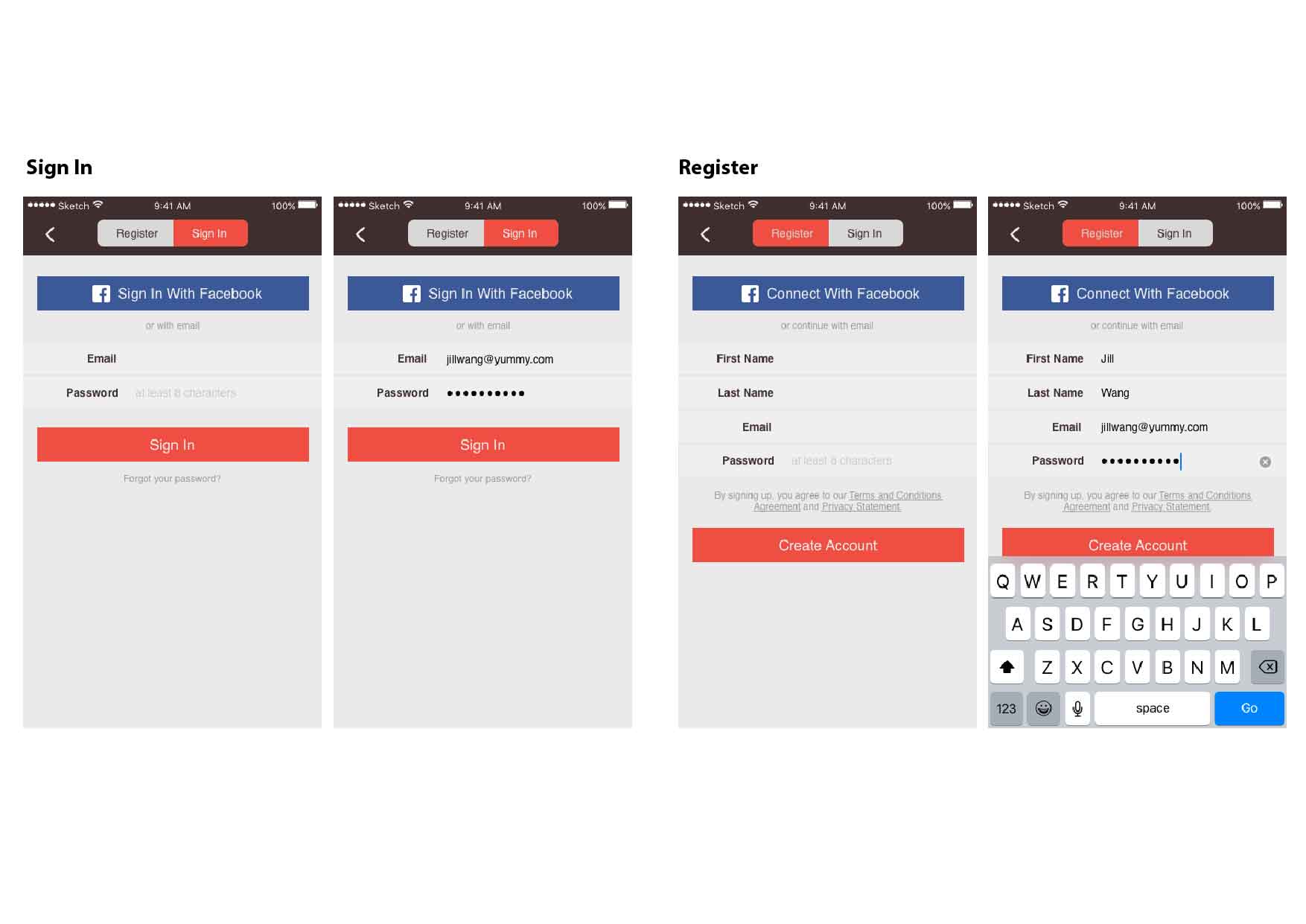
Also, in the app you can feel free to just browse through people’s recipe around the world without sign-in. Only if you want to collect others’ recipe or create your own recipe will you need to create an account.