1. Let translucent UI elements hint at the content behind them. Translucent elements—such as Control Center—provide context, help users see that more content is available, and can signal transience. In iOS, a translucent element blurs only the content directly behind it—giving the impression of looking through rice paper—it doesn’t blur the rest of the screen.
2. Choose dynamic type since people increase font size in settings often
3. Some iPads have split view or slide over and a good app uses auto layout to make sure their app doesn’t get messed up in this mode
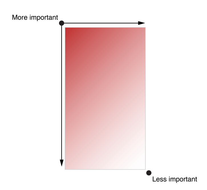
4. More important content in top left less important in bottom right
5. Give tappable controls a hit target of about 44 x 44 points.
Make it easy for people to interact with content and controls by giving each interactive element ample spacing. Give tappable controls a hit target of about 44 x 44 points. I was aware of the importance of spacing in mobile ui design, but it is good to know the recommended hit target was 44 x 44 points.
Use a peek to provide a live, content-rich preview of an item. It’s best when a peek gives users enough information about an item to augment their current task. For example, users can use peek to preview the webpage of a URL in a message before they decide to open the webpage in Safari or share the link with their friends. In a table view, peek shows users the detail view for a row item.
Provide a pop for every peek. Even though a peek should give users most of the information they need, you should always let users transition to the pop if they decide to switch away from their current task and focus on the item. The pop should be the same view that users get when they tap the item.
Don’t enable both peek and the Edit menu for the same item. It can be confusing when both features are enabled for one item. (To learn more about the Edit menu, see Edit Menu.)
Within a peek, avoid displaying elements that look like buttons. If users lift their finger to tap an element that looks like a button, the peek disappears.
Provide peek quick actions, if appropriate. Within a peek, users can swipe up to reveal actions that are related to the item. For example, peek quick actions in Mail include Reply All, Forward, and Move Message. Not every peek needs quick actions, but if you already provide custom touch-and-hold actions for an item, it’s good practice to provide the same actions within the peek that replaces touch and hold for that item. (Note that peek quick actions in a peek for a web view are supplied automatically.)
Don’t use peek as the only way to enable item-specific actions. Not every device supports peek and pop and some users may choose to turn off 3D Touch, so it’s essential to find other ways to make peek functionality available in your app. When your app runs on older devices, it can make sense to mirror a peek’s quick actions in a view that users get when they touch and hold an item.
I’m relatively new to designing for peek and pop guidelines and do not use 3D touch very often so it is interesting to see the ideal peek and pop specifications.
View Controllers To manage a set or hierarchy of views in your app, you typically use a view controller. A view controller coordinates the display of views, implements the functionality behind user interactions, and can manage transitions from one screen to another. For example, Settings uses a navigation controller to display its hierarchy of views.
Here’s an example of how views and view controllers can combine to present the UI of an iOS app.
Here are some things I didn’t know, and other useful guidelines to always keep in mind:
I had know idea split screen existed for iPads and desktop/laptops! I used to play around with this on PCs many many years ago, but I don’t ever remember it being an advertised feature. I had no idea it was even possible and seems not very intuitive to find out (press and hold green full screen button and then drag it around to highlighted halves). But even so, I was disappointed with this feature for two reasons:
It only allows half screens and not quarter screens on desktop
You can’t exit out of split screen without toggling into full screen first, and the other half screen automatically becomes full screened. There was just a lot of clicking involved to get to the original windowed state.
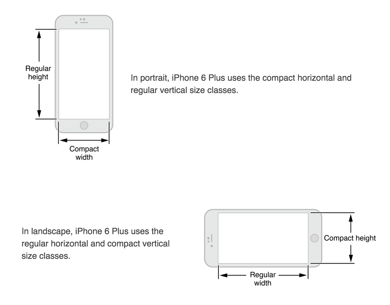
Responsive Views – Views should be designed as ‘compact’ and ‘regular’ for both width and height. compact/regular, width/heights should be interchangeable.
Color Blindness – don’t use red and green the only distinguishable features. Use more than 1 way to indicate interactivity other than just color, and look into image-editing software that can help test for color-blindness).
Color Contrast – I would really like to know what this means:
“Although viewing your app on a device can help you find some of the areas you need to work on, it’s no substitute for a more objective approach that yields reliable results. This approach involves determining the ratio between the luminance values of the foreground and background colors. To get this ratio, use an online contrast ratio calculator or you can perform the calculation yourself using the formula established in the WCAG 2.0 standard. Ideally the color contrast ratio in your app is 4.5:1 or higher.”
Color Meanings in Different Cultures – keep in mind that color might be interpreted differently by different cultures.
Font Rules –
Headline and body should be same font size, but headline uses heavier weight.
Text in Nav bar is 17pt
Never use light or bold font as it is hard to read at small sizes (use regular or medium weight instead)
Support Retina Display – Supply @3x & @2x image assets for best resolution. Never scale images greater than 100%
Give people confidence that their work is always preserved unless they explicitly cancel or delete it. Sometimes I lose some of my texts or notes in certain apps after I use other apps and want to continue my works. Because they restart themselves after recovering from multi-tasking. I always consider these situations as my personal problems. I think I should have saved everything before I switch away from the current app. I do not know that it is app’s responsibility to save user’s data periodically or automatically.
Tailor Customization to the Task. I believe that many designers want to be innovative and creative while design their products. At least I do. Because being different is attractive to audiences occasionally. However, it is really important to balance UI customization with clarity of purpose and ease of use. Briefly, we have to be aware of how users do their jobs and the necessity of elaborate design.
Avoid asking for health data before users have a chance to understand what it will be used for. I never used HealthKit before but it became popular since Apple Watch is released. And there are more and more apps using health data. It is really important while accessing user’s private information. It would be an issue if apps are not designed properly to do the tasks. Every designer has to pay attention to this detail.
1. Color Enhances Communication: In iOS, color helps indicate interactivity, impart vitality, and provide visual continuity. The built-in apps use a family of pure, clean colors that look great individually and in combination, and on both light and dark backgrounds.
If you create multiple custom colors, make sure they work well together. For example, if pastels are essential to your app’s style, you should create a family of coordinating pastels that can be used throughout the app.
2. Pay attention to color contrast in different contexts: For example, if there’s not enough contrast between the navigation bar background and the bar-button titles, the buttons will be hard for users to see. A quick but unscientific way to find out if your colors have sufficient contrast is to view your app on a device in different lighting conditions, including outdoors on a sunny day.
Although viewing your app on a device can help you find some of the areas you need to work on, it’s no substitute for a more objective approach that yields reliable results. This approach involves determining the ratio between the luminance values of the foreground and background colors. To get this ratio, use an online contrast ratio calculator or you can perform the calculation yourself using the formula established in the WCAG 2.0 standard. Ideally the color contrast ratio in your app is 4.5:1 or higher.
3. Be aware of color blindness: Most color blind people have difficulty distinguishing red from green. Test your app to make sure that there are no places where you use red and green as the only way to distinguish between two states or values (some image-editing software includes tools that can help you proof for color-blindness). In general, it’s a good idea to use more than one way to indicate an element’s interactivity (to learn more about indicating interactivity in iOS, see Interactive Elements Invite Touch).
4. Text should never be smaller than 11 points, even when the user chooses the extra-small text size. For comparison, the body style uses a font size of 17 points at the large size, which is the default text-size setting. The headline and body styles use the same font size. To distinguish it from the body style, the headline style uses a heavier weight. Text in a navigation bar always uses 17 points, which is the same as the body text style at the large setting.
Use depth to communicate: phone screen has small and limited design area, iOS uses depth to emphasize the importance of different layers which helps users understand the relationships among onscreen objects. This detailed design is a smart, clear, efficient to communicate with phone users. For example, when you open a folder on the home screen, the folder and its content float up with a translucent background.
User control: iOS UI/UX is clean and simple, straightforward for users to understand and remember how to use the function. When the user feels more in control of an app, the app can be a good one, especially when users know how to correctly respond to different designs, which means the ui/ux design is successfully meet designers’ expectations.
Consider hiding the navigation bar when users want to focus on content: I didn’t pay attention to this detail before, I thought the navigation bar was always there as default. But here is a design that let users focus on content, and hide the navigation bar.
The overall design of an app’s interface needs to distinguish content’s importance by placing them differently. The most important content would usually be placed on the top left corner, whereas the less important content would be placed on the bottom right corner.
“As much as possible, avoid displaying a splash screen or other startup experience”. Users would expect to be able to use the app immediately after they launch the application. Any kind of information or introduction to the app’s features need to be added with caution; because this might lose users’ interests, and prevent them from exploring more.
If an “onboarding experience” must be added to the app, then use animation or interactivity to improve users’ engagement, or be sure to design a way to exit or dismiss this part.
If certain tasks require a hierarchy of modal view, make sure the “Done” button does what users would expect it to do.
When design an app interface, be sure to consider color blindness when using colors as visual cues.
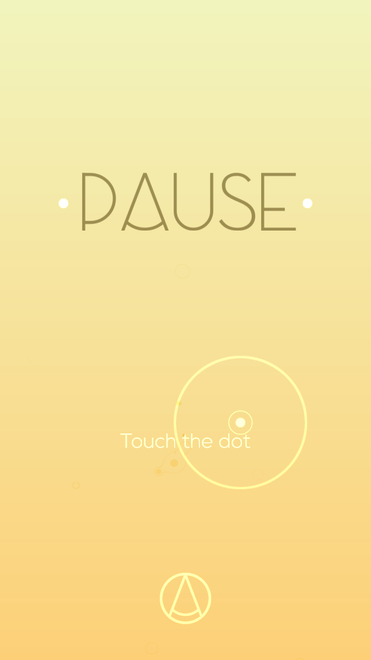
I want to talk about an game app that is somewhat different from others. It is developed by ustwo, the studio who created Monument Valley, and PauseAble. It is said to “bring ancient Tai Chi and mindfulness practice” to the users. In spite of its efficiency in bringing “mindfulness” to whoever plays the app, Pause does a great job in terms of simplifying UI and UX, and create an concentration on what it claims to do.
The starting page is very simple, with only two options: to start the game, or to go into the setting.
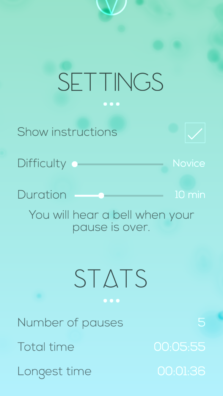
Setting page has limited options for users to adjust, which helps the user to avoid spending too much time on studying this part. With corresponding text, each option shows clear sign of how to adjust, and how much could it be adjusted.
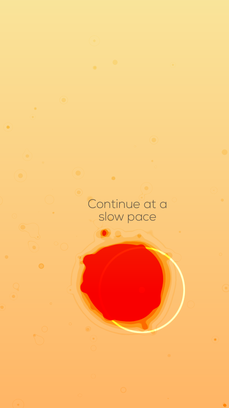
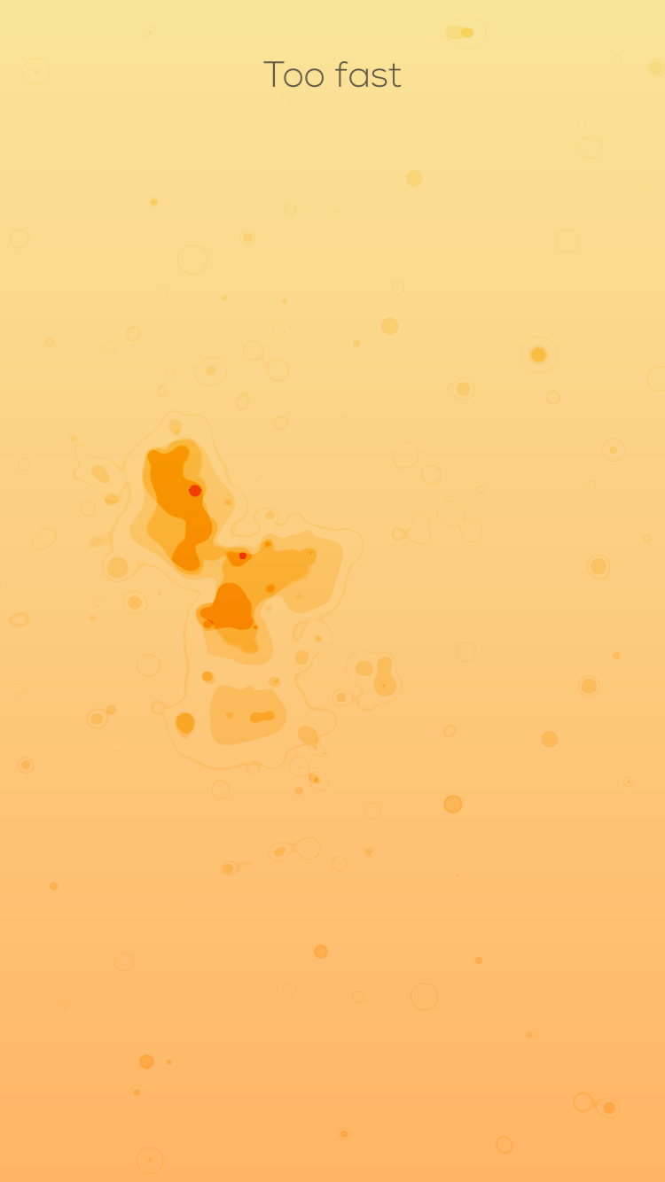
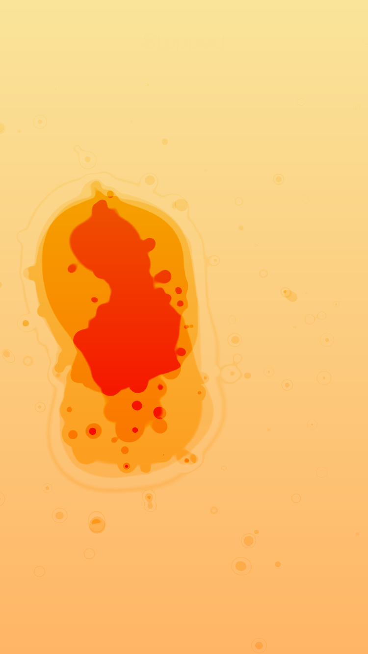
The gaming part is pretty clear as well. The only thing that the user has to do is to follow the hold his or her finger on the screen, and follow the dot. Corresponding instruction would appear besides the dot to help users to navigate through the initial stage. When the user passes the initial stage, he or she will be given more control to the dot. However, reminding text would appear on the top of the screen to instruct the user about their movements. The text is clear enough for users to notice, yet not overpowering the design of the game. With a fluid motion design, as well as an elegant color palette, the user would definitely be able to enjoy the process.
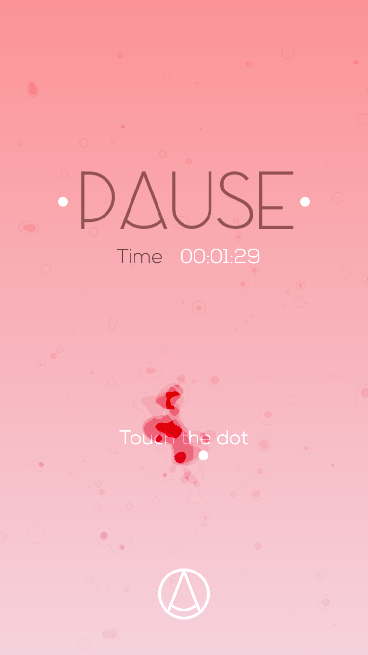
When the user finishes the game, a summary would appear on the screen, along with the exact option to re-start the game again.
Overall, I think the best part about this game is its simplified UI and UX, to allow the users enjoy a rather relaxing process while playing it. And the elegant and beautiful design of its graphics gives me another reason to keep playing it.