User insights I have learned:
1. I can combined friends’ activity page with search+hot&popular page
2.Timer function is not shown clear
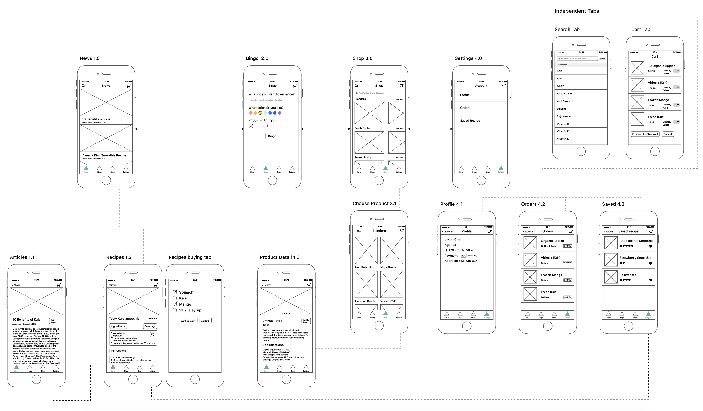
APP MAP:
Things I learned from prototyping:
1.Saved item is suggested to remove from tabs and have it’s own button floating on the page.
2.Smoothies should combine with recipe. Also, the instructions of choosing the colors are unclear. This week, I designed a CNYK bar which is a pretty intuitive interface for users.
3.Added shop as one of the tabs.
4.During the paper prototyping, my users pointed out several missing “return button”, which I added this time.
 I realized that a lot of the items that were on my app map were not actual screens, but rather states that occur on the same screen. I also got rid of the settings tab and replaced it with the profile tab, which houses settings.


Hello! My name is Yao Huang. I’m come from China and graduated from Rutgers University in New Jersey. My background is Human Resources & Visual Arts. And now I’m the first year student in MFADT.
Three things I don’t know from Apple HIG:
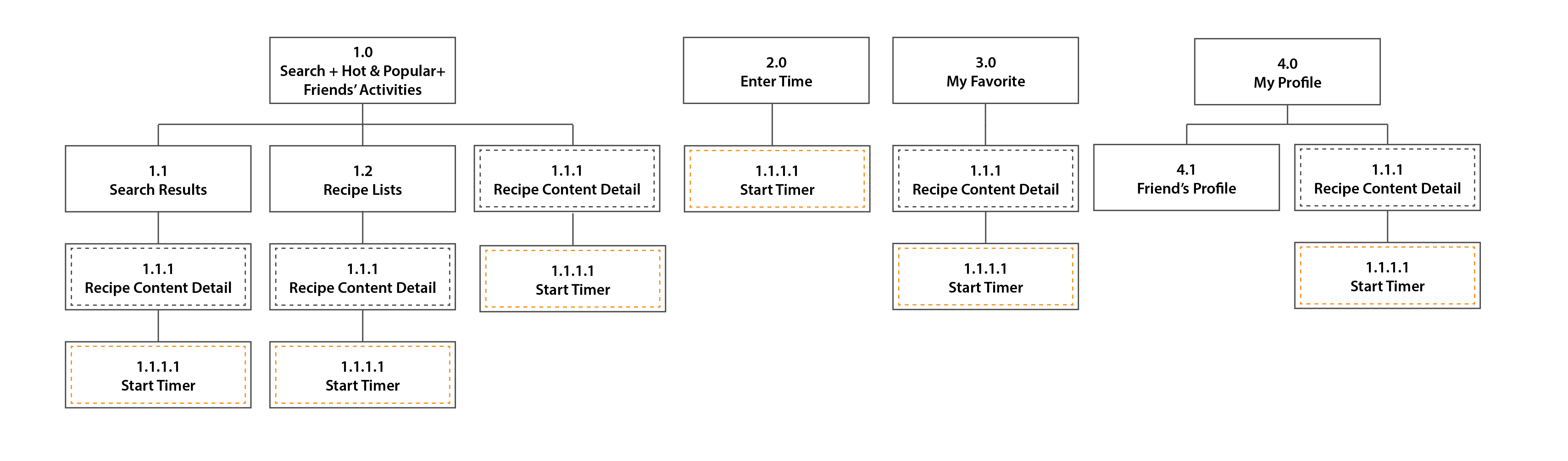
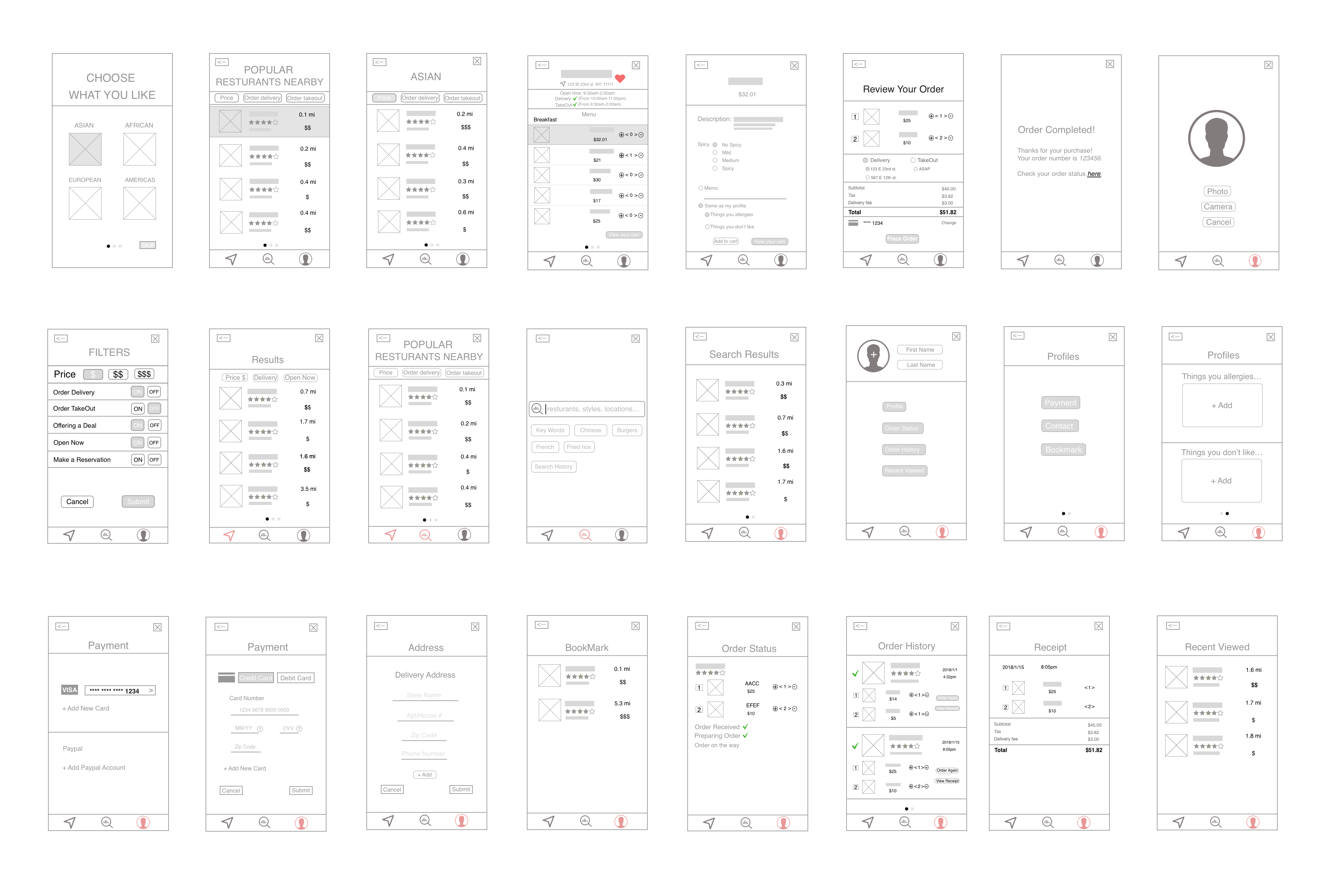
Here is my App Map:

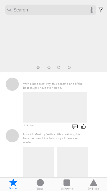
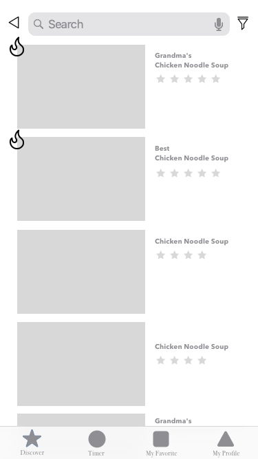
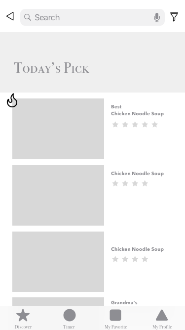
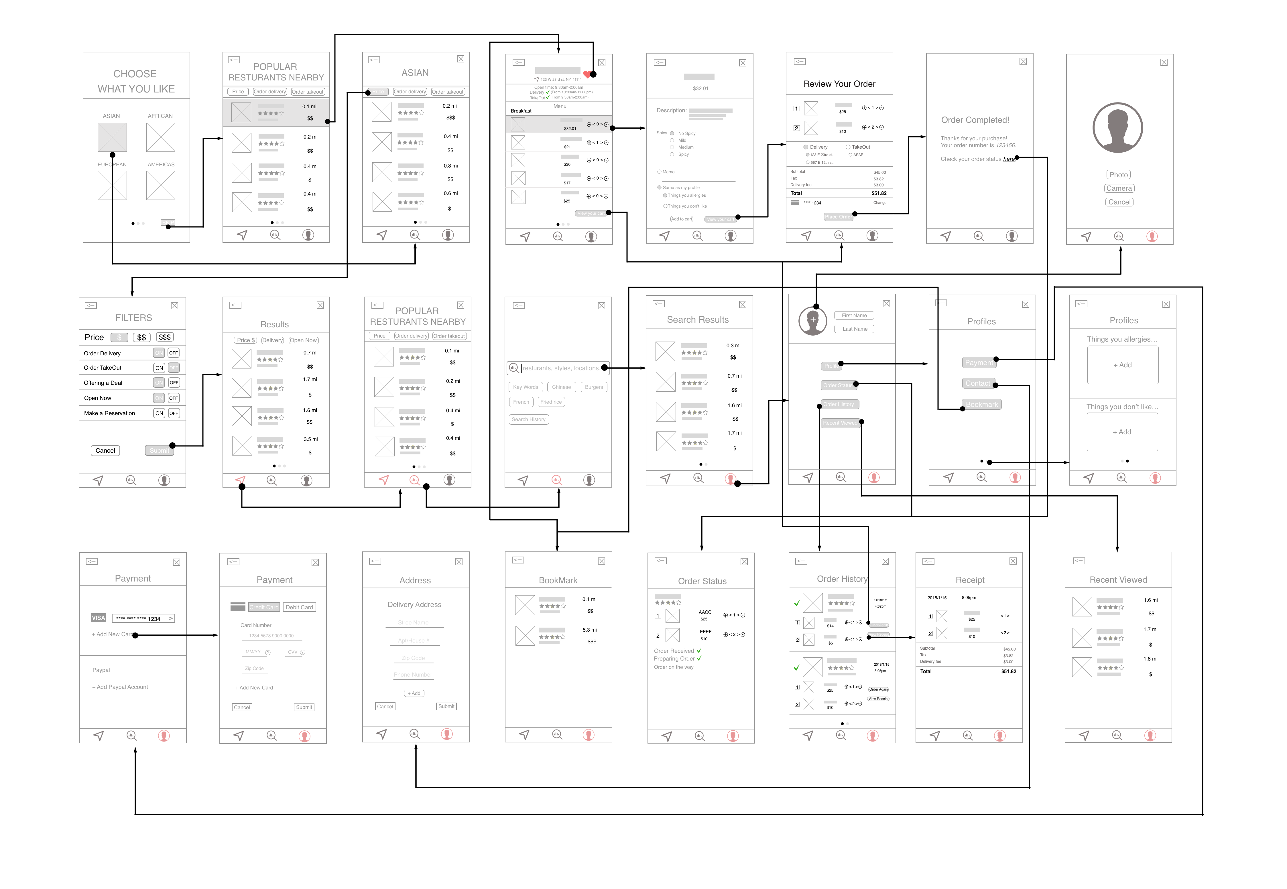
Here is my WireFrame:
The whole app:
Too many functions are mixed, which causes this app complicated.
Home:
1. Give the “Home” tab a name which is related to the content of the tab rather than using “Home”.
2. “Adding to cart” function seems to have the logical problem.
Food Regulation:
The name of “Food regulation” seems to confuse the user, which means that the user won’t think the food shown in this tab is the food the user has at home.
Health Record:
1. How would you get the health data? Could it link to Health app to get part of the data?
2. The layout of this tab is confusing.
App Map 2.0
![]()
Wireframe 2.0

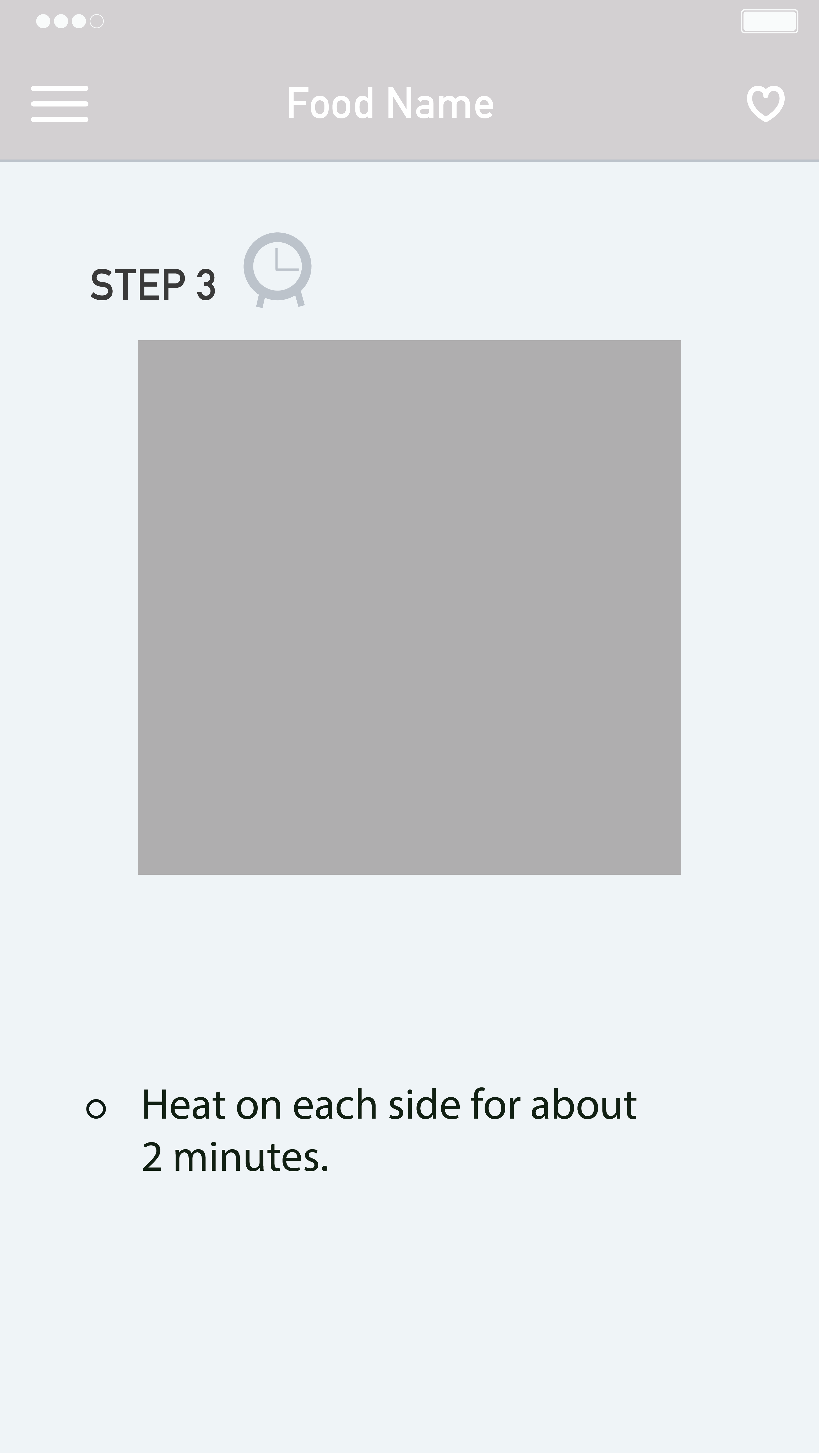
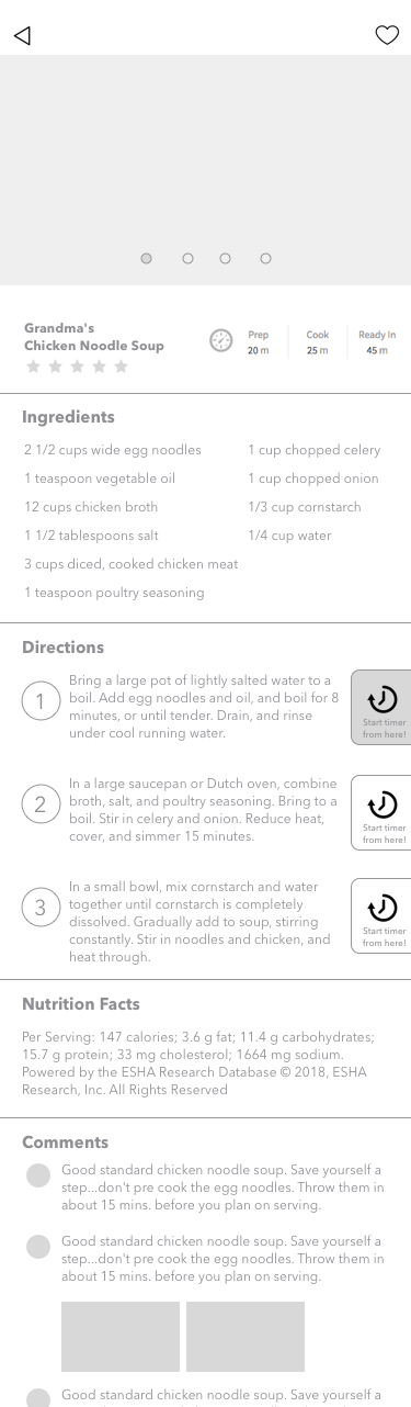
Sign for the last page of a recipe.
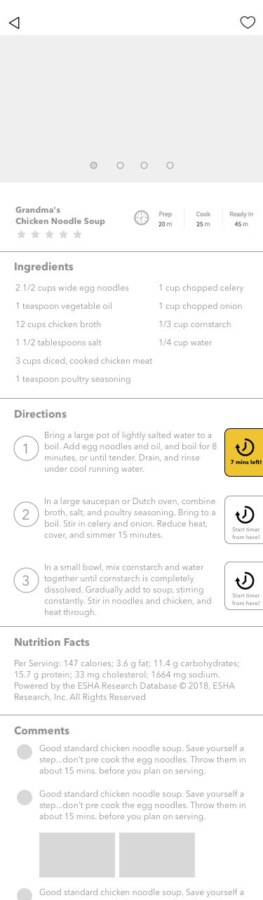
Users were confused about the last page of the recipe because on the step3 page; there was no clue to figure out the page is the final step. Also, users wanted to go back to the main page where they chose a recipe for the first time from the last step of a recipe. But they had to take two steps to go back; which was tapping on a menu and then home button.
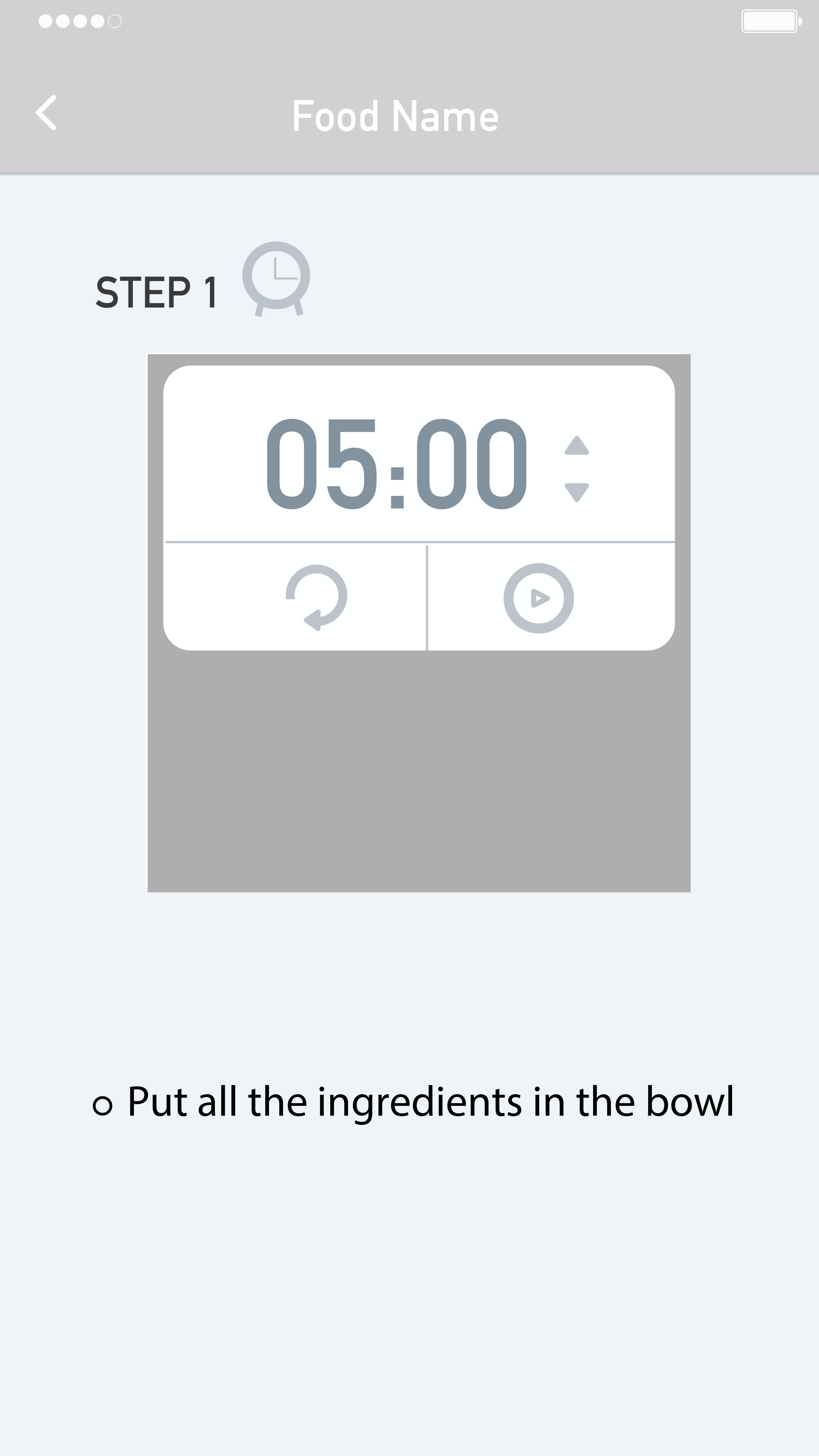
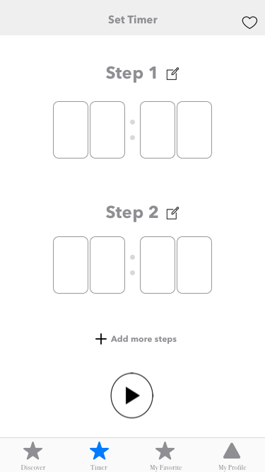
Timer function.
Nobody recognized the timer icon. Users said icon does not look like clickable. The timer is needed when people boil while cooking, but once they click the timer, it should be minimized, so it does not cover recipe photos. Users no need to set the time themselves because based on the recipe, a timer can set it automatically for them.
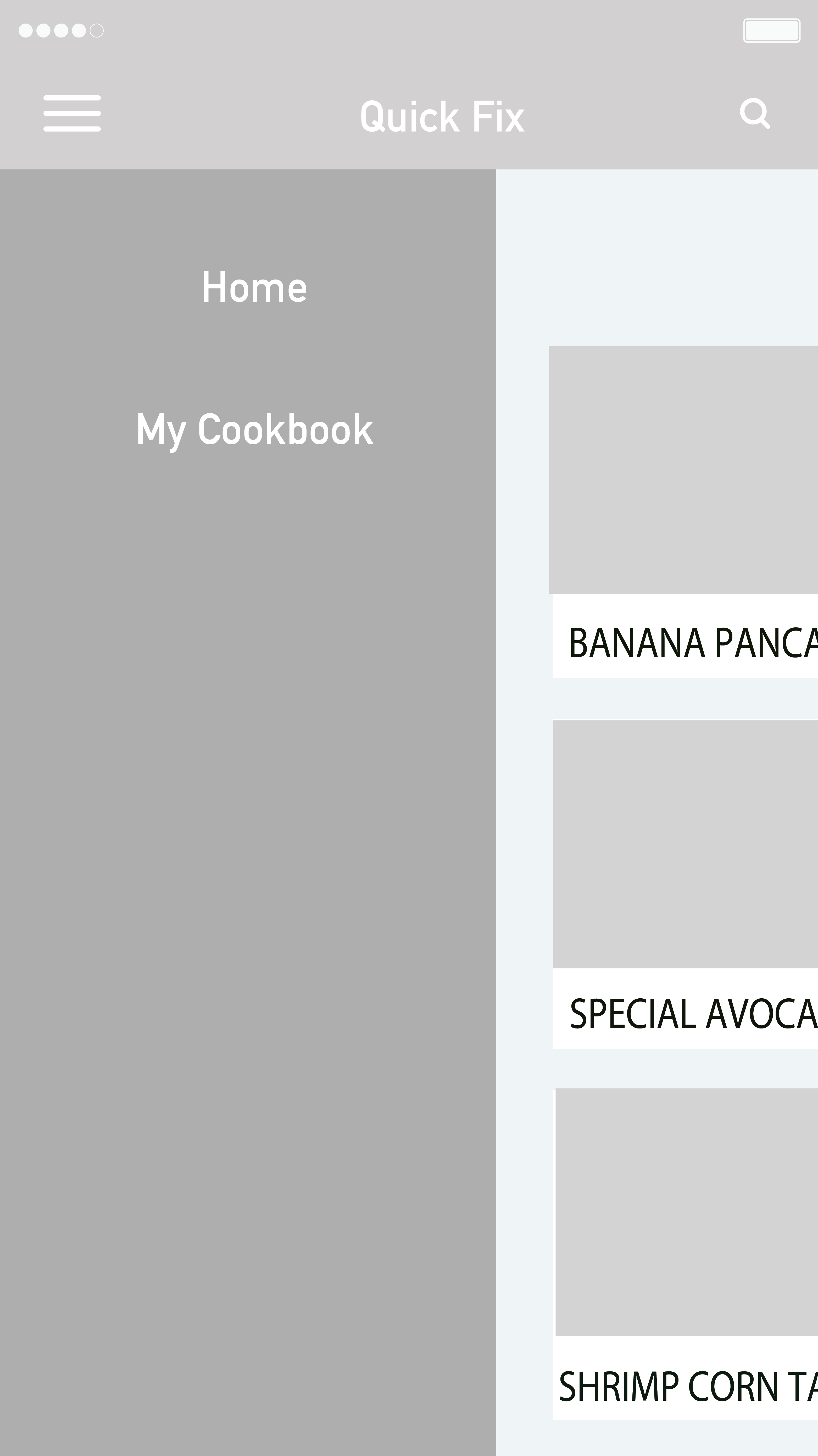 Navigation.
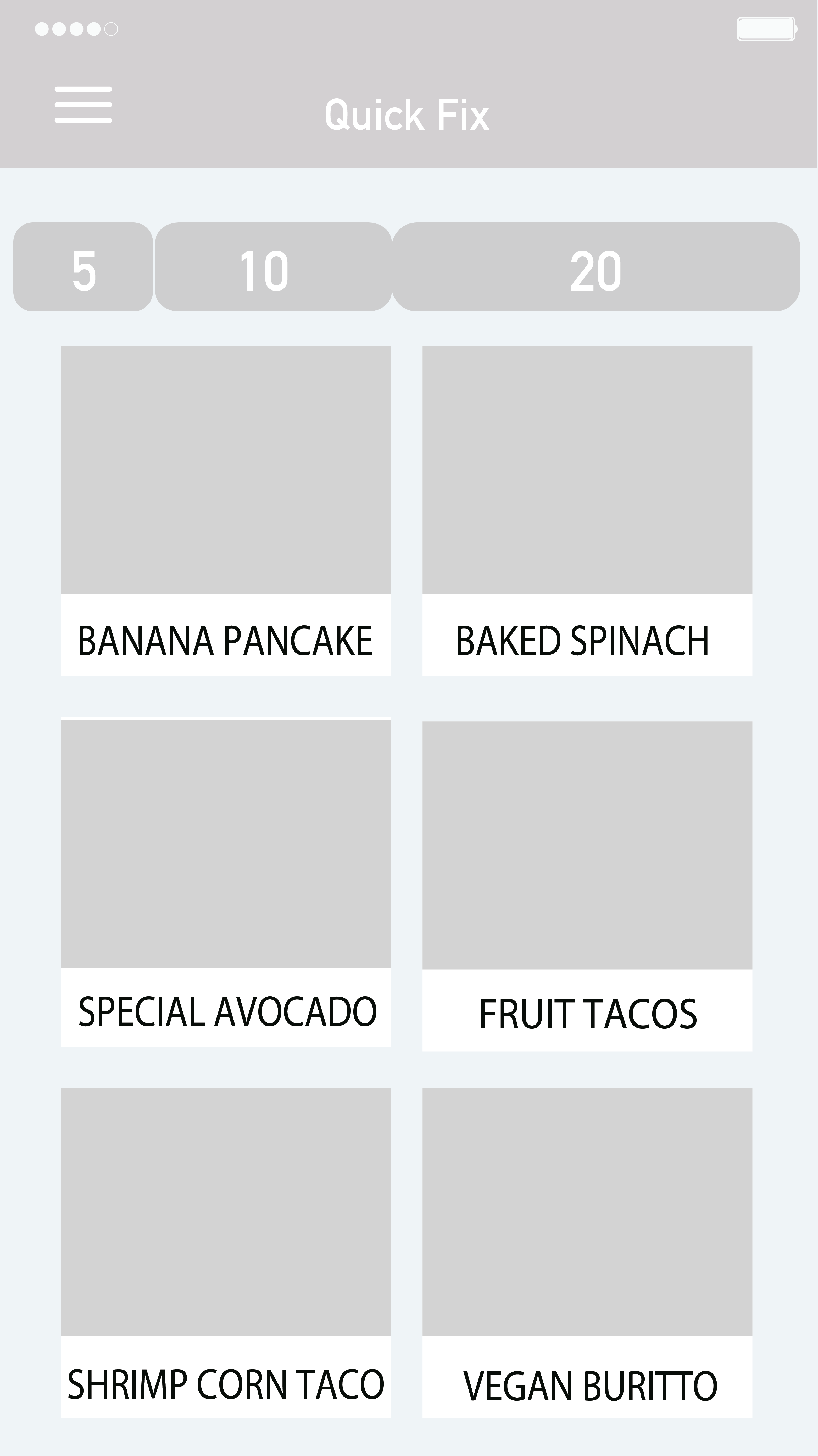
Basically, there is a menu bar on the left to navigate, but has two buttons, which are ‘home’ and ‘my cookbook.’ Users said there is too much blank for the menu navigation, so they suggested me to put those two buttons underneath of the whole interface. Another navigation bar is choosing a recipe based on time. There are three options 5, 10, and 20 minutes. Users said split into three times seemed restricted. Many recipes cannot fit into those three options and suggested me to think about how to make this filter flexible.
Based on the feedback, I iterated the prototype.
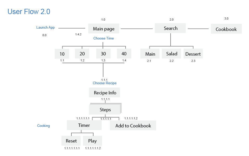
Below are the second user flow and wireframe.
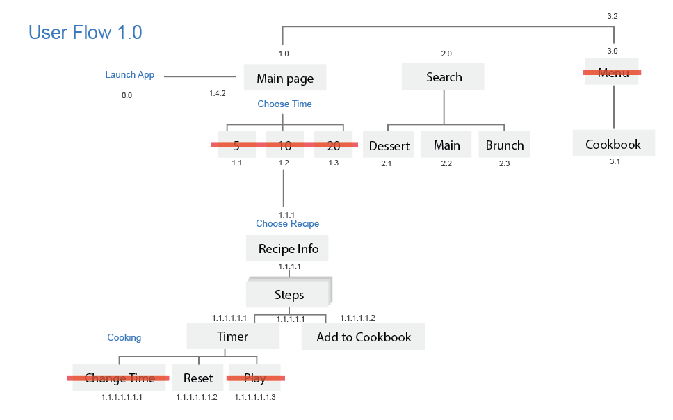
<First user flow>
<Second user flow>
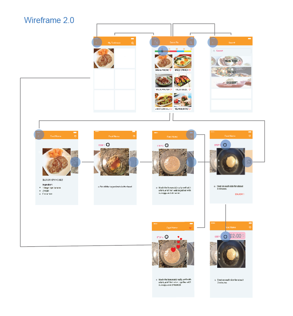
<Second wireframe>
3 User Insights

About Me

I’m Qinwen Xing. My background is graphic design. Most of my previous work are focused on branding, book design, and packaging.
3 things I don’t know from the Apple HIG
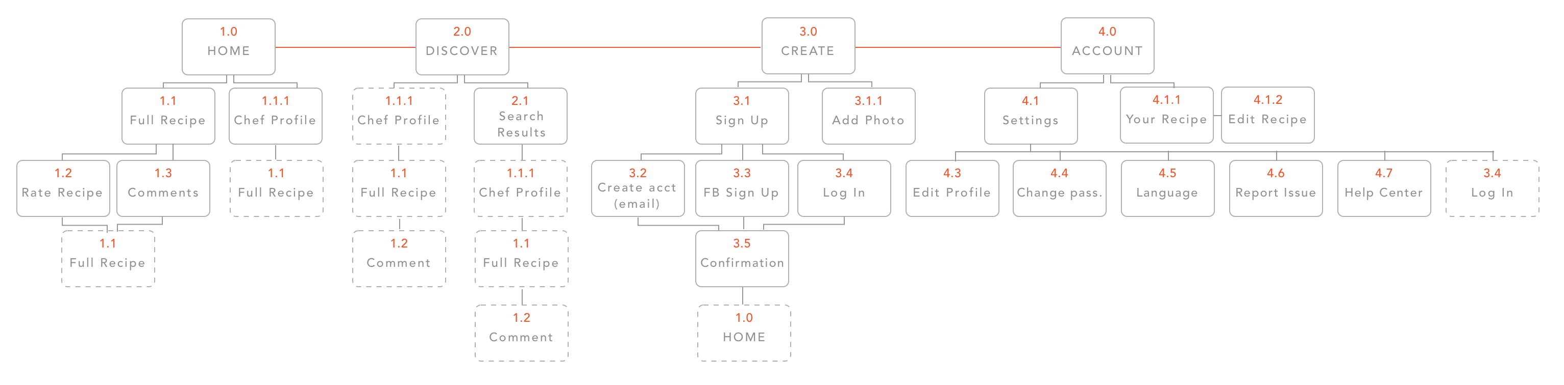
App Map
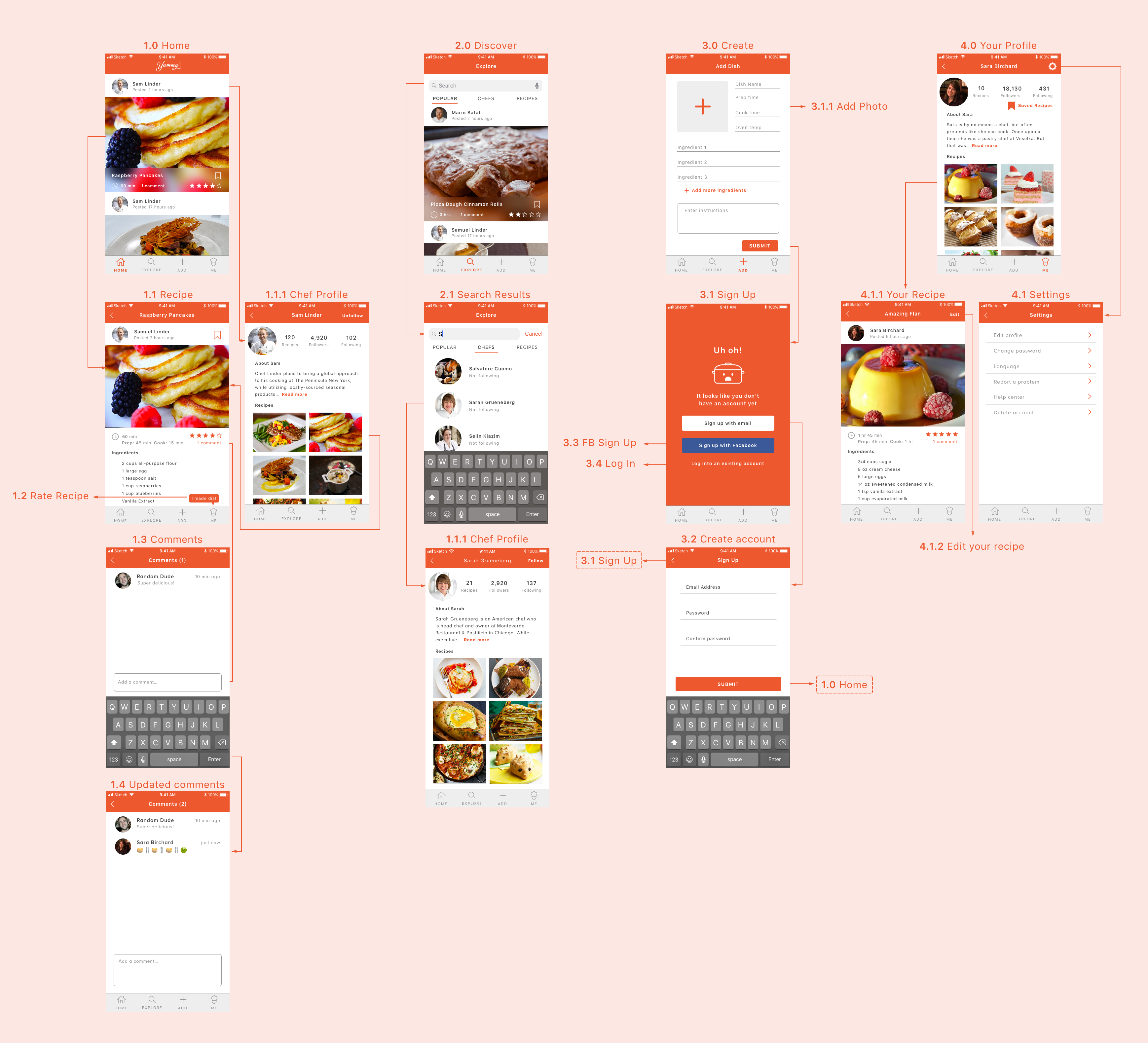
App Wireframe
![]()