Hi! My name is Yiying Xiao and you can call me Frannie. I came from Beijing, China. And I defined myself as an artist, creative producer, experience designer, and interaction designer.
Things I didn’t know about Apple HIG:
[Feedback]
I didn’t realize before that there are subtle indicators for user to subconsciously know what’s going on with the APP. But it does give the user a hint on the feedbacks that are very subtle that works better than a grand gesture of status changing.
[Consistency]
I actually noticed that most used apps for me has similar icons which are designed visually similar to the Apple system icons. But I didn’t realize the reason of this action is to keep the app consistent with the system so user would feel familiar with what’s happening in the app.
[Color & Branding]
The part that encourage designers to stick with the color palette which coordinate with the logo and overall brand vibes are very inspired since I’ve always only thought about how the color palette would effects user’s emotions rather than the way they perceives the brand.
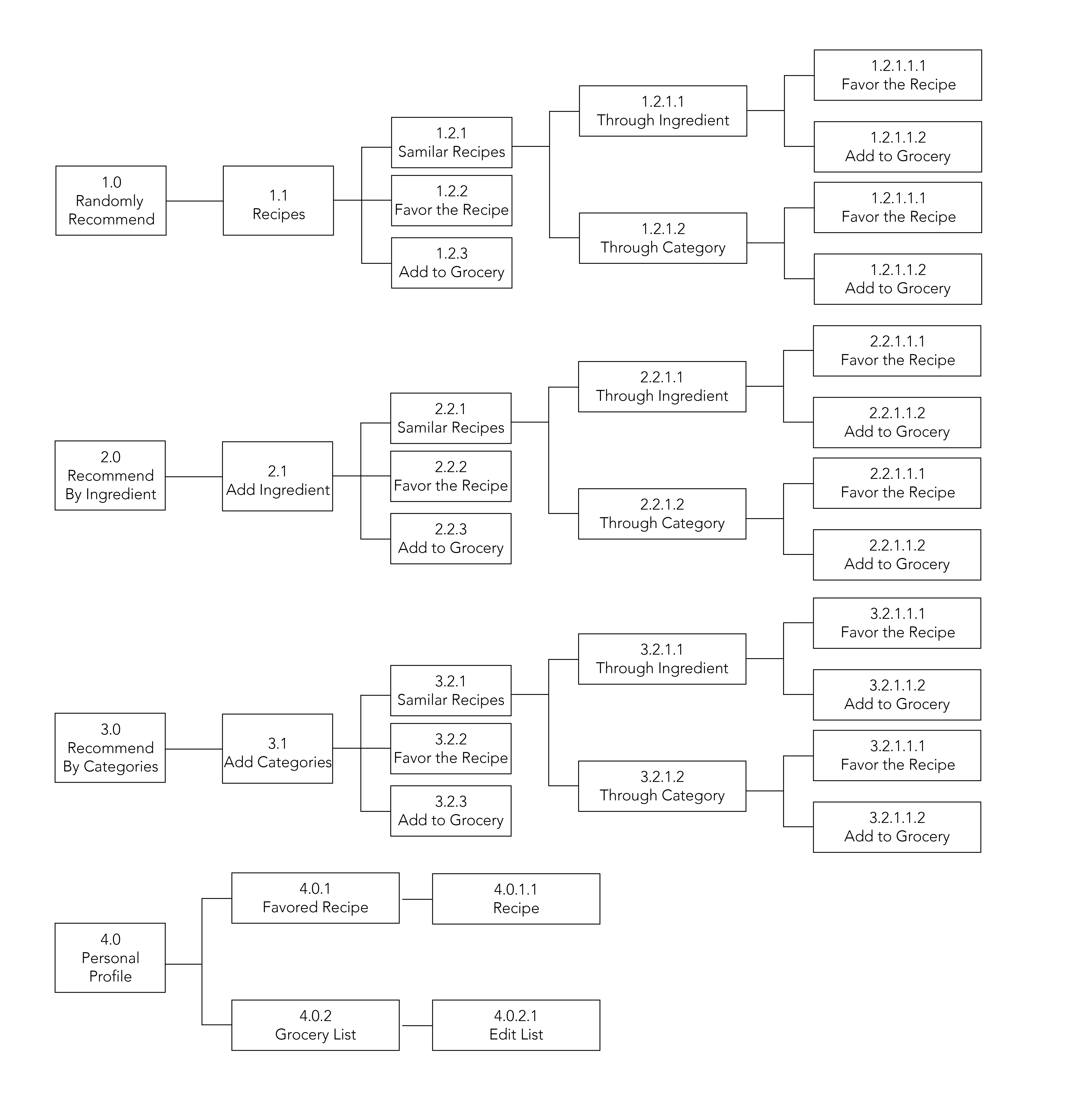
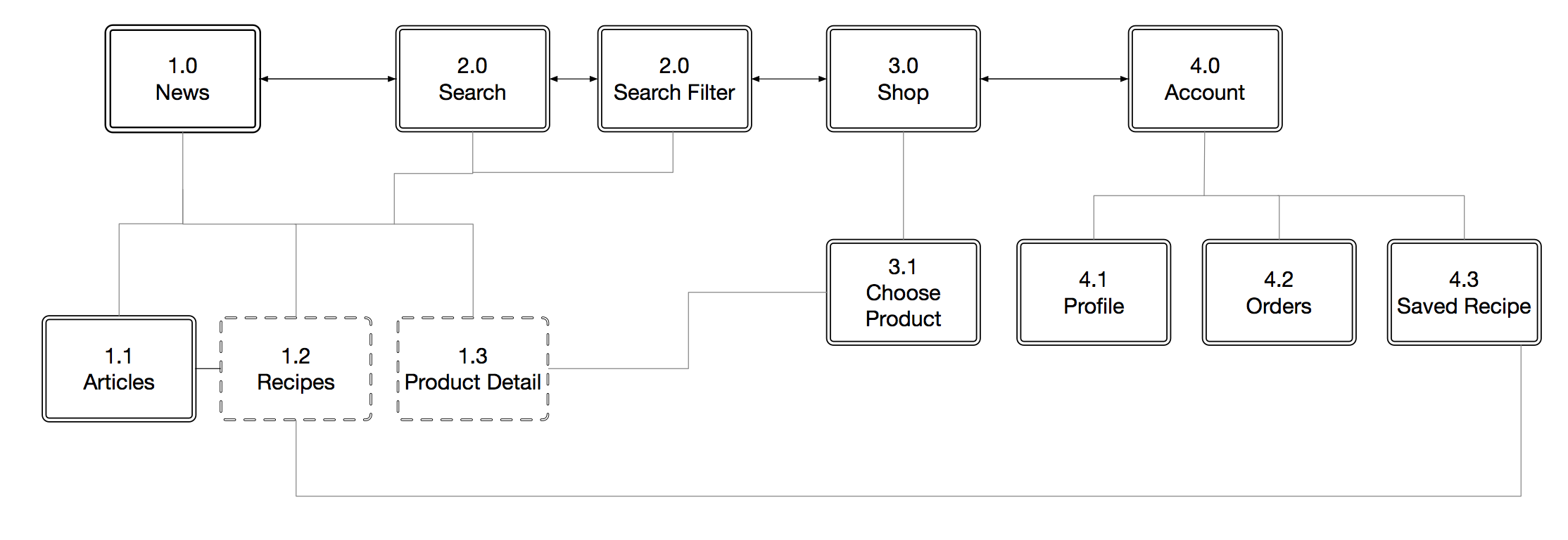
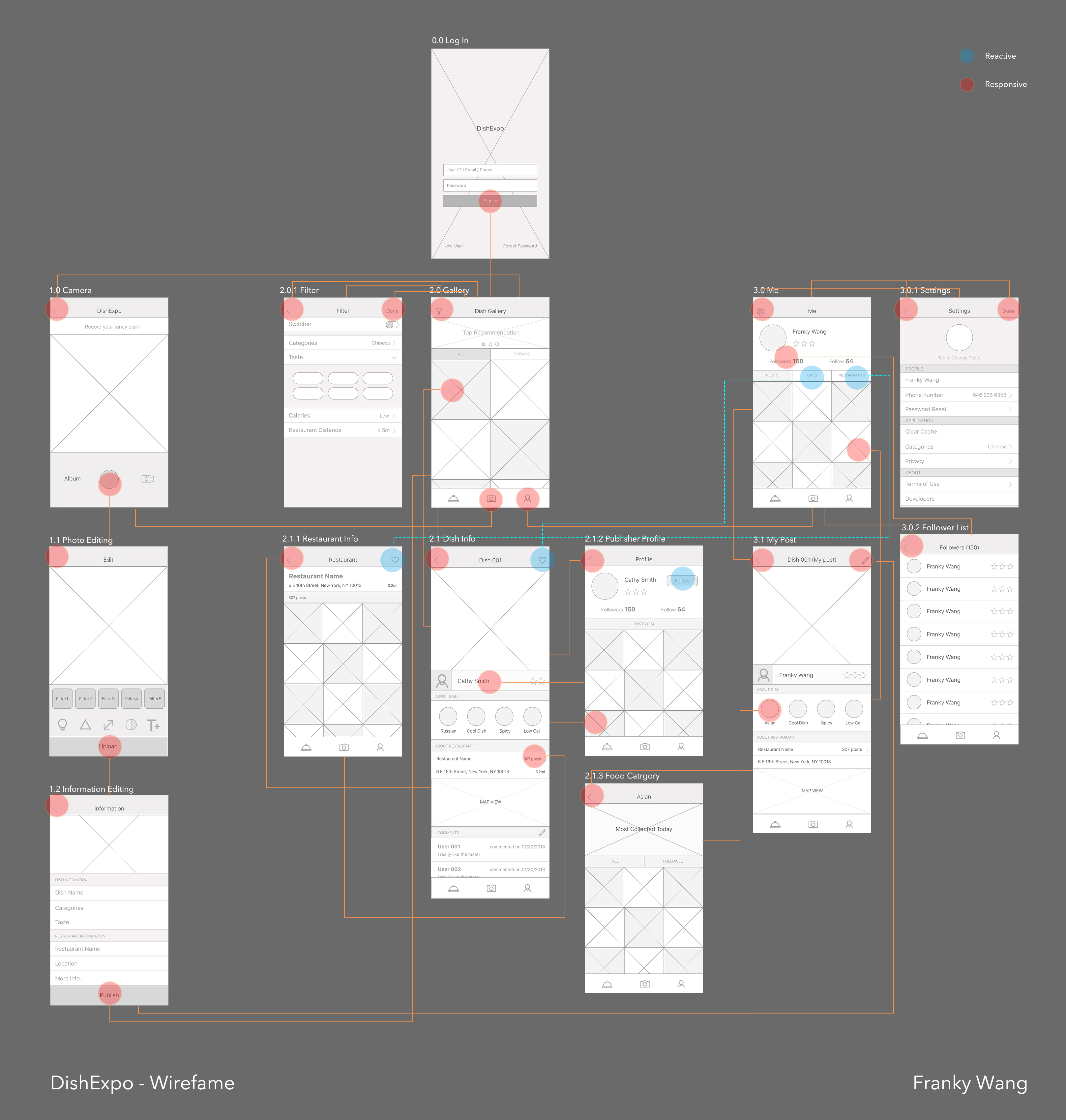
APP MAP
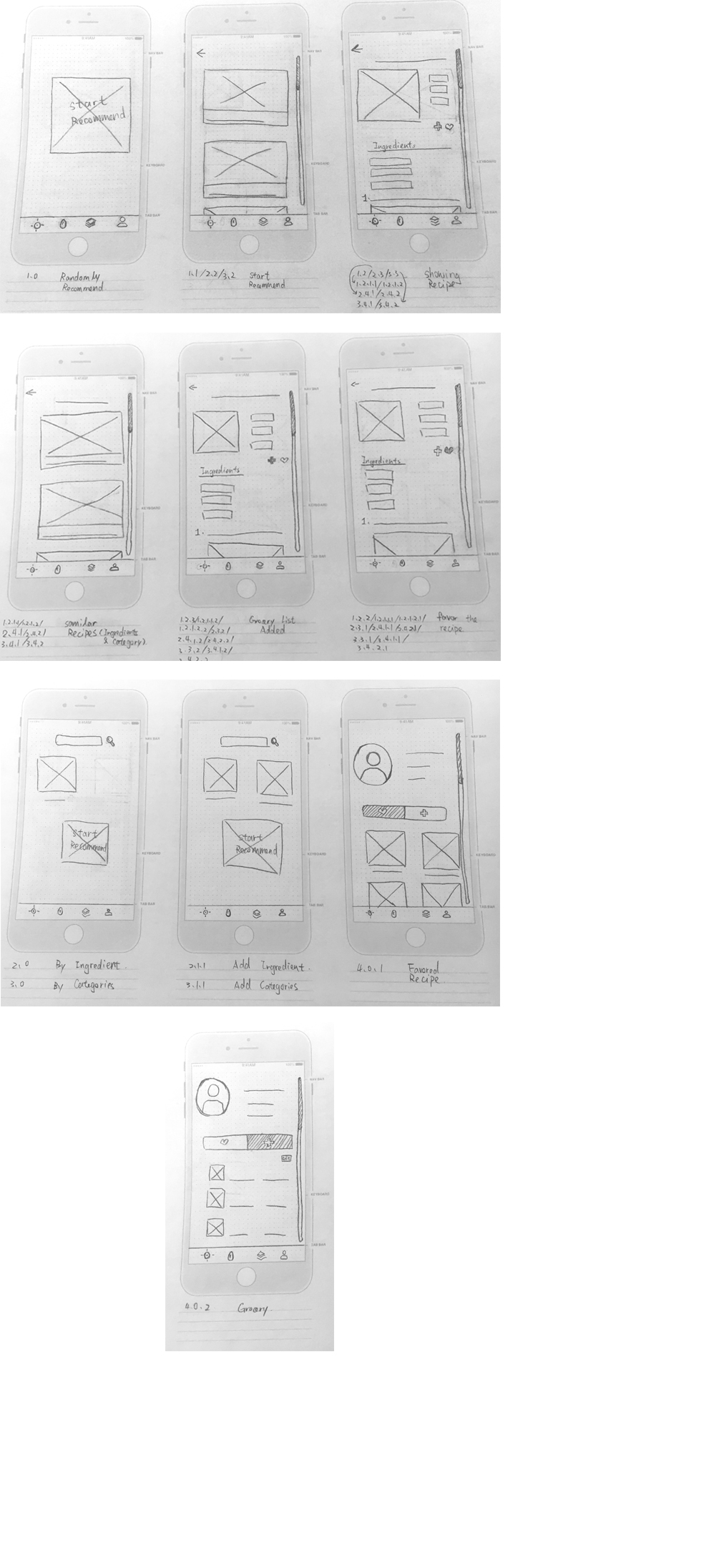
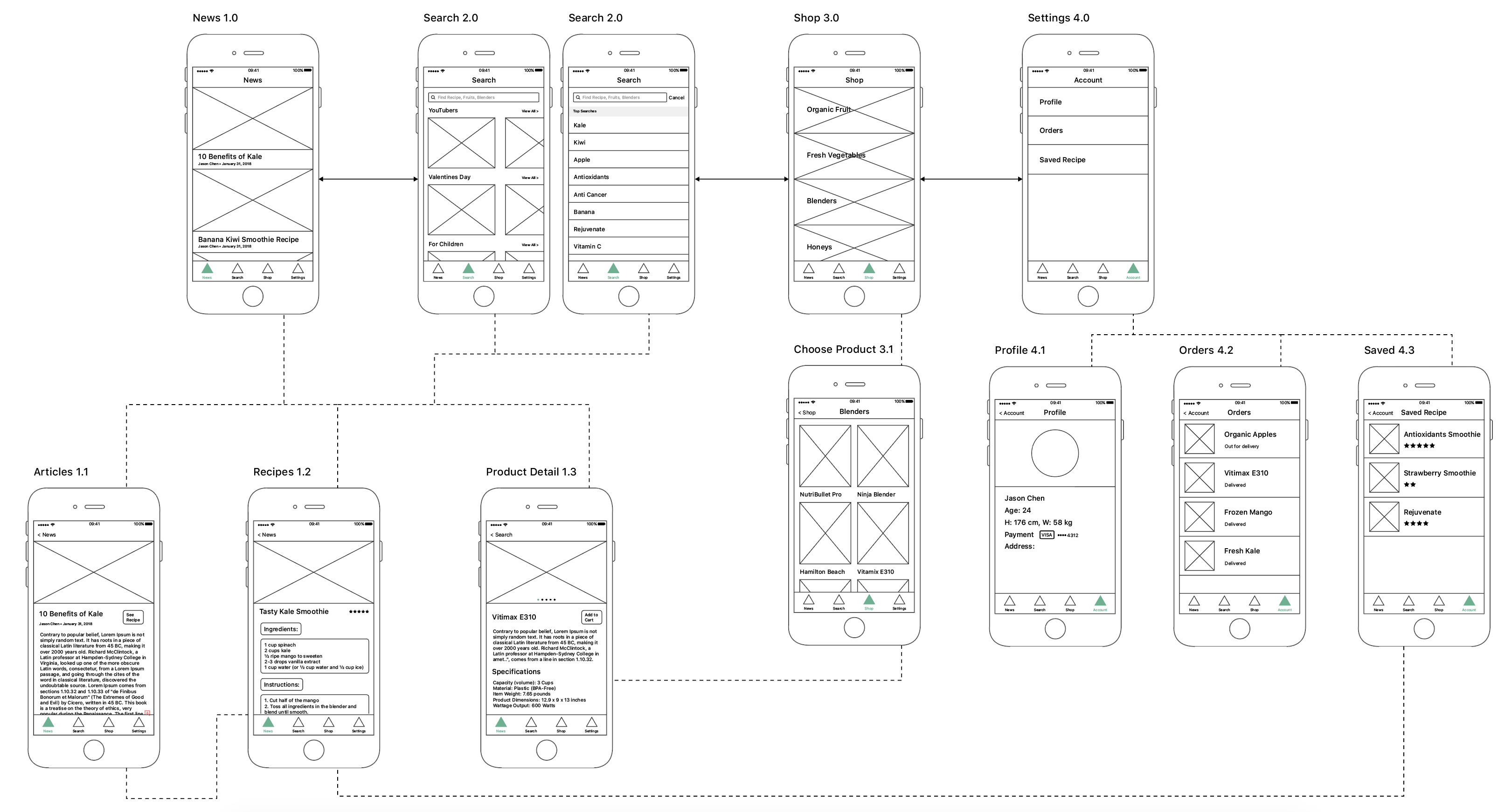
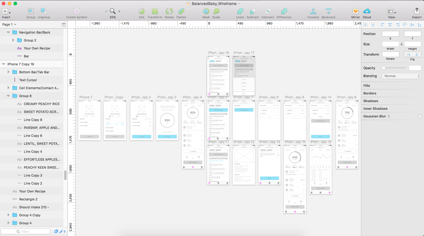
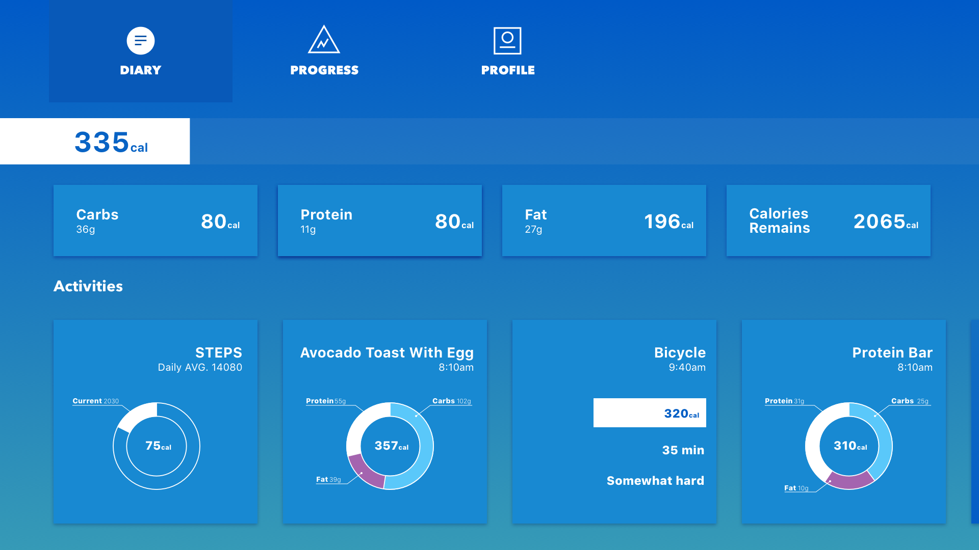
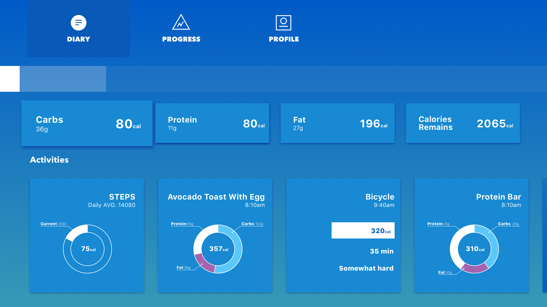
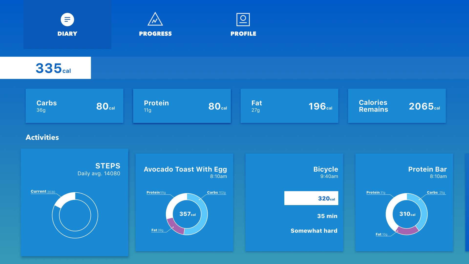
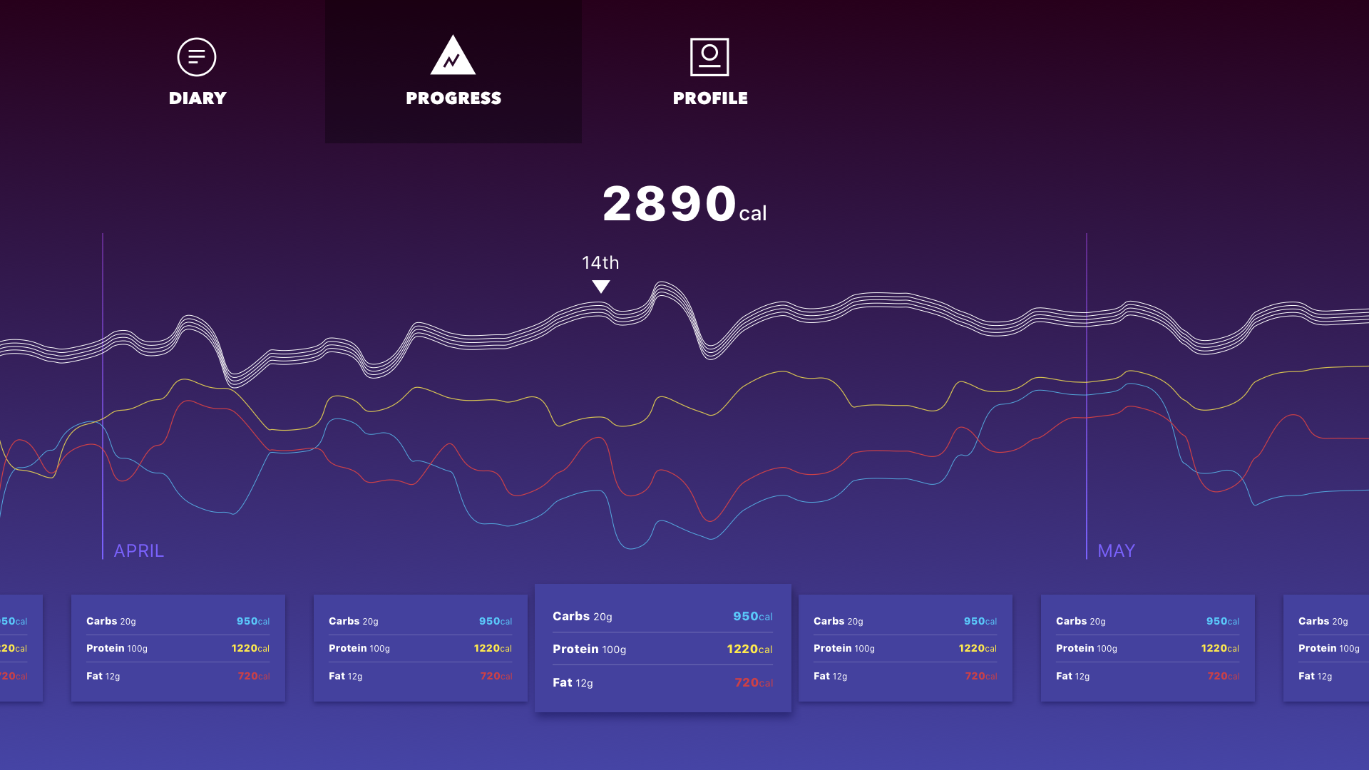
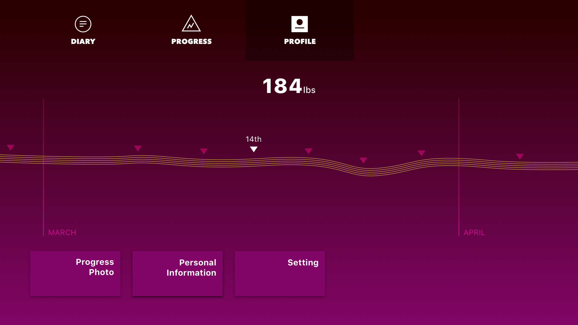
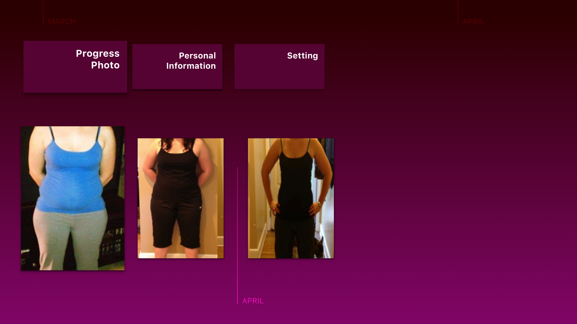
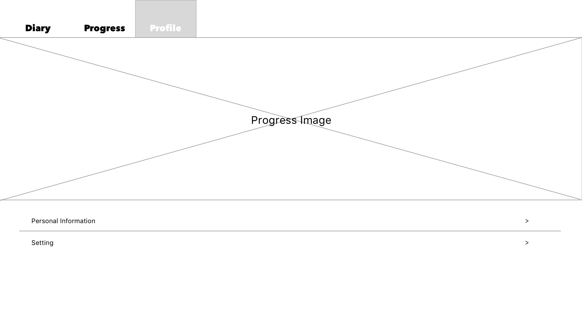
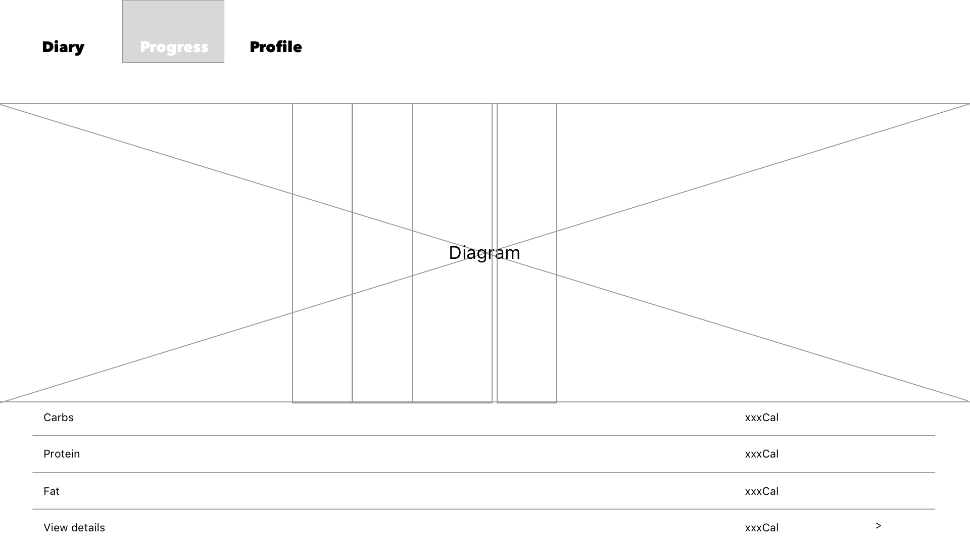
WIREFRAME
 Hello, my name is Aim. I come from Bangkok, Thailand and I am a visual designer, a front-end developer, a researcher, and an aimer for change.

 Kelsey (Yue Yu)
