Category: Uncategorized
Material Design | Poetry in Motion – Dana Martens
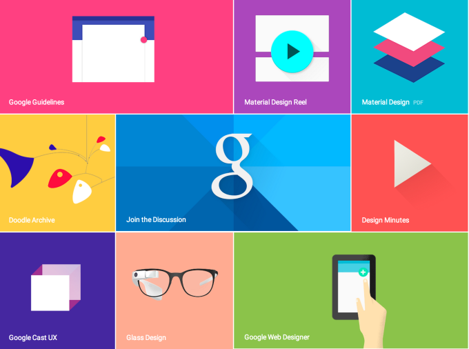
Finally have obtained a brand-new computer after this week’s saga and am posting last week’s blog assignment: to read Apple’s HIG or Google’s Material Design Guide and give examples of 3 things we learned!!!
Since I studied the HIG last semester for my iOS class, I thought it would be useful to see Google’s approach. Although I can develop for iOS, using an iPad, I’m an Android user through and through with my phone. I’ve come to realize this actually gives me a very different subconscious and unintentional understanding of Android vs. iOS. One of learning through recognition, and user experience versus recall from principles learned for design.
Continue reading Material Design | Poetry in Motion – Dana Martens
IOS human interface comment – GI
there are several things that I noticed while studying the IOS design guide lines. I also looked at material design by google, but in this post, I will focus on the IOS interface.
— By default, all bar buttons are borderless.
It is interesting to see all the guide lines that apple suggested, one of them was
normally, if you are a user, you don’t pay a lot of attention to design, you pay more attention to whether it functions well, and is it simple enough to use it. I was one of them, and I realized even though without a borderline, it can also distinguish between bar button by color. Also, the texture of the bar button(if you have one,) can make content distinguishable with contents too.
–Today’s date remains highlighted and the year appears in the back button, so users know exactly where they are, where they came from, and how to get back.
One of the things that I noticed was when a user tries to go to the view or function of what they want and if the path does not exist or the path is too hard for the user to find out, user gets frustrated. He will less likely to use an app. That what I do, when I download an app, I want to test to see if the app have what I want ; for example, I downloaded an app to write something quickly, but if the app requires me to tap 3-4 times to write something simple, I would not use the app. I believe “paper53” is well-designed, and also has a good path of navigating one to another. Designers have to vision the path that a user will take for the first time, and simplify what is the most important reason for the user to use this app and what is the function that the user want. So the user can quickly access the function whenever they want.
—users navigate by making one choice per screen until they reach their destination.
This is what I do when I download a new app. After hitting the destination, I want to go back to where I was. Designers(I was a designer) tend to focus more on the interface than the path that a user will take, but thinking of the path and function first and integrate with interface design will make them a better designer.
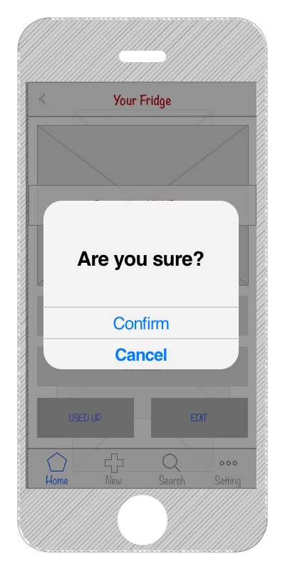
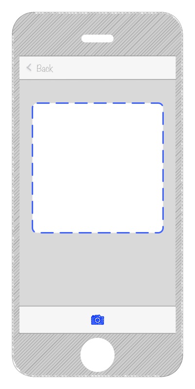
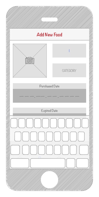
Project #1: Food Guardian – App Map & Wireframe
-
Introduction
Most of people buy food and groceries regularly. Take myself as an example, I cook my own food and eat at home most of the time, at least breakfast and lunch. However, I sometimes forget what I have in the refrigerator or storage box and leave them in the depths. Of course they are no longer fresh after expired. And it is quite inconvenient to check the expired date frequently. Thus, it would be easier if our smartphones can take care of that for us.
Food Guardian is an app that can helps its users to manage their food and groceries. Users just have to input the info of food, especially the expired date, then Food Guardian will notice you while the food is about to go bad.
-
App Map

-
Wireframe


–
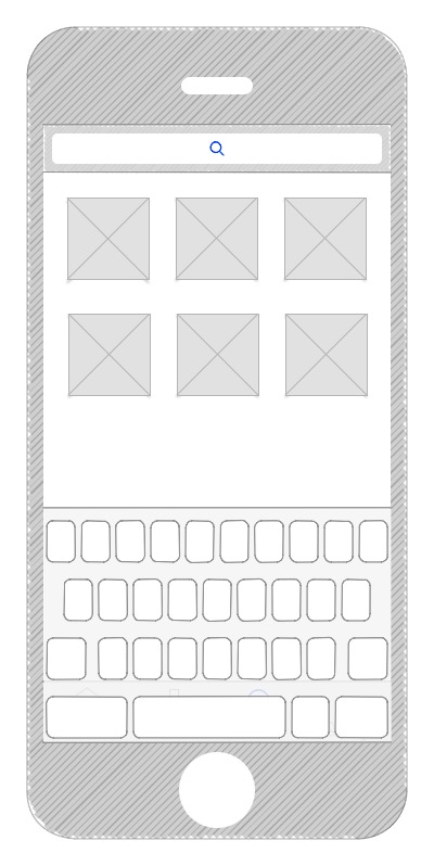
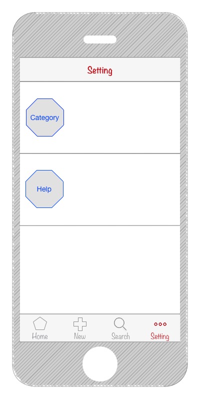
Teller: Paper Prototype for Project 1
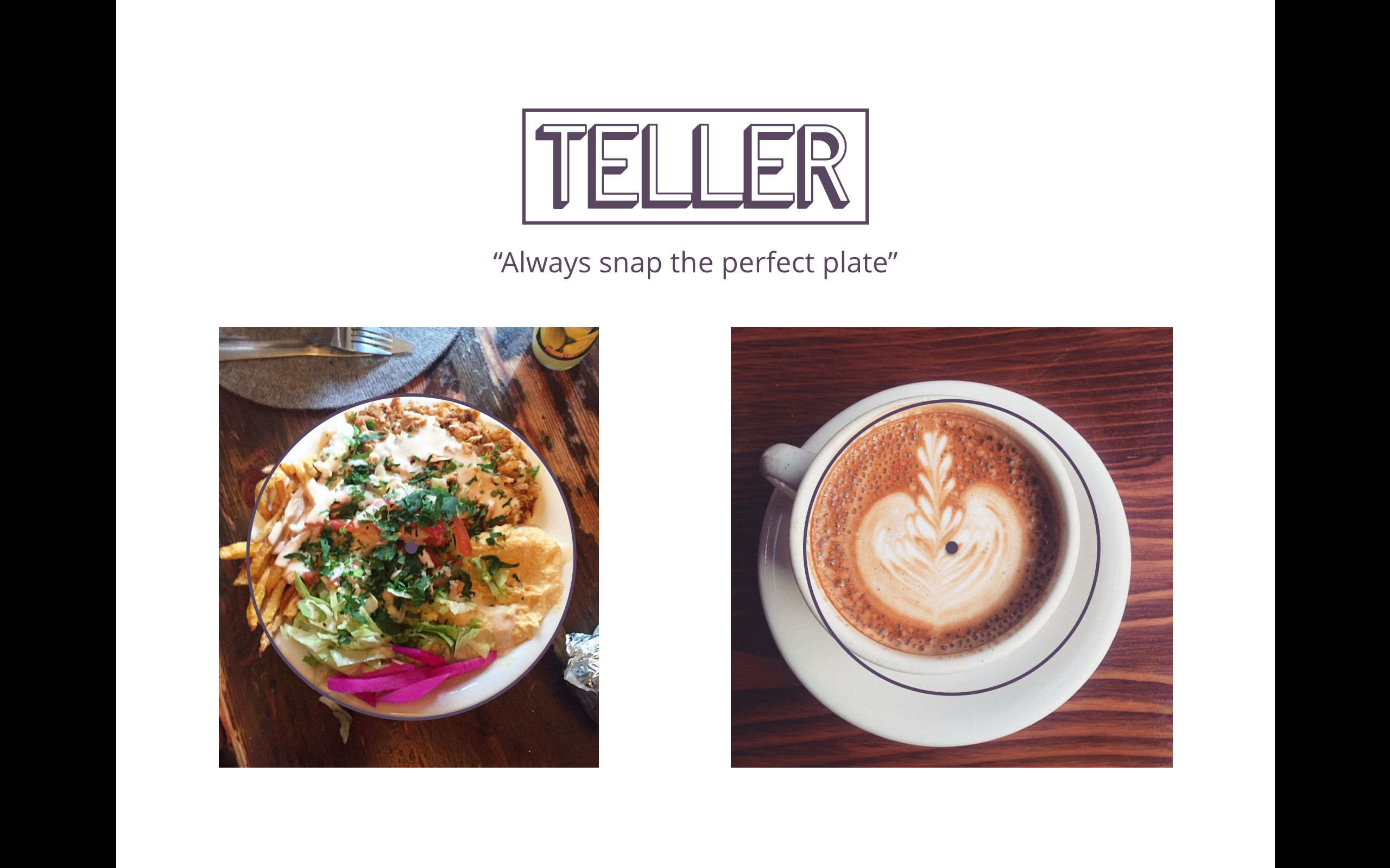

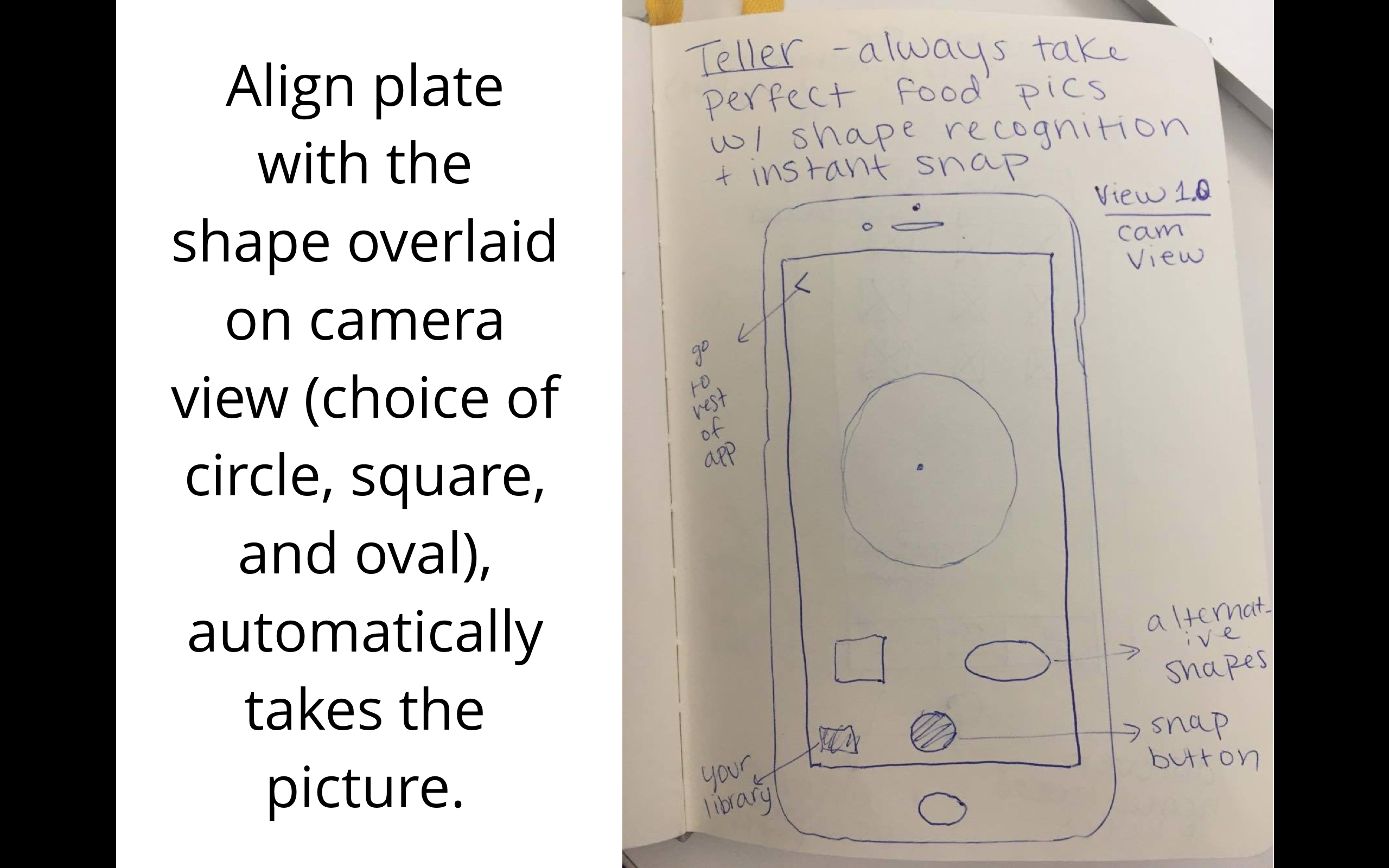

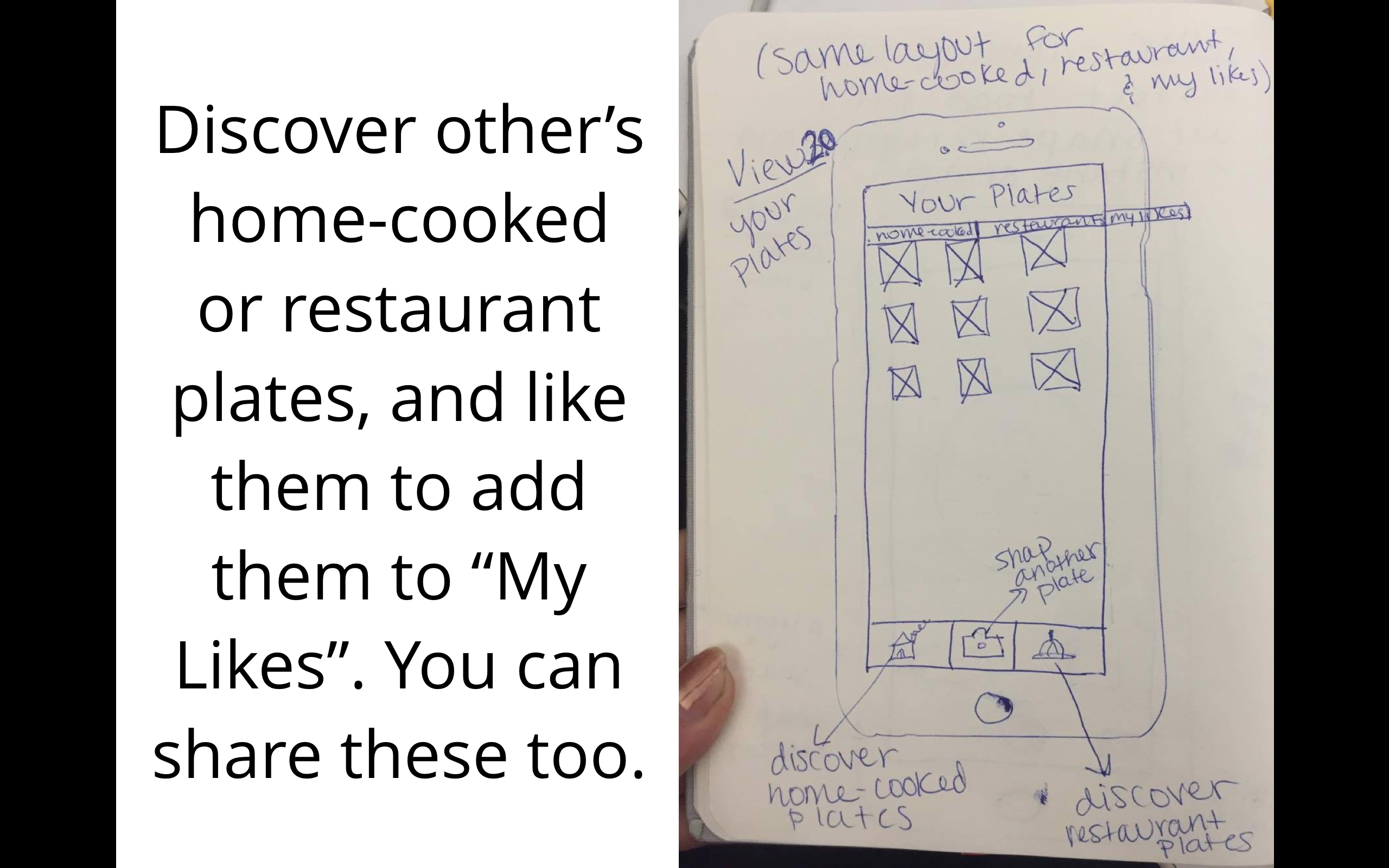
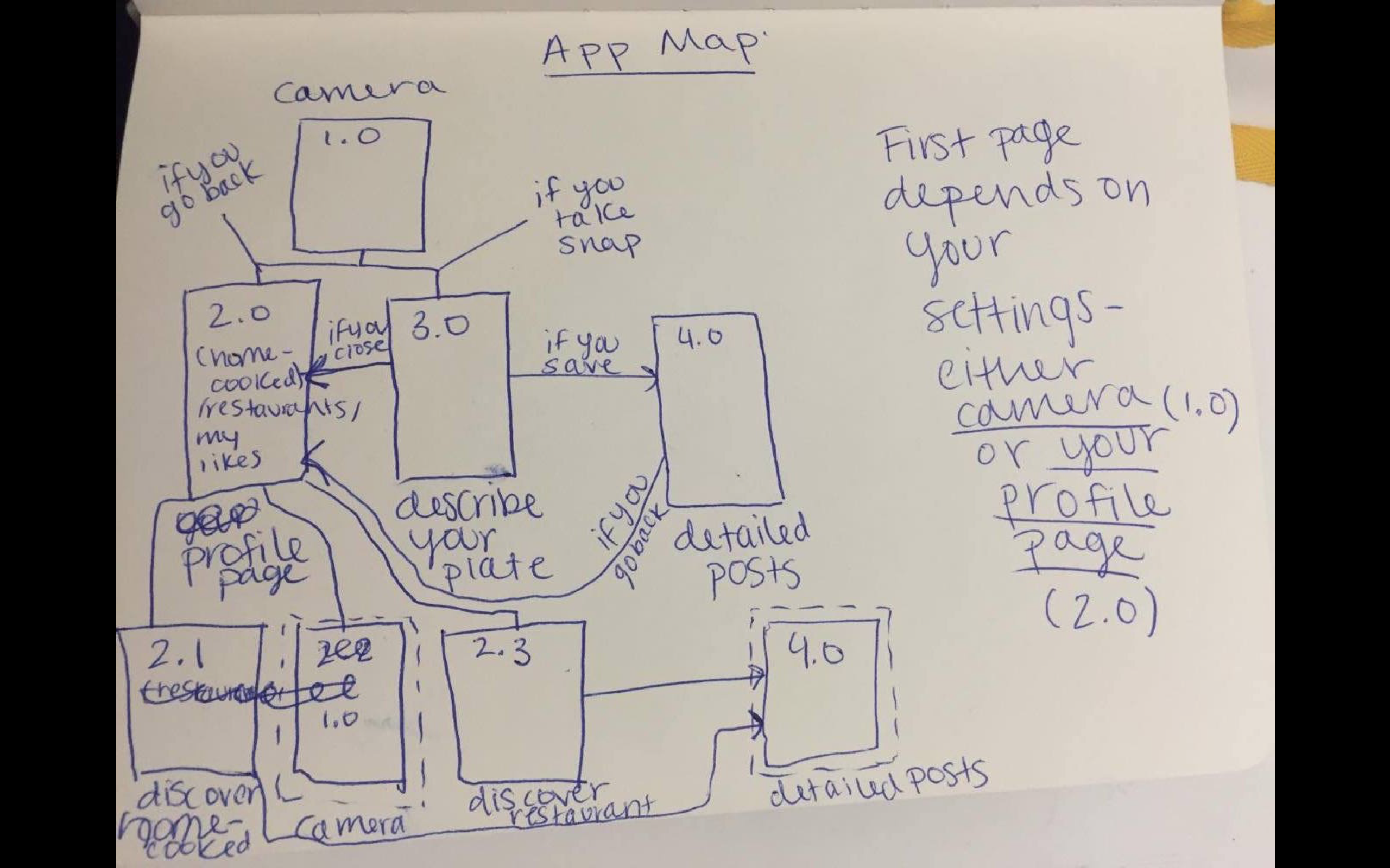 I had a new idea for the organization: instead of segmented controls that then hide some of the content…what about a filter option at the top in the form os a thin slide that has the options: Home-cooked, Restaurants, and Both with a default setting of Both. That way they can be exposed to all content at once on any page. Tab bars would be Discover, Personal Profile, Camera, and My Likes. All of those except camera would have the filter option at the top.
Cookgram: Wireframe & first UI
Concept Statement: Cookgram is an interactive recipe app where users can post their recipes as well-designed recipe album. All they need to do is take a picture every step, and then add texts after. It will be a place to explore, collect, make your own, and share recipes.
Based on some user feedbacks from Wireframe presentation and paper prototype, I have updated some of the ux flow in this version.
User Insights (from Wireframe & paper prototype):
- Category view:the design looks like users can type in not choose from lists
- Add Text View: Better to have an overall instruction in mind for user after taking the picture. Now the view is not clear about what’s the next step.
- Can corporte with iPhone 6S live photo function
- Can be a community for people to like, share, upload recipes.
Presentation Slides: https://docs.google.com/a/newschool.edu/presentation/d/1ZVXjphTBUieI36Nth3COheS0gaTt7iOpuhys-FMxBBI/edit?usp=sharing
User Insights (from this presentation):
- Text size is small, hard to see. Need to prototype on the phone
- The aim of category? “Cooking steps” is confusing in “category”, after taking pictures and add text, is repetitive with the “cooking steps”. Cooking steps better be called “instructions” (The camera – text – post part ux need to be simplify and cleared)
DumpCook: Iteration1
DumpCook: Dump Recipes for Dumb Cooks, is an app for finding, organizing and sharing the easiest foods to cook.
Dumb cooks unite!
ProjectOne_Presentation
Food Scout // Presentation 1
Food Scout is an application for travel and food enthusiasts. It caters to the needs of adventurous travelers that wish to enjoy authentic and cultural food experiences on their travels. Existing application review restaurants and give minimal information about the cuisine. One has to do a separate research to find out about a city’s dishes.
iOS HIG notes
1. Let translucent UI elements hint at the content behind them. Translucent elements—such as Control Center—provide context, help users see that more content is available, and can signal transience. In iOS, a translucent element blurs only the content directly behind it—giving the impression of looking through rice paper—it doesn’t blur the rest of the screen.
2. Choose dynamic type since people increase font size in settings often
3. Some iPads have split view or slide over and a good app uses auto layout to make sure their app doesn’t get messed up in this mode
4. More important content in top left less important in bottom right
5. Give tappable controls a hit target of about 44 x 44 points.