Three things I didn’t know about HIG
- Navigation: Hierarchical Navigation, Flat Navigation, Content-Driven or Experience-Driven Navigation. I didn’t consider much about the types of navigations. This helps me to analyze the information architecture.
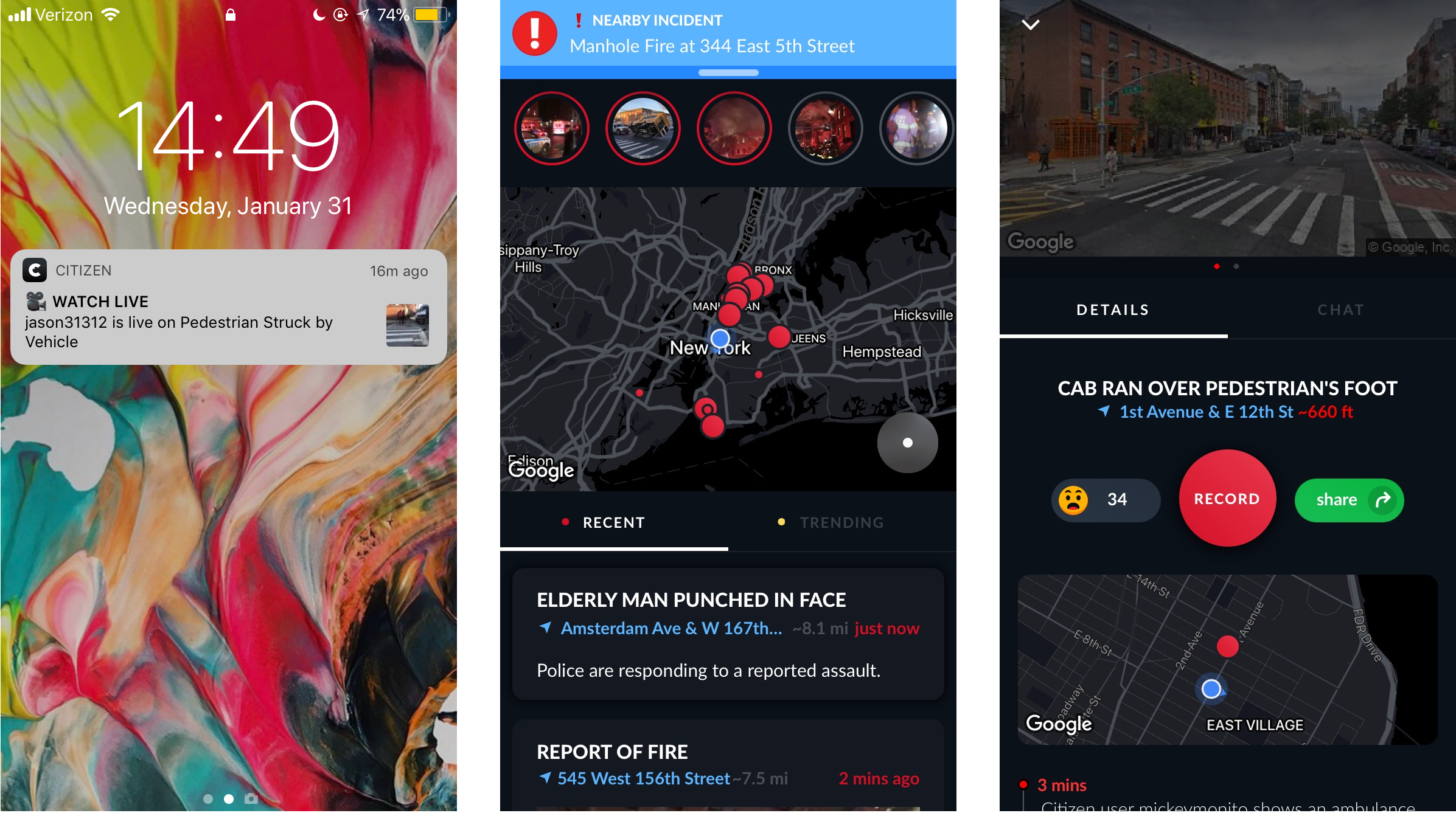
- 3D touch: in the past, when I design interactions, I didn’t consider applying varying levels of pressure to the touchscreen to access additional functions.
-
Layout Guides and Safe Area: it aids with the positioning, alignment, and spacing of content. I didn’t know safe areas and margins in UI.
About me
 My name is Yin Hu, currently a first-year student in MFA DT. I studied Mass Communication in the undergraduate study. And I have two internships in UI&UX area. One is at the user experience lab of Tongji University, in China, the other one is at an internet company. I want to further study UI&UX design more systematically in my graduate study, so I chose Designing for Usability the last semester.
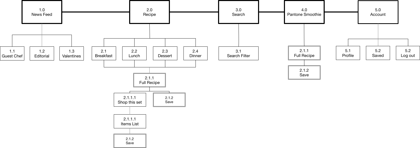
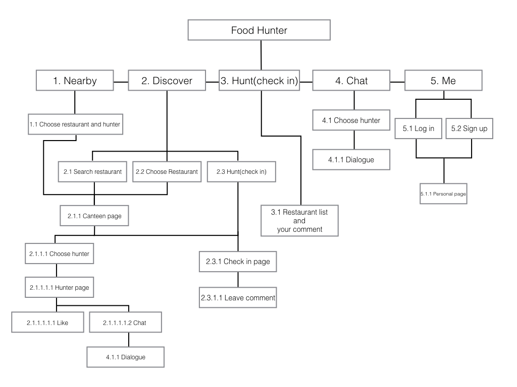
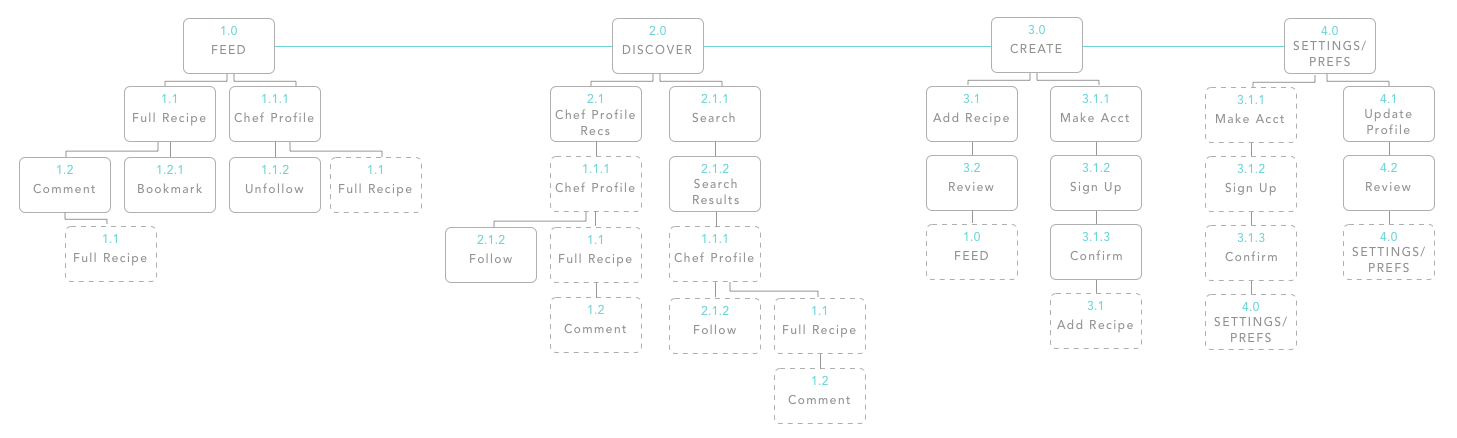
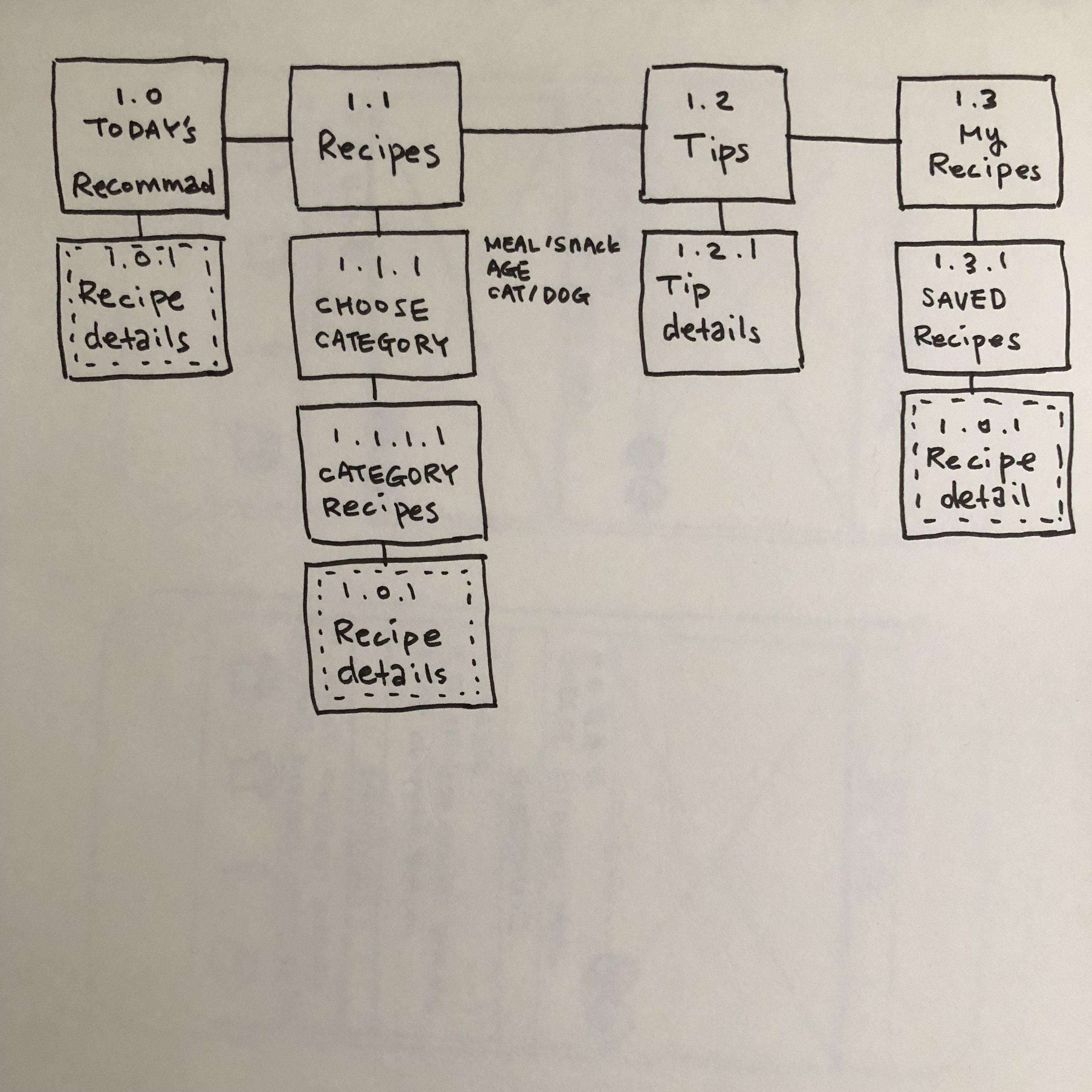
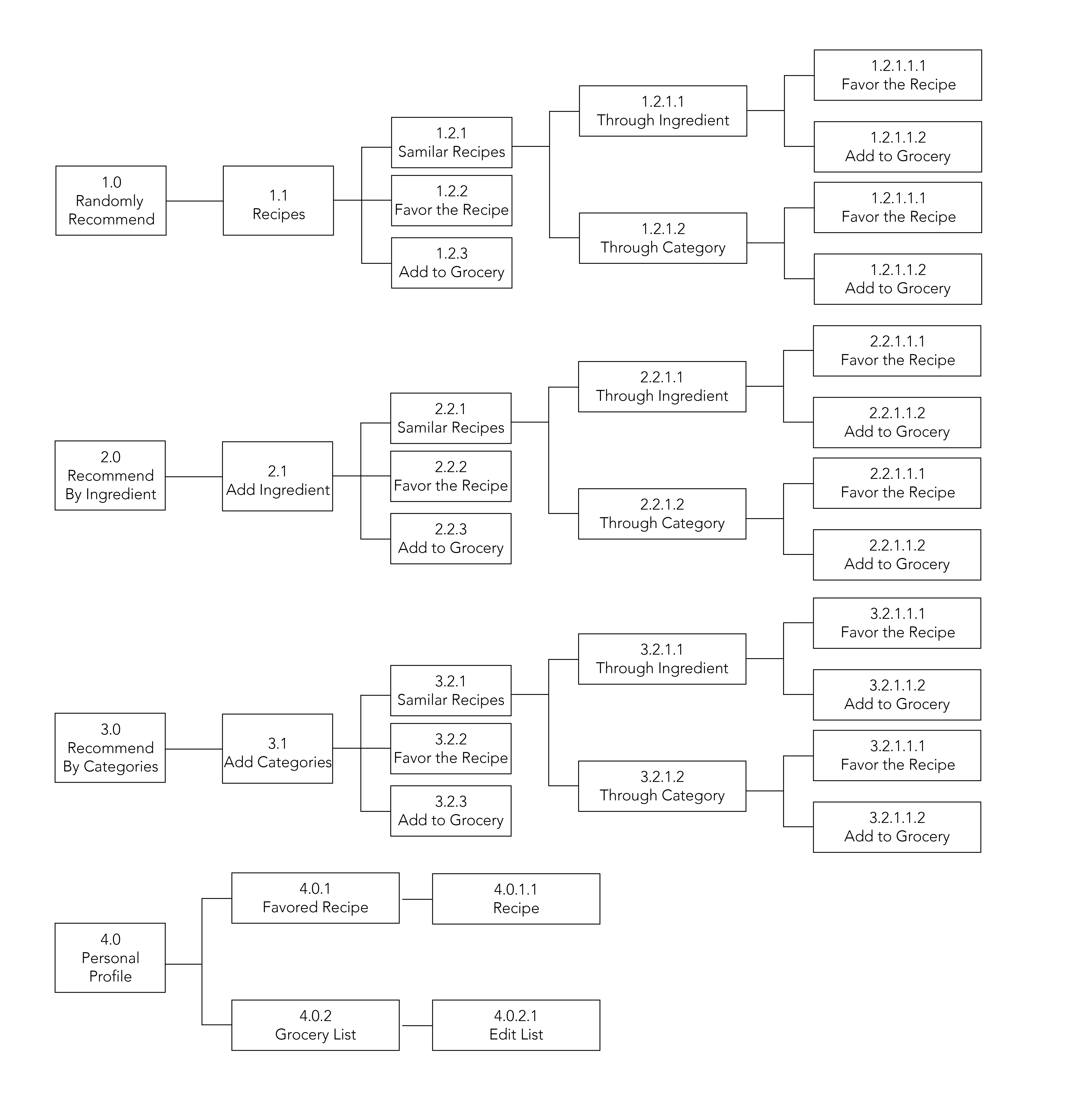
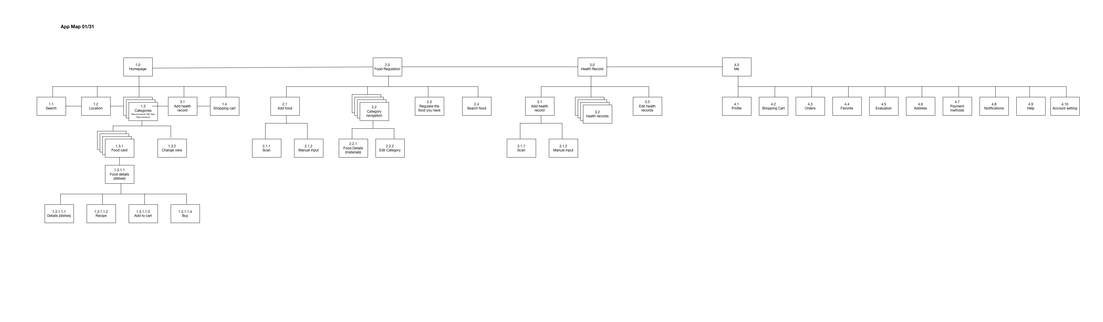
App Map
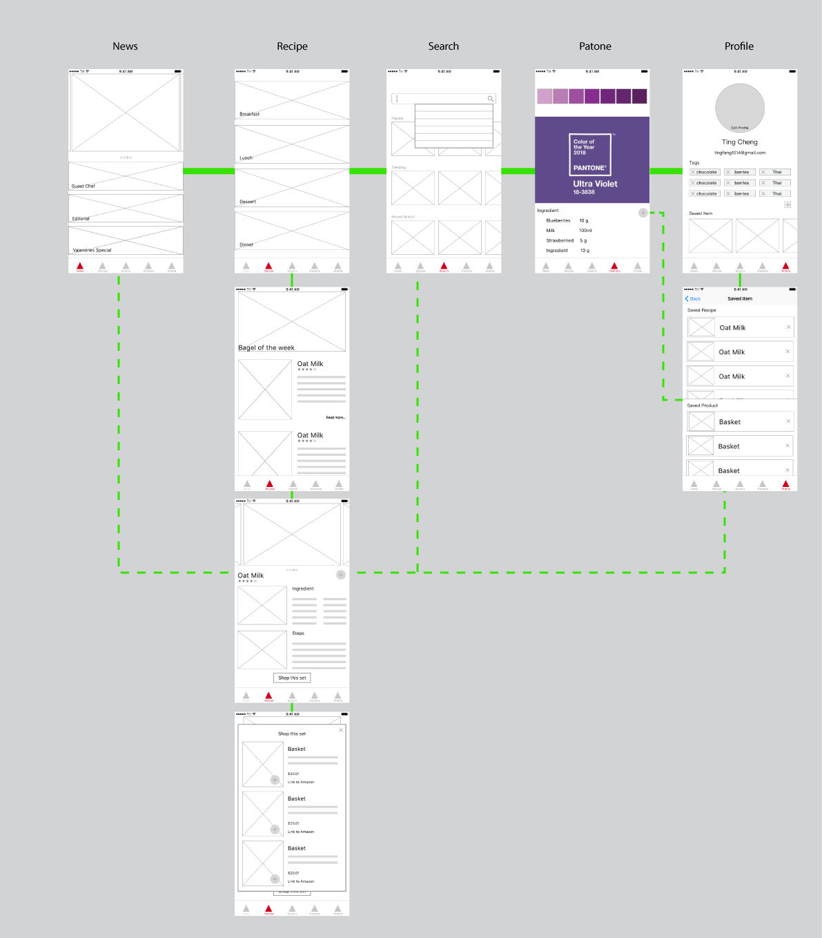
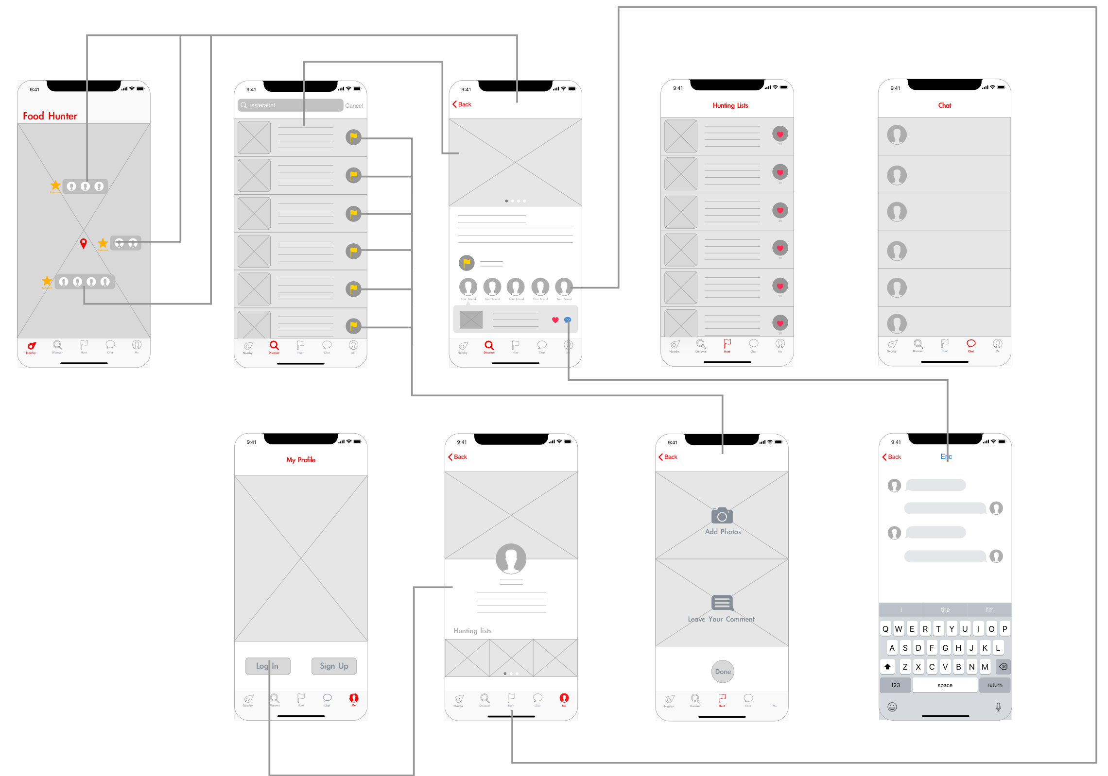
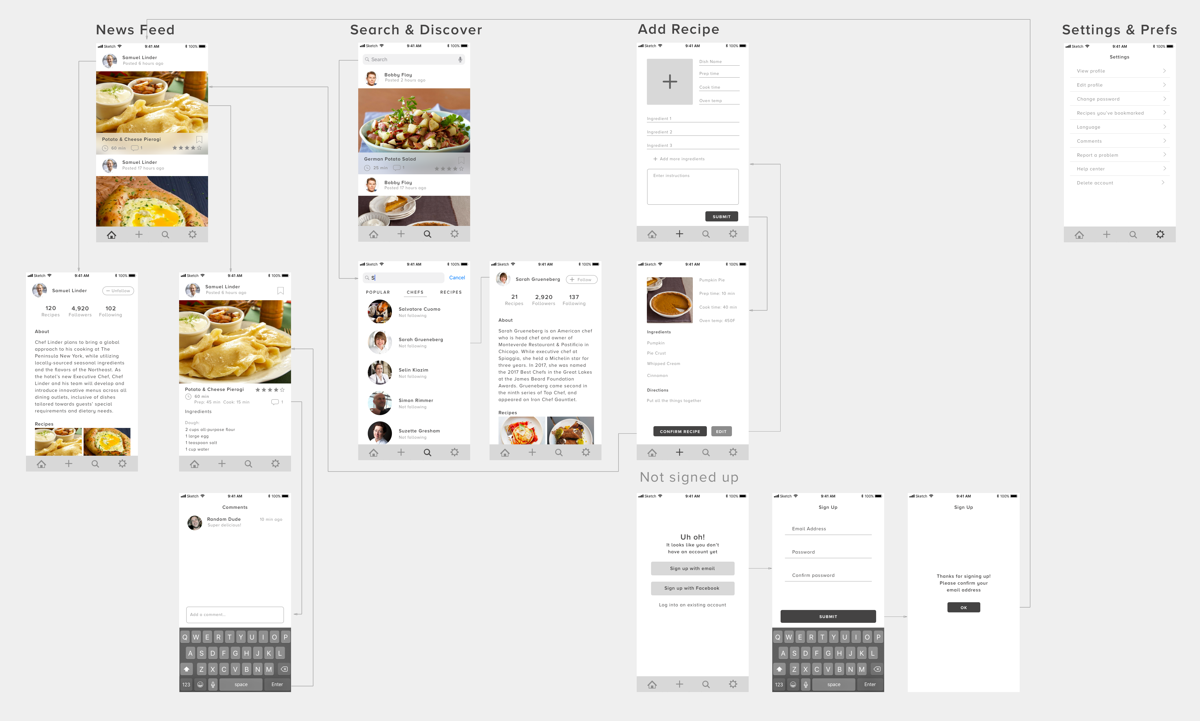
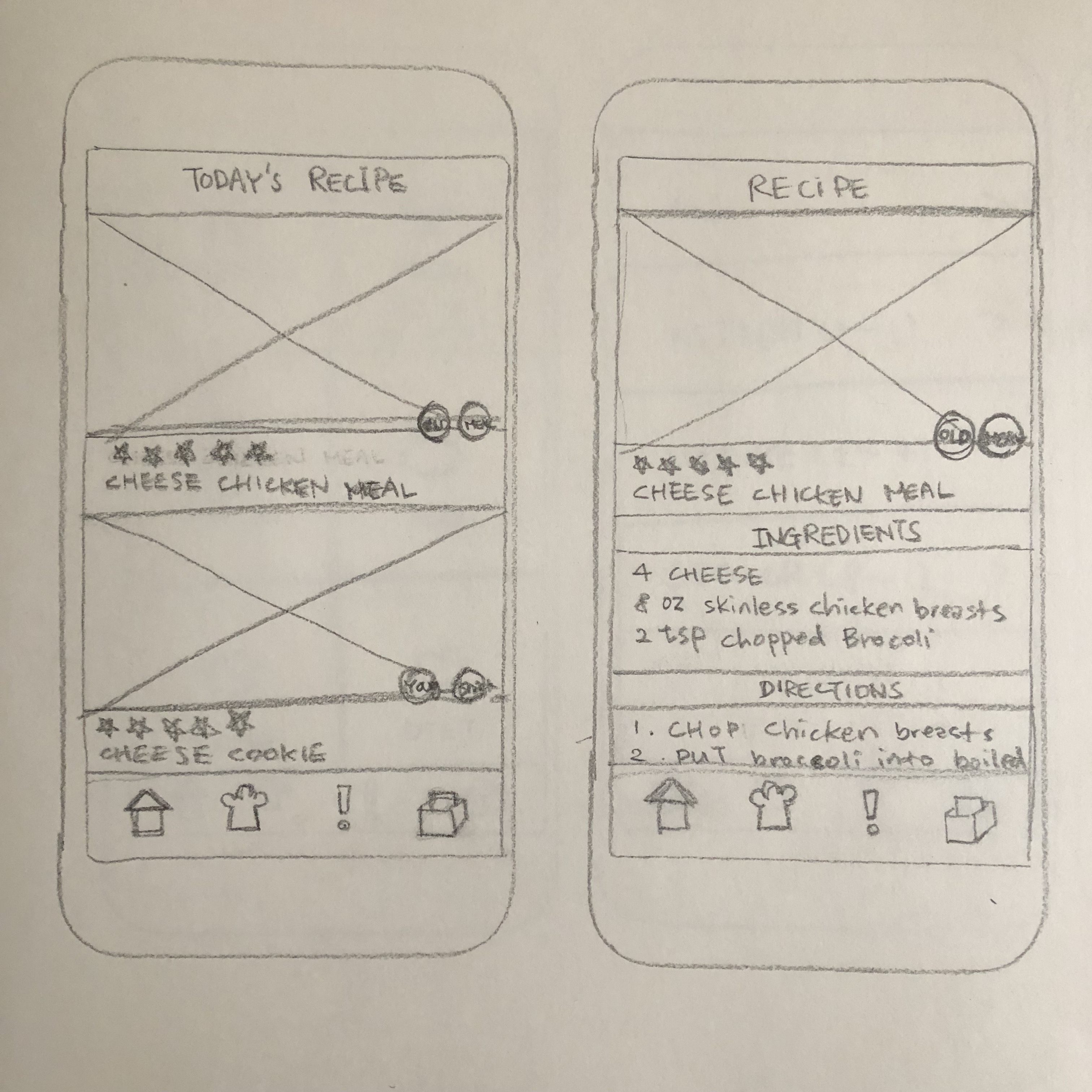
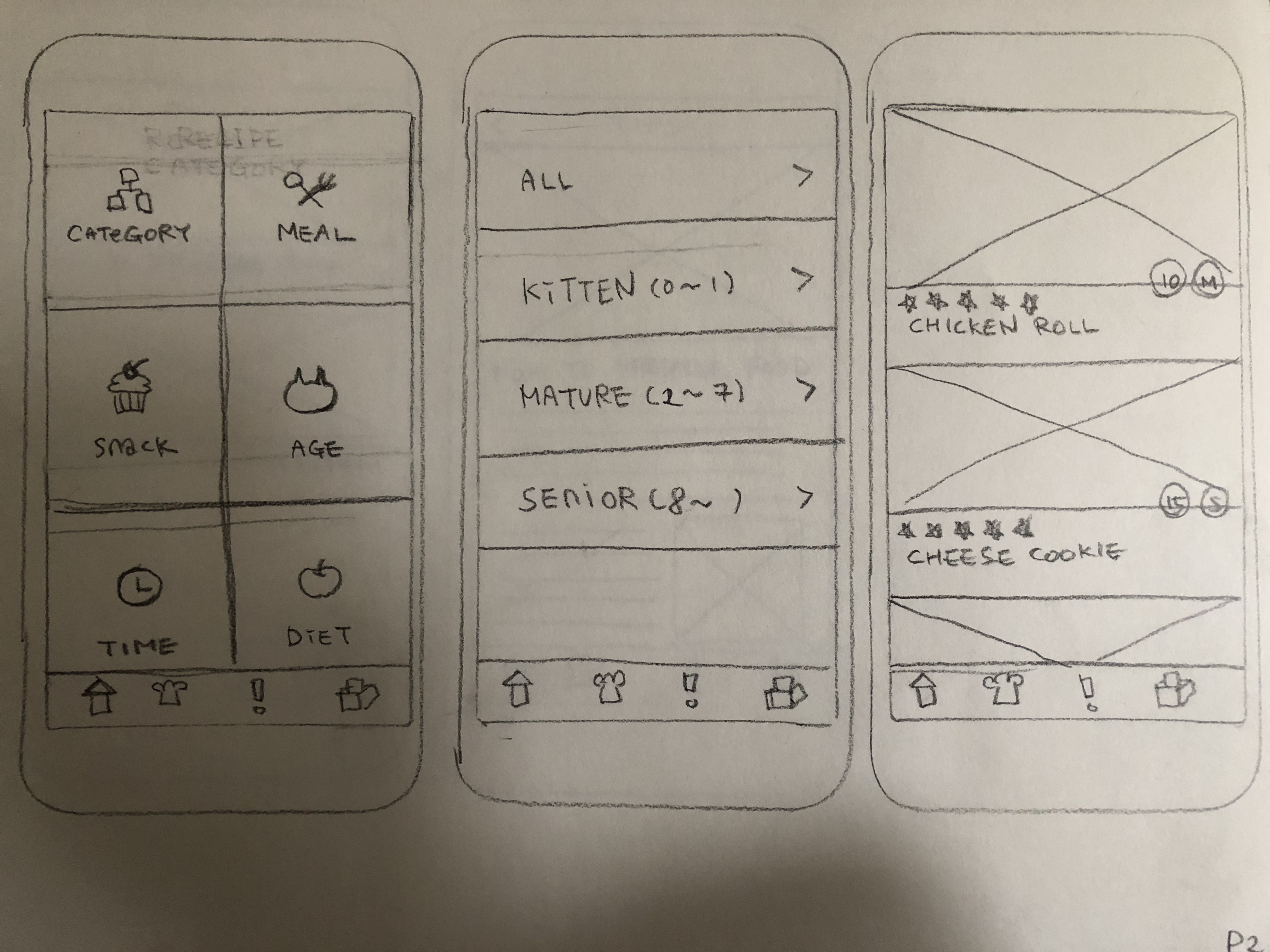
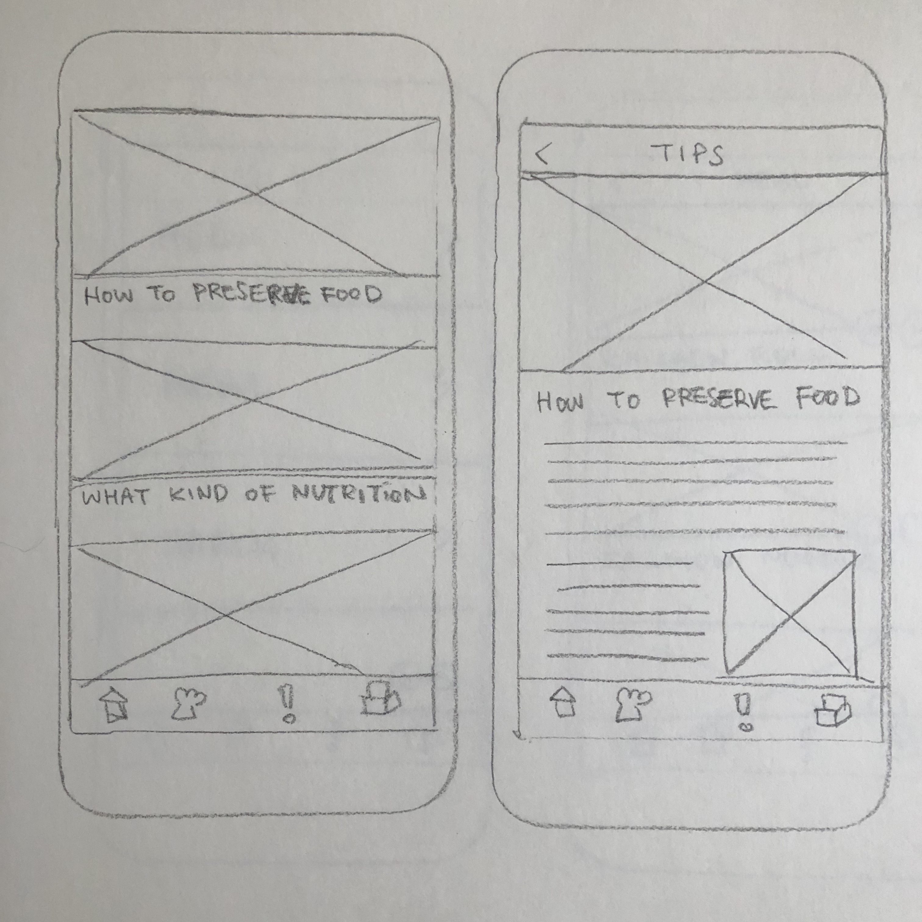
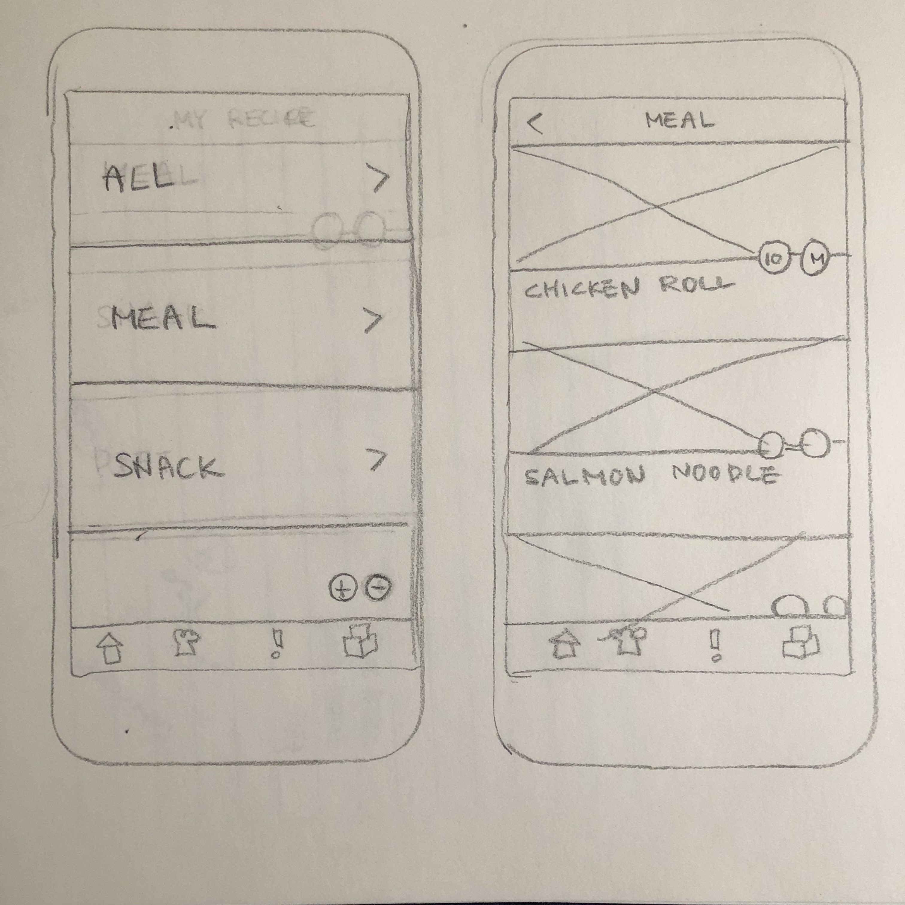
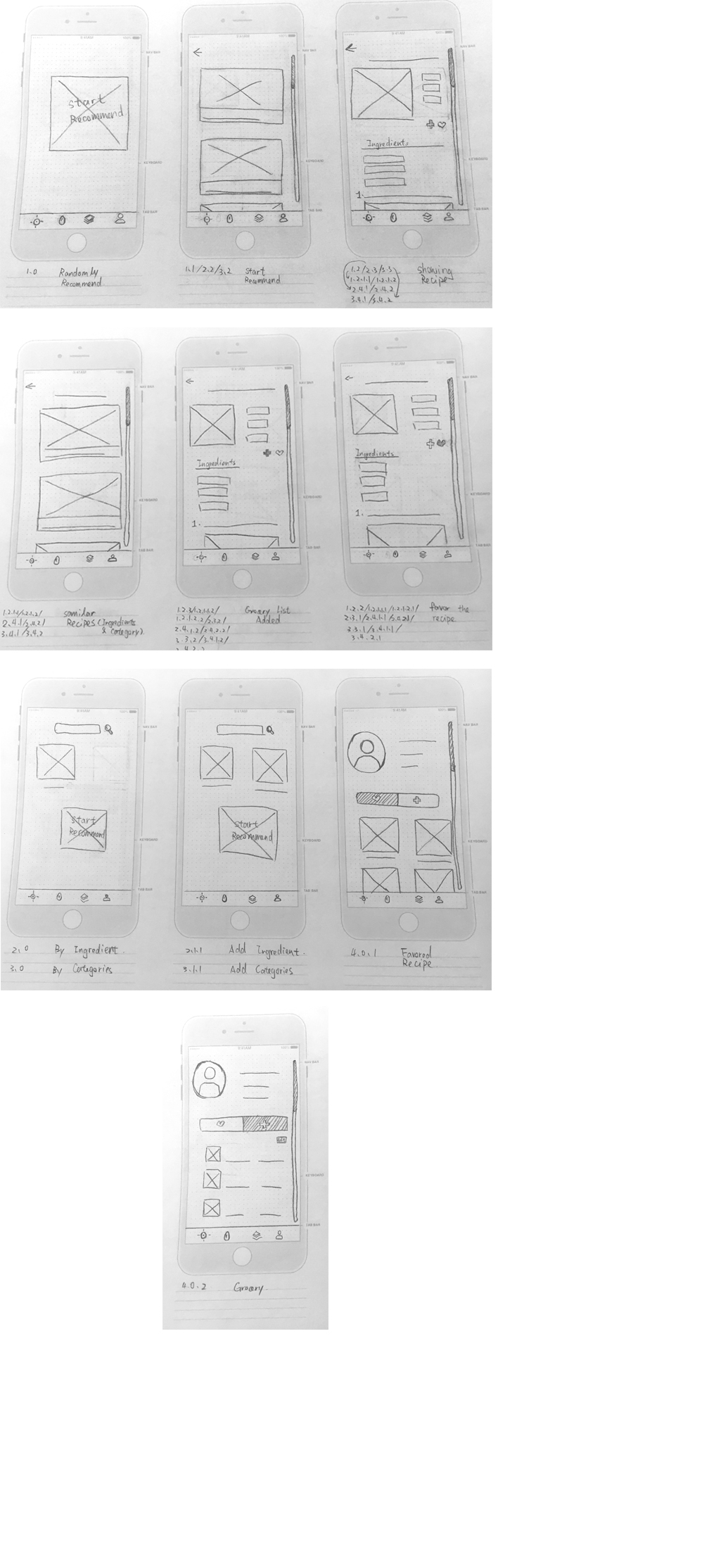
Wireframe