1.Initial wireframe – Food manager 1.0

屏幕快照 2014-02-12 21.56.58屏幕快照 2014-02-12 21.57.11屏幕快照 2014-02-19 21.56.26 屏幕快照 2014-02-19 21.56.49 屏幕快照 2014-02-19 21.57.07 屏幕快照 2014-02-19 21.57.18 屏幕快照 2014-02-19 21.57.30 屏幕快照 2014-02-19 21.57.43 屏幕快照 2014-02-19 21.57.59 屏幕快照 2014-02-19 21.59.52

If you buy vegetables in the market, you need to swipe your bank card, at the same time, this app can scan the barcode from list, and save the information in this app. Because you can’t always remember what’s missing from your fridge. So this app can help you to know that what kinds of food you need to buy and your have bought something. And also this app can remind that what kinds of food that you can’t eat  together.

Of course, if you had eaten some things, you can delete the balance in your free time, and also you can through Siri or click to increase and decrease your new foods.

App Idea & HIG

For the food assignment I want to create an application that allows users to flip pancakes. A timer would count down letting the user know how long to cook each side of the pancake, they would need to flip the pancakes by flipping their wrist that’s holding the phone, which will be detected through the phones accelerometer. If the user were to burn the pancake they would loose. When each pancake is completely cooked they would slide it off the pan by shaking the phone, and would then pour a new pancake on the pan by using their finger to draw on the batter. They would then repeat this process. The more pancakes they cook, the hotter the pan becomes and the faster they have to flip the pancakes before they become burnt.


Reading HIG was useful and brought up a lot of things that I never noticed before, like the fact that iOS applications never display a close or quit option. I suppose it was always just second nature but reading the text allowed me to think more intently about the interactions I am designing for the users. When reading HIG one of the things that stood out to me was to avoid a splash screen when creating an application. In designing applications I always questioned if it would be a nice way to introduce a person to your application or if it was superfluous. It makes sense to avoid the screen in order to allow users to get to an application as fast as possible without being hindered by seeing another image, but previously I thought of it as a branding opportunity to show the users your logo once again.

However, this ties in with another thing I read in HIG and that was to resist showing your logo on screen, because the screens are small and you don’t want to take any of the real estate away from the interaction. This makes sense when you acknowledge that the users know what app they are in, because they tapped the icon to open it, and similarly they wont need to see the splash screen because they are aware of which app they are clicking when they tap the icon. It also suggests that if we do use a splash screen it should be very similar to the first view we see in the application so the user has the feeling that the application runs quickly.

Another good tip is to delay a login requirement as long as possible, often times users are deterred from applications that require them to log-in so if we prompt them with a log-in in the beginning they may never give the application a chance. It is better to allow majority of the users access to using the parts of the application that do not require a log in, and then prompt them with an area to log in once they need to.

[thursdayplays] Musyc by fingerlab

Musyc is a fun and innovative music application where touch turns into music.”

– It’s one of those apps which you don’t know what it really does but it’s cool so you end up spend hours playing with it – It’s fun to play with and beautiful to look at. There are several geometric shaped elements and line, these play as instruments. Each shape generates different sound and has its own movement – you move/ scale/ spin/ drop/ drag/ bounce them etc and each move will gives make different sound depending on movement – visual and audio is closely related and thousands of possibilities to make new music. Adjust setting to make your own instrument set.

image


image

image

IDEAS for FOOD APP

1. Minimal food

USER:

people who want to live a healthy life

WHY:

In these days, people eat too much and people tend to eat even they are not hungry.

From the research, “One day one meal” keeps people healthier than 3 times a meal which contains too much nutrition. According to research, Being hungry makes people healthy.

In the Asia countries, this “One day one meal” is famous and many people are doing this.

So, people will care more about what they eat with enough nutrition.

Research:

https://www.sunmark.co.jp/eng/04/04/h-and-b_17.html

(http://news.ameba.jp/20131228-150/

HOW:

1. users choose a day during 7days and help them to eat one meal per day.

2. let user to eat a healthy meal carefully.

3. by experiencing hunger, people could involve a campaign of donation to the children in developing countries.

EFFECT:

Advertisement of Donation + Healthy Meal


2. Food Universe

USER:

people who love food and imagination

CATEGORY:

ENTERTAINMENT

WHY:

bring user’s imagination to make a food universe.

HOW:

“What does alien eat?” -Make a food universe

With user’s favorite food, draw something more and add it in virtual universe.

Beside, planets like sun, moon, mars, or milky way user can create planets and aliens for their favorite food.

#thursdayplays: Triposo World Travel Guide

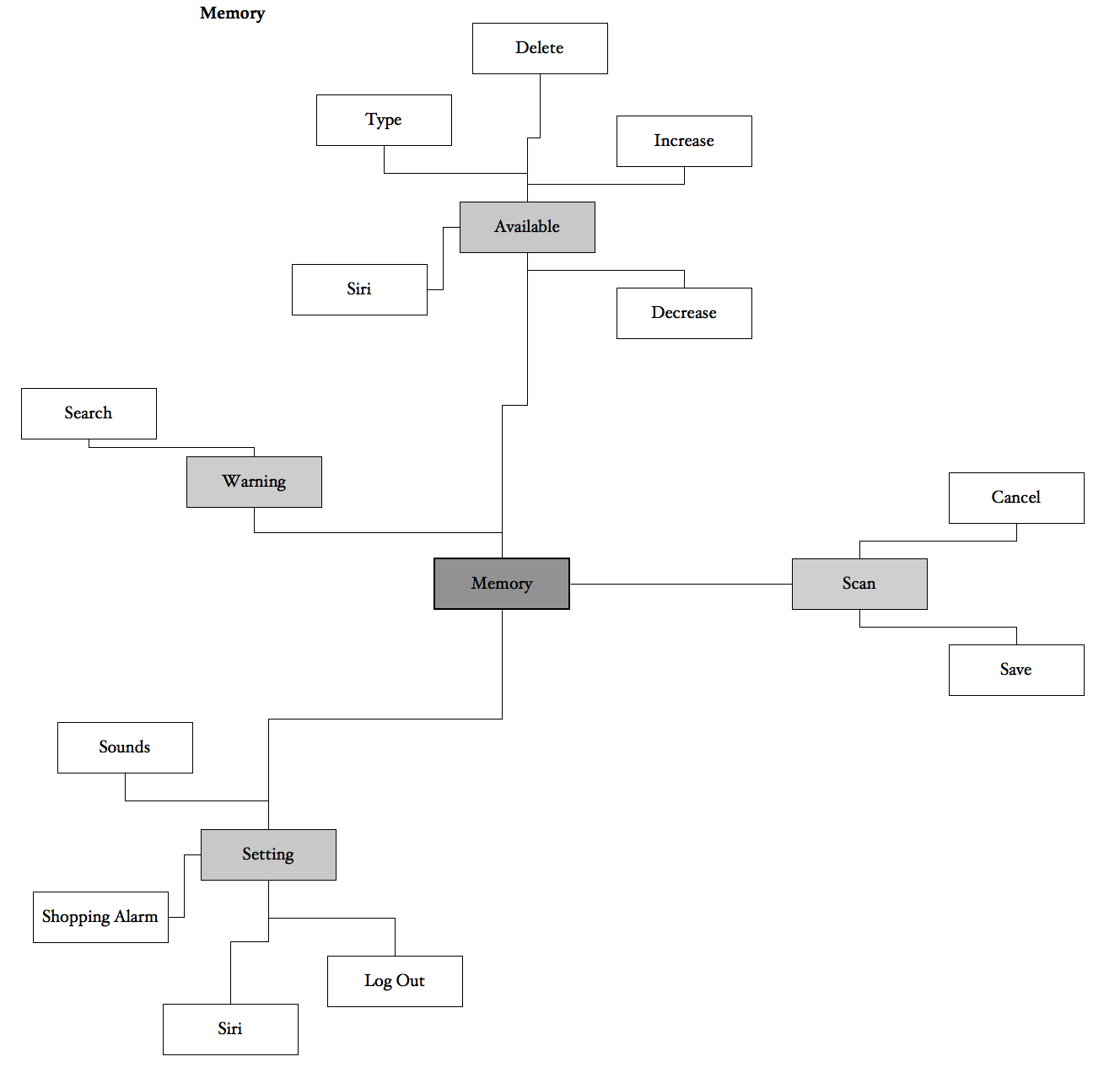
As the name of the app suggests, this is a travel guide app, and a very very useful one! I just discovered it today and wanted to share it with everyone.

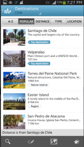
Triposo World Travel Guide is available for both Android and iOS, and it has information packages for a whole list of countries all around the world. You can download those individual country packages on your phone so that you can view them offline. (The size is fairly large, but this is still useful since you may or may not have internet connection while traveling.) I downloaded Chile for example here.

Screen Shot 2014-02-10 at 7.31.22 PM  Screen Shot 2014-02-10 at 8.03.24 PM

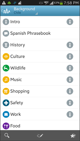
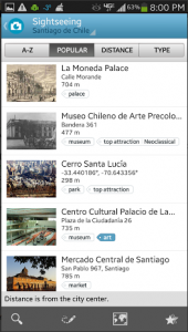
What I really like about this app among all the other travel guide apps is how it presents information. The layout is very clean and simple, which makes navigation super easy. The app offers background information about the country, such as its history, culture, safety tips, etc. Plus it has a useful phrase book for non-English-speaking countries.

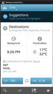
My most favorite part is the exchange rate calculator, like you can see on the bottom of this screenshot. I’m sure this exchange rate calculator would come in extremely handy if I were traveling abroad.

Screen Shot 2014-02-10 at 7.31.32 PM

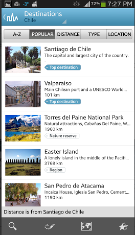
Similar to this app, TripAdvisor City Guide also works offline, and it has a lot of useful information for travelers. In fact, I feel like TripAdvisor might have more information than Triposo. But personally, I like Triposo better, because I have trouble navigating through the lists and blocks of texts in TripAdvisor. Triposo lists out information as well, but oftentimes it is accompanied by pictures, which I prefer. The tag-like system in Triposo also helps me learn more at a glance.

Screen Shot 2014-02-10 at 7.31.42 PM  Screen Shot 2014-02-10 at 8.02.59 PM

One thing that Triposo lacks compared to TripAdvisor City Guide is the rating/ranking system for restaurants and other tourist destinations. It does have some sort of ranking system but I’m not sure where it’s getting that information from. The ratings and rankings in TripAdvisor are super helpful, so it would be nice if Triposo could somehow bring in those features (but without cluttering the layout).

Overall, Triposo seems like a well-designed app that offers useful information for a lot of different cities and countries around the world. I really want to travel now so that I can use this app!