Week 2 Jason Chen

User insights I learned from paper prototyping

  1. Why does “search” deserve a tab? Can it hide inside of the News tab
  2. There is no Cart.
  3. Why not just show everything in shop, then apply filter.
  4. There is no star button in the recipe.
  5. There is no buy button in the recipe.
  6. There is no price in product detail.
  7. This app doesn’t need profile picture.
  8. It is not necessarily to create an account.
  9. Blenders is less likely to be purchased than those ingredients.

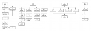
App Map 2.0

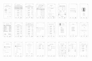
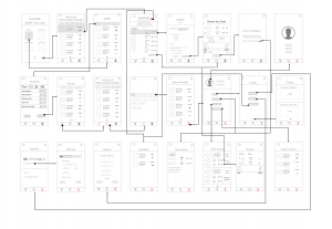
Wireframe 2.0

WK2_Yin Hu

Insights from paper prototyping

The whole app:
Too many functions are mixed, which causes this app complicated.
Home:
1. Give the “Home” tab a name which is related to the content of the tab rather than using “Home”.
2. “Adding to cart” function seems to have the logical problem.
Food Regulation:
The name of “Food regulation” seems to confuse the user, which means that the user won’t think the food shown in this tab is the food the user has at home.
Health Record:
1. How would you get the health data? Could it link to Health app to get part of the data?
2. The layout of this tab is confusing.

App Map 2.0

Wireframe 2.0

Week 2 Haemin

User Insights from the first user test


Sign for the last page of a recipe.
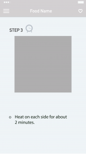
Users were confused about the last page of the recipe because on the step3 page; there was no clue to figure out the page is the final step. Also, users wanted to go back to the main page where they chose a recipe for the first time from the last step of a recipe. But they had to take two steps to go back; which was tapping on a menu and then home button.


Timer function.
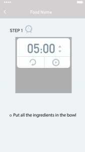
Nobody recognized the timer icon. Users said icon does not look like clickable. The timer is needed when people boil while cooking, but once they click the timer, it should be minimized, so it does not cover recipe photos. Users no need to set the time themselves because based on the recipe, a timer can set it automatically for them.


Navigation.
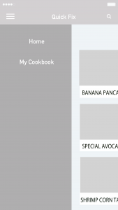
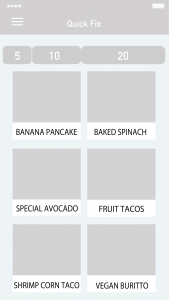
Basically, there is a menu bar on the left to navigate, but has two buttons, which are ‘home’ and ‘my cookbook.’ Users said there is too much blank for the menu navigation, so they suggested me to put those two buttons underneath of the whole interface. Another navigation bar is choosing a recipe based on time. There are three options 5, 10, and 20 minutes. Users said split into three times seemed restricted. Many recipes cannot fit into those three options and suggested me to think about how to make this filter flexible.


Based on the feedback, I iterated the prototype.

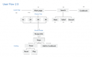
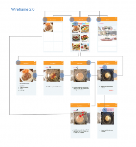
Below are the second user flow and wireframe.

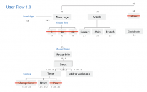
<First user flow>

<Second user flow>

<Second wireframe>

wk02 Stella

User insights I learned from paper prototyping

  1. PLAN:
    1. It may be unnecessary to set up the number of family members because the family plan has already existed.
    2. Users couldn’t search within the plan to check which recipes are in the plan before they confirm to buy it.
    3. It is hard to know how many recipes are selected in the selection page.
    4. tags may help users to make decisions among the recipes.
  2. CURRENT
    1. The processing circle is distractive.
    2. Both horizontal and vertical layout are not that effective.
    3. Ranking feature may be set after users finish cooking.
  3. NOTICE
    1. alert rather than notice?
    2. Delivery tracking is necessary.
  4. ME
    1. Why users need to connect to their facebook account?

Evaluation from the critique

  1. PLAN:
    1. The coexistence of horizontally swiping and vertically scrolling is unclear and confusing.
    2. Users need more obvious trigger to notice that the page could be scrolled down.
    3. Price button may get users give up buying the plan.
    4. users couldn’t preview the details of those recipes.
  2. CURRENT:
    1. The processing circle may be not that necessary.
    2. What if users skip one of the day (for example, hang out for the dinner)?
    3. The most important feature on this view should be how to check the recipe that day.
  3. SEARCH:
    1. Where do users need to search for something? The position of searching is vital.

App Map V2.0

Wireframe V2.0

Week 2_Qinwen

3 User Insights

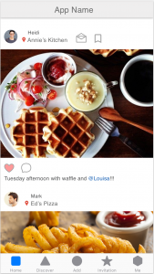
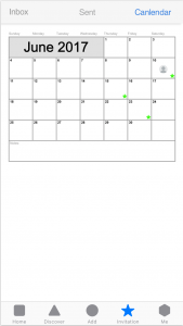
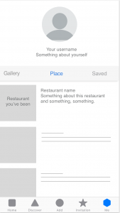
  1. User expected something happens after tapping the image and want to view more about the restaurant, such the map, distance, rating and etc..

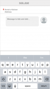
  2. Add function “start a plan” (same with facebook messenger) that can add plans to calendar directly when the user invites a friend in the dialogue box.
             
  3. User wants to see who they went to the places together rather than the posts from others about this restaurant.


Qinwen_Week 1

About Me

I’m Qinwen Xing. My background is graphic design. Most of my previous work are focused on branding, book design, and packaging.

3 things I don’t know from the Apple HIG

  1. Apple changed their system fonts to a new typeface “San Francisco” since ios 9.
  2. 3D touch gives the user more possibility to interact with contents, such as peek and pop allows the user to preview photos, links, page and etc. It’s important that the peek view is designed big enough so that fingers don’t obscure its content.
  3. Make animations optional. When the option to reduce motion is enabled in accessibility preferences, the app should minimize or eliminate application animations.

App Map 

App Wireframe

App Wireframe


Week 2 – Franky Wang

User insights from paper prototyping on Feb 1st

1 – The order of functions after logging in the APP

The APP is originally designed to immediately enter the page of capturing dish photo after logging in. Some users think it’s kind of inconsiderable for a dish recommendation APP to start camera function at the very beginning (Usually filter application does). It might be more reasonable to enter the “Expo” page, where dish photos are displayed when users first enter the APP. Then they could decide whether touching the camera button to upload photos, or just having a random glance.


Currently, the camera is designed as the index page, which might be better if replaced by the photo display page.


2 – Imprecision of categorizing in filter descriptions

In the filter page where users select choices to screen out their favorite kinds of dishes, the users gave feedback that the descriptions are not precise, which causes misunderstanding.
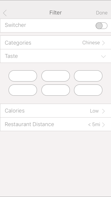
For example, the description “categories” is easily interpreted as terms like “breakfast”, “dessert”, “drink”… On the other hand, if the dish is categorized by cultures and countries, it would be better to use the word “Nationality”. And the description of calories is also not reasonable to simply use the term “high” or “low” without the specific number of the range. These are detailed problems but still worth considering.


3 – The unreasonable settings of “All Posts”
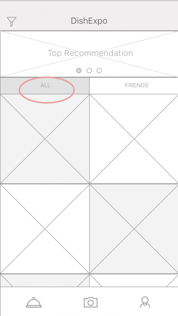

In the “Expo” page (currently defined as the index page), I created a segmented bar and separated the posts into the “all” tab, which includes all the current users’ photo upload, and the “friends” tab, which only shows the photos of connected users. However, there would be a huge amount of information refresh for displaying posts from millions of online users, which would definitely cause a mass flow and challenge the capability of the backend system. Also, users do not tend to see the photos which have little connections to them.

It might be better if the first tab is displayed based on location, showing the users the photos from nearby restaurants. The location-based recommendation could be more practical and build up the solid connections between users and information in this case.
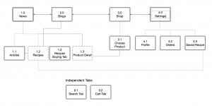
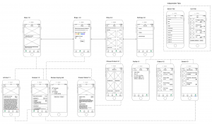
Wireframe 2.0

APP Map 2.0

Week2- Kelsey (Yue Yu)

  • Note 2-3 user insights that you learned from paper prototyping

1:country selections and calendar is too small

2: The saved menu should exchange the position with current menu.The Current menu is important and it’s should in the tab-bar.

3: Add a remind interface to ask people if they want to generate a new plan and covered the original one during a week.


Week2 wireframe