iOS Human Interface Guideline

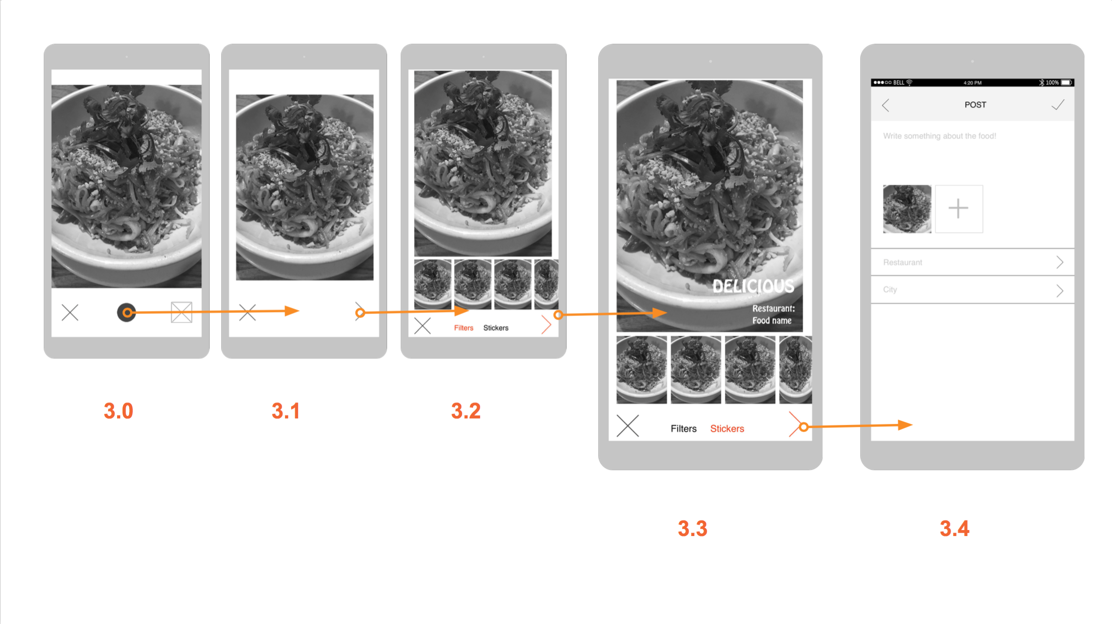
1. Ensure legibility by using the system fonts

When designing an app, I thought it is ok to use any font as long as it is legible. I did not take into consideration that this font should actually be legible at any size. System fonts are made to fit this criteria. Other fonts however might be well adjusted at one size but then issues such as kerning might interrupt legibility when the size changes.

2. Be straightforward if your app runs in only one orientation

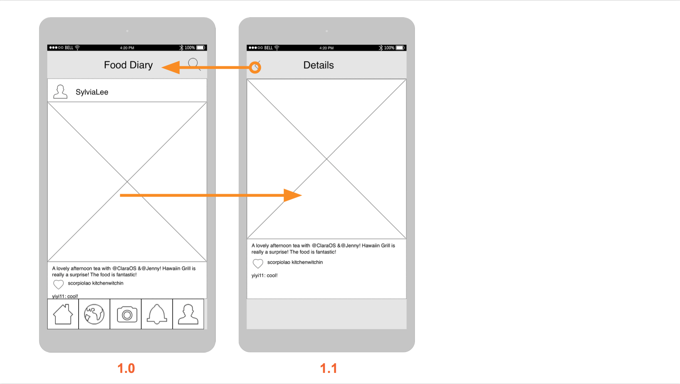
In my first wireframe I only considered the application to be running only in a portrait format. Now I am rethinking about the possibility of having it in landscape as well and how that would look like.


3. Make it easy to focus on the main task by elevating important content or functionality

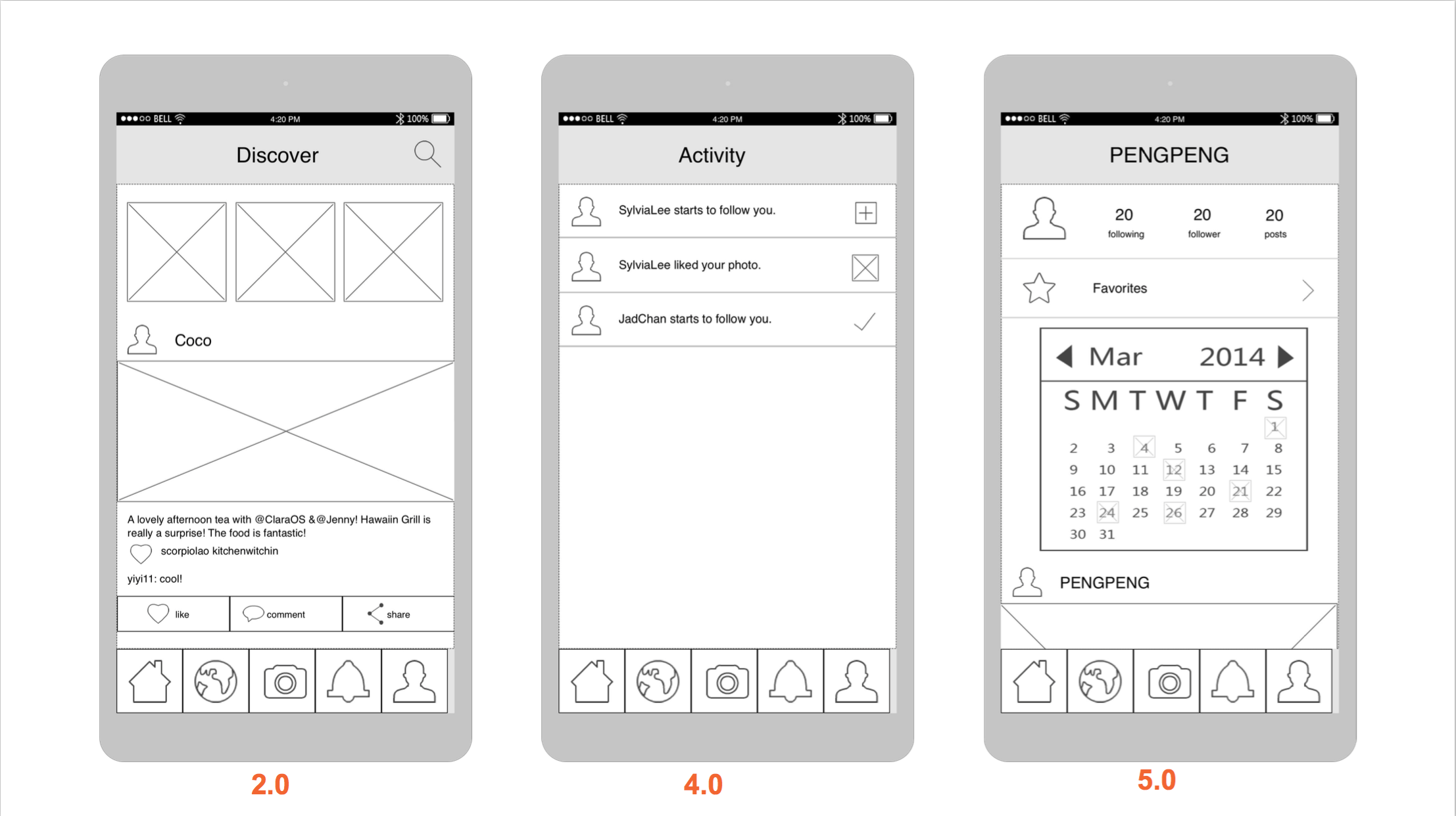
It made sense to me before that naturally more important tasks would be more towards the top of the screen. However, I had no idea that there is a huge difference between the upper right corner and the lower corner versus only the upper and lower sections.

4. Make it east for people to interact with content and controls by giving each interactive element ample spacing

I was well aware of this logic but it’s very convenient to see that the hit target is 44 x 44 points

5. Focus on the needs of 80 percent of your users

As a communication designer my logic was to try to cater to everyone’s needs. However, this can be very problematic because sometimes the more specific tasks or information can overcrowd the page. Although this is a user centered design, it is interesting to see that if certain functionalities might not be wanted by most users, it can be left out. Another option would be is that it can be hidden and can pop out or expand if it’s wanted.

Tengami #thursdayplays


Tengami is a very elegant puzzle game with a beautiful Japanese style. The whole scene is a crafted pop-up book. You need to solve puzzles to move on, and during the process, you can experience stories and mystery.

Every screenshots is as beautiful as a painting!

Well, maybe some puzzles are a little too difficult and I need to find solutions online. But over all, it is a perfect experience!

Project 1: Food Story

Food Story_wireframes_MobileMedia

010203040506070809


10

Pengpeng Yu


Thank you guys for the feedback, this is an update for the user insights learning from the paper prototype.

  1. The name of the tab is very important. And so it the icon. Testing with users, I found out that some of them can not fully understand all these icons. So I will add text under it.
  2. Though I want to link the restaurant info onto the story, it is not shown in this prototype. The content and the format are both needed to consider about.
  3. It is important to use the correct icon in the paper prototype. I used a circle to represent the icon of taking photos, which made the user confused.
  4. Users are confused about how to add the story into their favorites. And talking with them, I found out the share button is relatively useless in the possible contexts. So I will move it into the detail page.


Teller Prototype 2: New Navigation Organization (App Mapp)/Invision App

Link to Invision App

APPMAP

Next Steps: Currently, I have kept the social aspect simplified. ie there is no following users, just tags, and no comments, just likes for the purpose of keep a list of favorites. This makes the app a jumping off point for sharing to other platforms. Next steps include comments and follows making it a niche instagram. I need to include a notifications tab as well, plus a search filtered by people, tags, and location. I also need to create a mapview for when someone clicks on a location. I would like to make those locations likable as well, in order to keep a list of locations as well. That way, in the “my likes” view I could add a segmented control that shows liked images on one view, then liked locations on the other.

Furu_Appmap Wireframe 2

AppMapWireframes2


Three things I learned from user testing:

1. Tap is the primary action users would conduct instead of swiping. 

2. When user want to change the location, she wanted to tap on the work “Bangkok” directly (instead of going to setting).

3. Compared to the “Turkey” icon, the “plate” icon makes more sense as dishes.

iOS Human Interface Guidelines Notes

Hi guys, sorry for the delay. My laptop died last week and I just got a new one.

Here’s what I learned from iOS Human Interface Guidelines.

1 .Make it easy for people to interact with content and controls by giving each interactive element ample spacing. Give tappable controls a hit target of about 44 x 44 points.

2. As much as possible, avoid displaying a splash screen or other startup experience.

3.Avoid asking people to supply setup information. Instead:

     –  Focus on the needs of 80 percent of your user.

     –  Get as much information as possible from other sources.

     –  If you must ask for setup information, prompt people to enter it within your app.

4 . Delay a login requirement for as long as possible.

5.Think carefully before providing an onboarding experience. (Onboarding introduces an app’s features and explains how to perform common tasks.)Onboarding is not a substitute for good app design.

    -Give users only the information they need to get started.

-Use animation and interactivity to engage users and help them learn by doing.

-Make it easy to dismiss or skip the onboarding experience.

6. Navigation

Broadly speaking, there are three main styles of navigation, each of which is well suited to a specific app structure:  Hierarchical, Flat, Content- or experience-driven.

     -Use a navigation bar to give users an easy way to traverse a hierarchy of data.

     -Use a tab bar to display several peer categories of content or functionality.

Users should always know where they are in your app and how to get to their next destination.Regardless of the navigation style that suits the structure of your app, the most important thing is that a user’s path through the content is logical, predictable, and easy to follow.

Boil Monitor – Wireframe/App map Slides & In-Class User Testing

Here’s my slides of wireframe & app map:

BoilMonitor_wf

For the in-class user test last week, I learned these:

  1. The paper prototype I printed was too small and not the actual size of the phone, this will affect the user test.
  2. My user indicated that when her task is done, there’s no way to return to the beginning and start the next task. (I fixed that at the second iteration)
  3. My user suggested that in the timer settings, I can provide the function for users to save multiple timers as presets, so they can just turn on the desired timer when needing it again next time. (I’m still considering about this point — more user test needed)

Gi – prototype1 (app map & wireframe) food art app

I designed “food art app”(I don’t have a name right now..)

the purpose of the app is to make food art into a hobby, so many people can join the community and make something fun to look at. There are lots of people ordering food and take pictures before they eat, so it looks like a piece of art. So I searched food art app, but there was no specific app that has a tutorial of making a food art. Also, normally people think it’s too hard to make the food into an art. So I want to focus on making a simple food art app that generates ideas to make a simple food art with everyday food materials.

food art app presentation