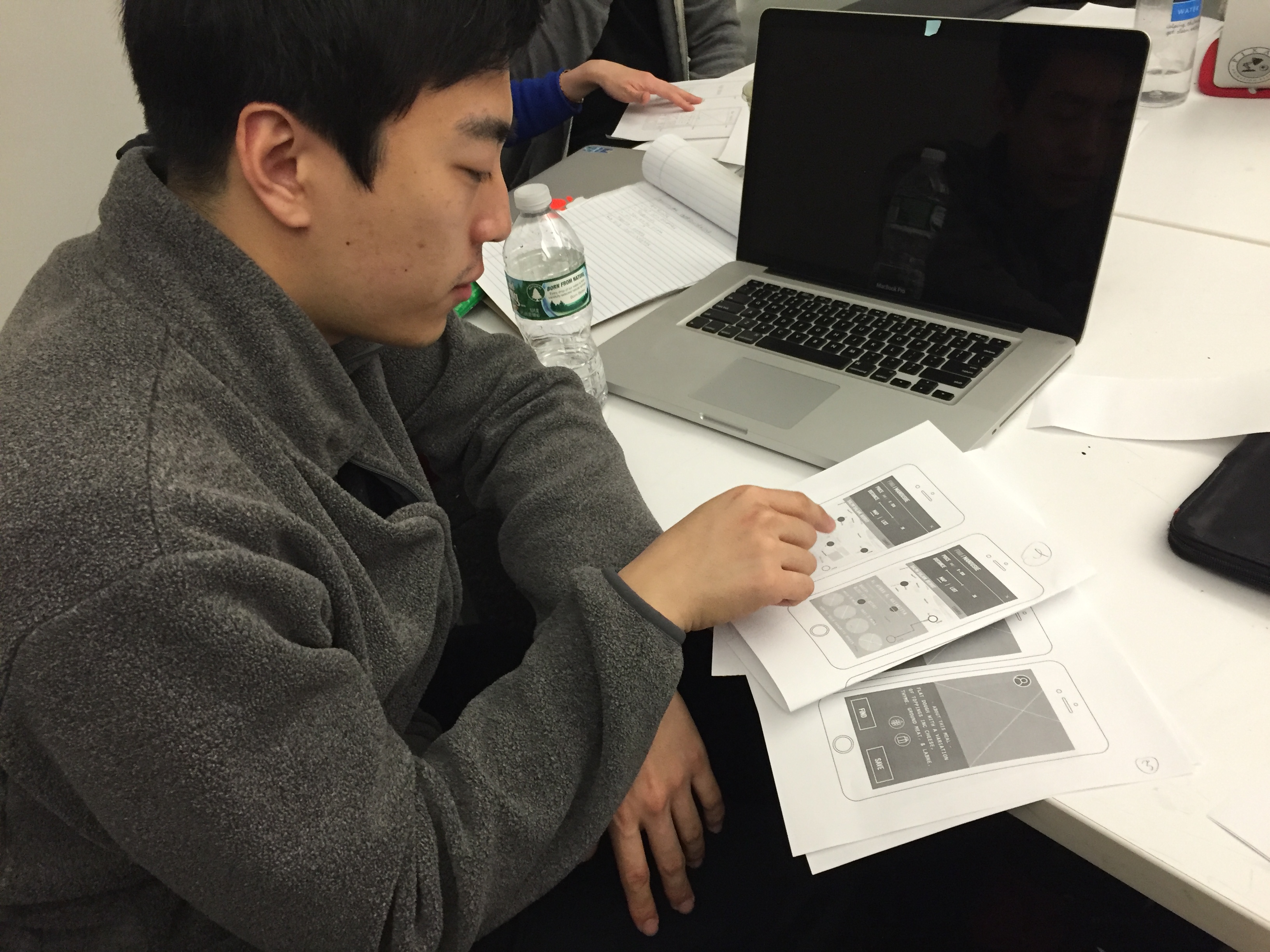
I reviewed one of the interesting app that is named “paper53”, it is a drawing app that has a simple interface.
here’s a pdf
I reviewed one of the interesting app that is named “paper53”, it is a drawing app that has a simple interface.
here’s a pdf

Dubsmash is a mobile app to create short selfie videos dubbed with famous sounds.
I saw this app through some celebrities who have posed some funny videos on the instagram. After sharing the still photos and life videos on those social medias, it seems like people need something new other than the regular life visual contents. So Dubsmash seems like a great cure which can add some flavor in people’s life. Then I downloaded this app to play with it, it’s very easy to follow and play. Also, the funny sound that pre-made behind your video is short, around 5-15 seconds, which is appropriate long for your friends to watch and enjoy. I like this idea very much!
Below are some screenshots from this app.
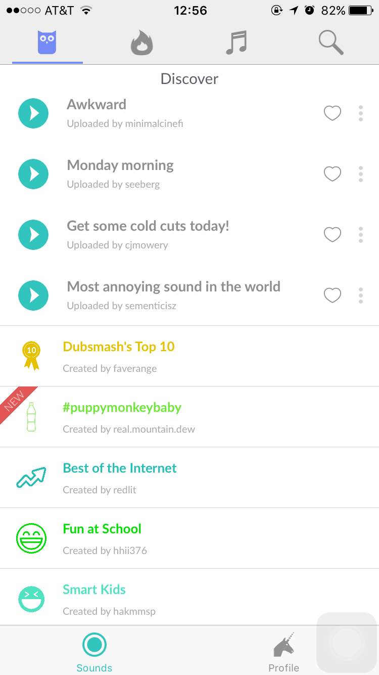
When you open this app, it will start with this page, which is very easy to follow, you don’t need to set up an account at the first page. Also, the “discover” shows the recent very popular sound in the very begin part, which leads the new users to try in the very first time and determine whether they will keep use it or not.
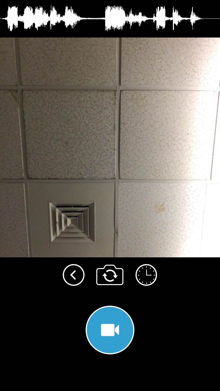
After you select a sound you would like to have, it will automatically jump to the selfie camera mode, and tap the “camera” icon, it will start to record. The whole process won’t take longer than three minutes, which is a very good idea for people who just join this app and play with it and enjoy!
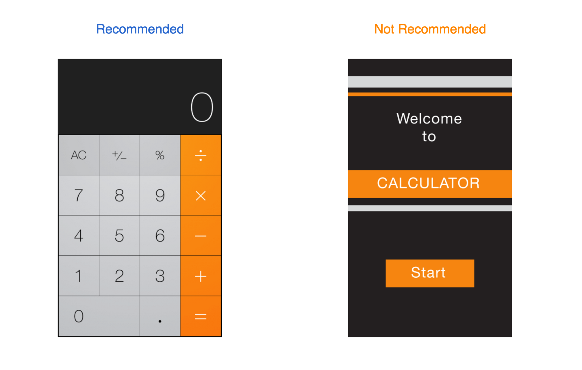
By default, all bar buttons are borderless. In content areas, a borderless button uses context, color, and a call-to-action title to indicate interactivity. And when it makes sense, a content-area button can display a thin border or tinted background that makes it distinctive.

Before, I didn’t there is a default that all bar buttons are borderless. This seems like a new “rule” based on iOS for apple users, because I still remember all the buttons were supposed to be designed like a 3D real button with some shadow, which leads users to think this button is clickable. However, flat design for UI seems like a new trend for designers to follow.
to do this are to place principal items in the upper half of the screen and—in left-to-right cultures—near the left side of the screen:
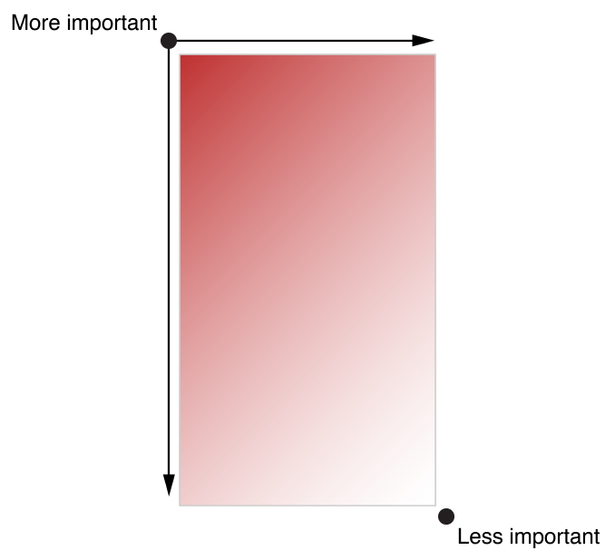 I never know this rule before. I understood why the upper information is more important because people read from top to bottom, but I don’t know why the left side should be placed more important content. Then I guess, because people read from the left side to right side, and most used control bar is placed on the left side as well.
It’s often said that people spend no more than a minute or two evaluating a new app. Don’t tell people to reboot or restart their devices after installing your app. Restarting takes time and can make your app seem unreliable and hard to use.As much as possible, avoid displaying a splash screen or other startup experience. It’s best when users can begin using your app immediately.
I totally agree with this guideline, I never thought about this as a designer before, but I did this all the time as a user. I will delete too complicated app after one minute if I can’t start to use it or play it or ask me to register and log in and …….. I guess maybe there are too many apps in the market right now, which makes users losing their patience and want to have the high efficiency and have a great use of the useful apps.
Participant 1
Profile
Chis Lee // 25 // South Korea // Based in NYC // Graduate Student
User Input
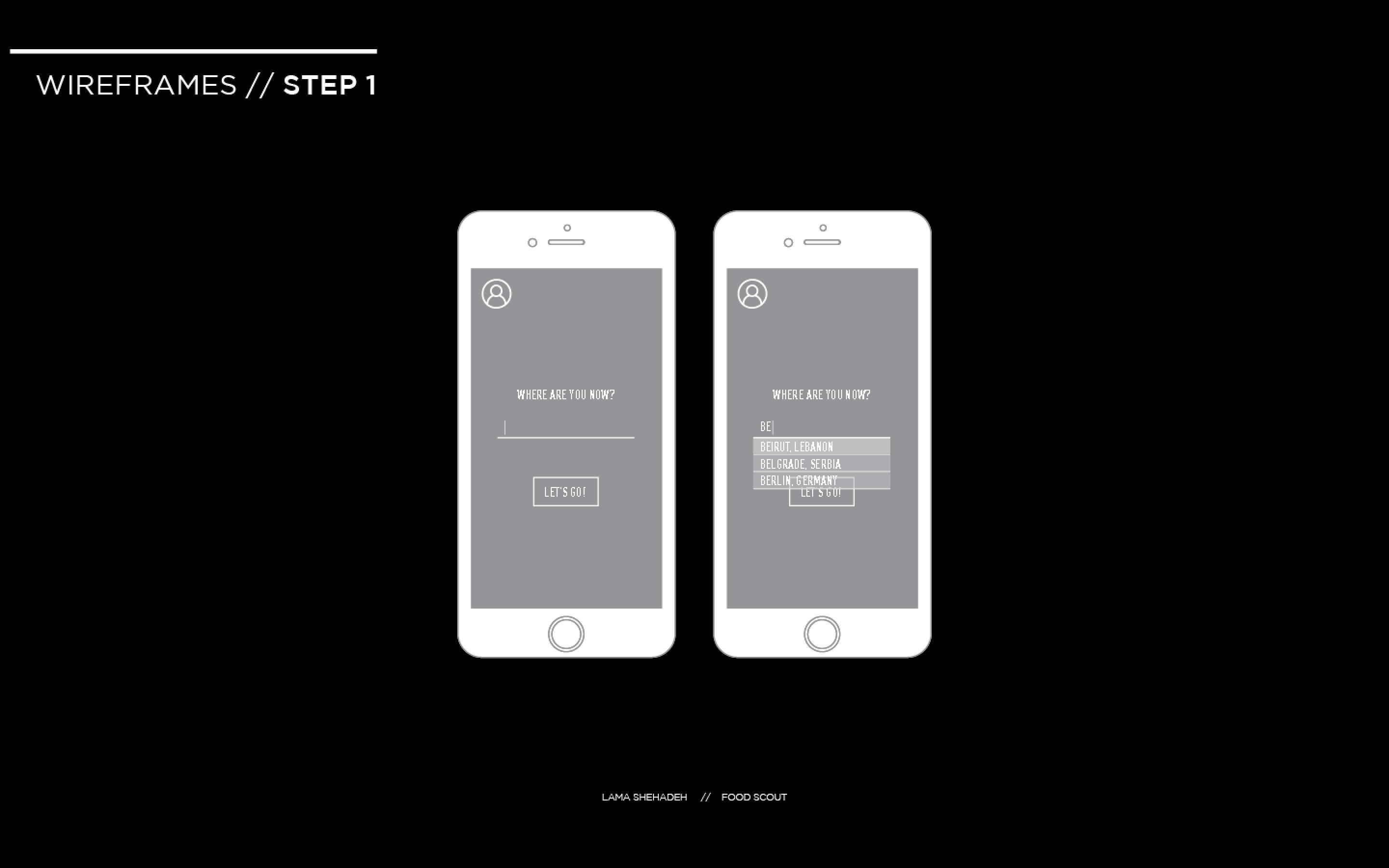
The user found the interaction direct and had no problem figuring out the first step which is to type in the location
The user did not consider interacting with the profile icon. This means that it’s function was not obvious. Supposedly, it should be linked to the user’s profile. But this is the first page, so it should be a sign in page for the first time, and then a personal profile for returning users. I need to think how to make obvious to the user that this is clickable without confusing them whether to press on it or go to the location first.

The direction of swiping was obvious for the user. However, he was looking for a search option that allows him to look up items. I want to keep the items restricted to local iconic food items. Looking through the icons gives room for more exploration by the traveller. I will do a few more user test in order to decide on the addition of the button or not.

The user did not know that there’s a possibility to scroll down on the page. The user opted to go foe find.
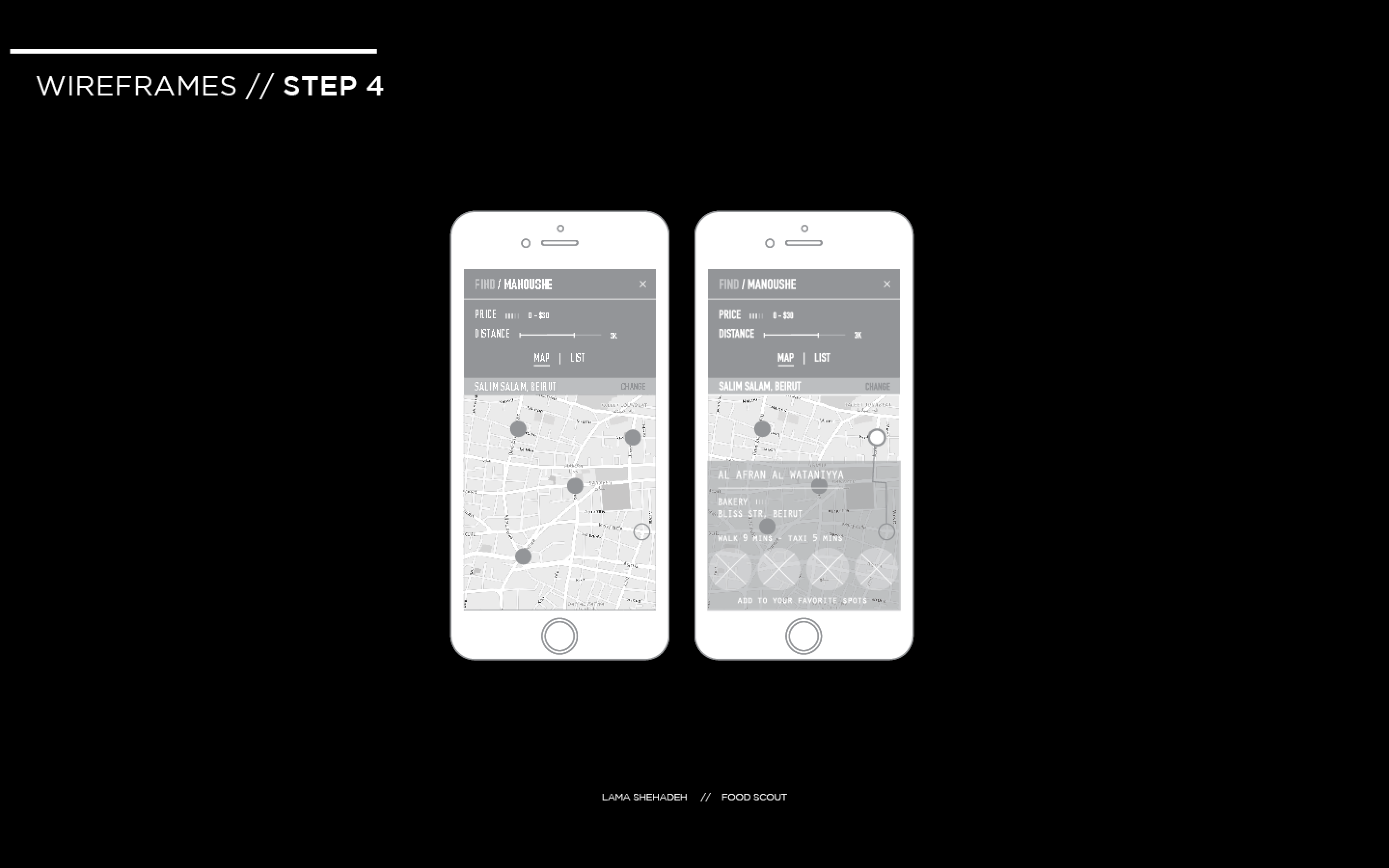
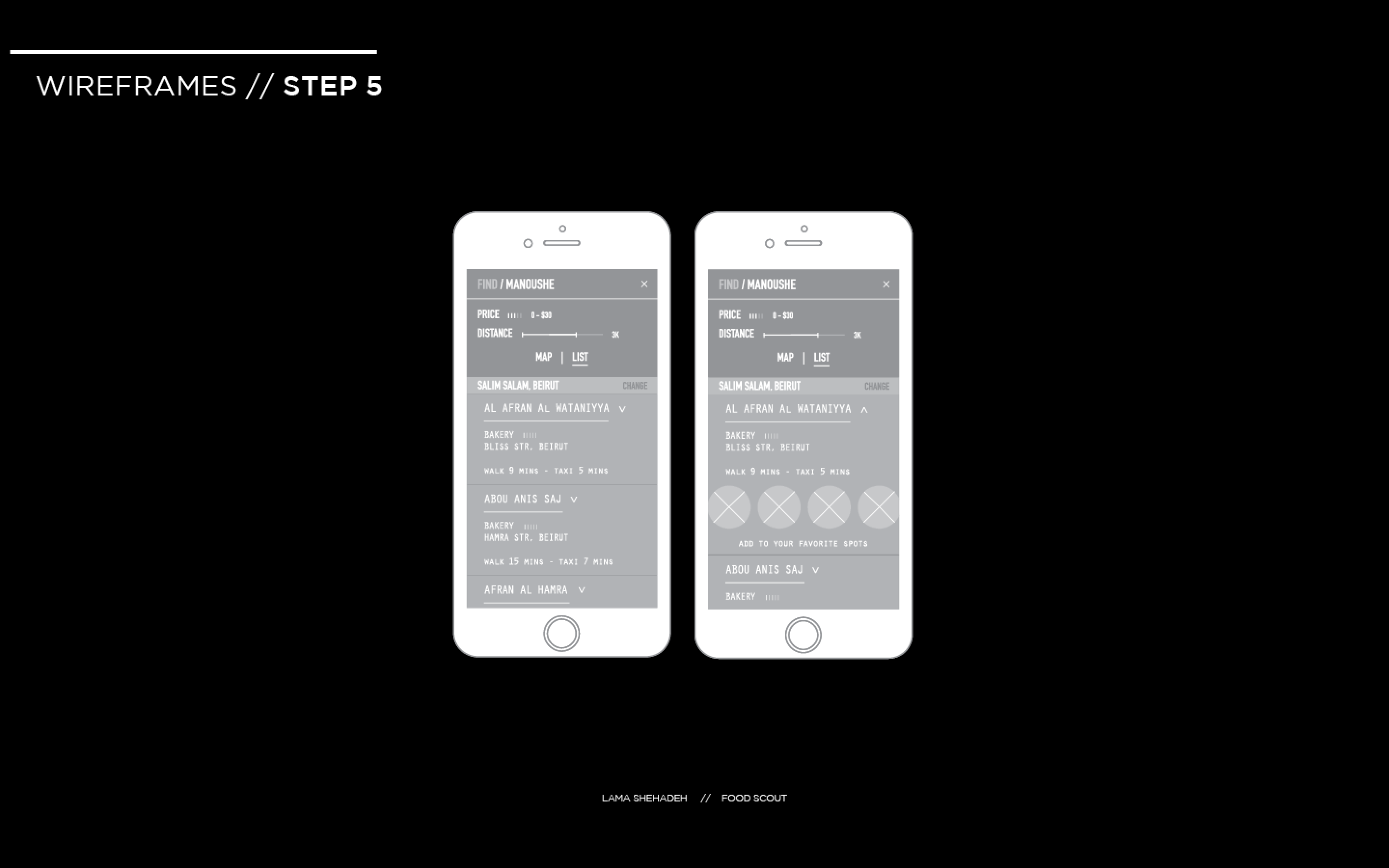
The user was confused by the price indicator and found it too be too small. He was not able to easily tell his location on the map and was confused by the written location as well. The word “change” next to his written location was unclear to the user to what it would be affecting exactly. He was unable to identify “Add to your favorite” spots as a button. The user confused the word “List” to mean the menu list.
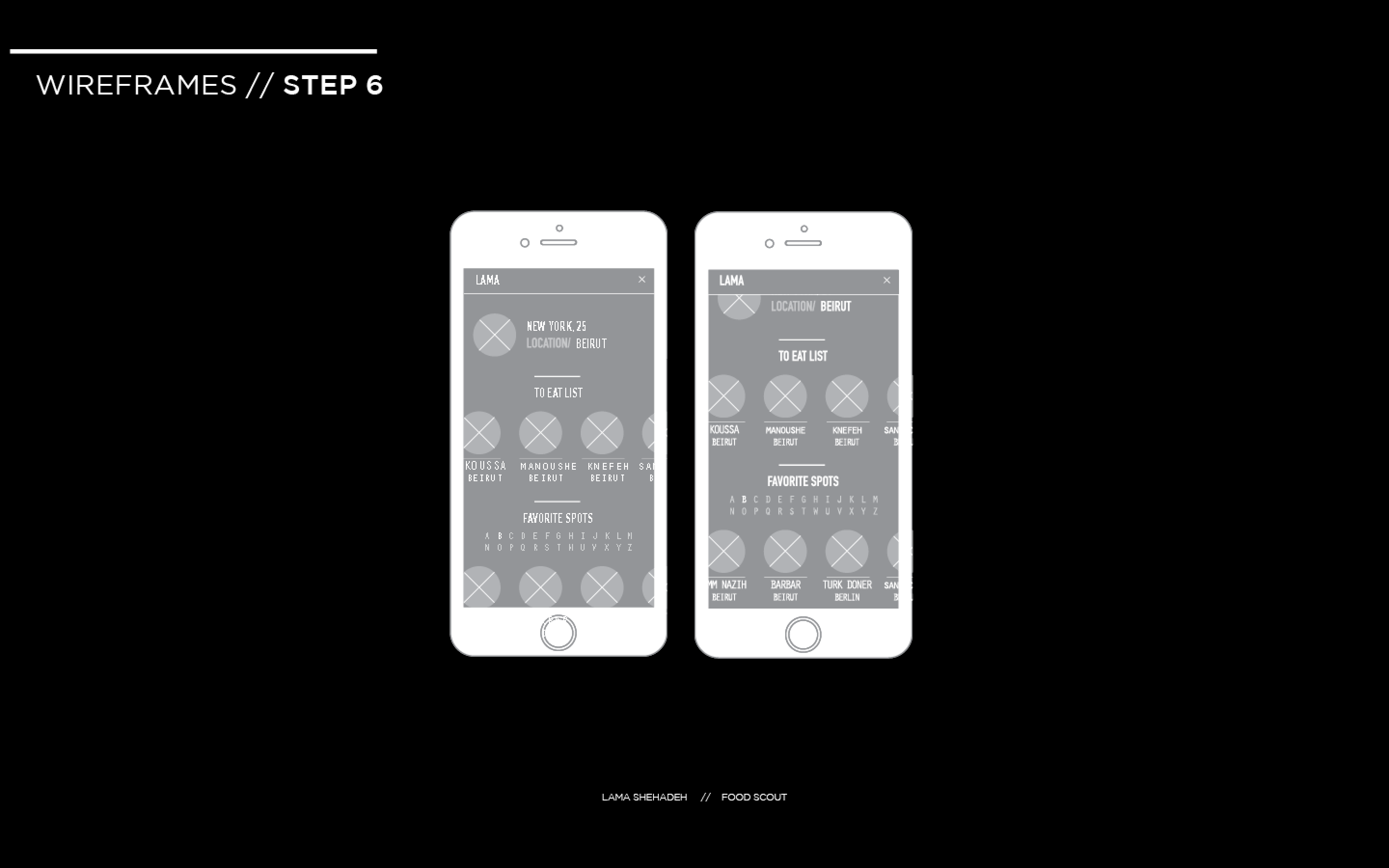
The user had no problem going back to the find the profile icon. He preferred to the see the same filtering mechanism used for “Favorite Spots” to be applied to this section.
I will be conducting two more user tests. Thereafter, I will identify what is positive and negative at this stage and iterate on the interface and experience.
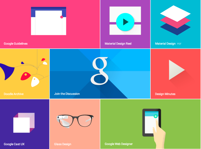
Finally have obtained a brand-new computer after this week’s saga and am posting last week’s blog assignment: to read Apple’s HIG or Google’s Material Design Guide and give examples of 3 things we learned!!!
Since I studied the HIG last semester for my iOS class, I thought it would be useful to see Google’s approach. Although I can develop for iOS, using an iPad, I’m an Android user through and through with my phone. I’ve come to realize this actually gives me a very different subconscious and unintentional understanding of Android vs. iOS. One of learning through recognition, and user experience versus recall from principles learned for design.
Continue reading Material Design | Poetry in Motion – Dana Martens
there are several things that I noticed while studying the IOS design guide lines. I also looked at material design by google, but in this post, I will focus on the IOS interface.
— By default, all bar buttons are borderless.
It is interesting to see all the guide lines that apple suggested, one of them was
normally, if you are a user, you don’t pay a lot of attention to design, you pay more attention to whether it functions well, and is it simple enough to use it. I was one of them, and I realized even though without a borderline, it can also distinguish between bar button by color. Also, the texture of the bar button(if you have one,) can make content distinguishable with contents too.
–Today’s date remains highlighted and the year appears in the back button, so users know exactly where they are, where they came from, and how to get back.
One of the things that I noticed was when a user tries to go to the view or function of what they want and if the path does not exist or the path is too hard for the user to find out, user gets frustrated. He will less likely to use an app. That what I do, when I download an app, I want to test to see if the app have what I want ; for example, I downloaded an app to write something quickly, but if the app requires me to tap 3-4 times to write something simple, I would not use the app. I believe “paper53” is well-designed, and also has a good path of navigating one to another. Designers have to vision the path that a user will take for the first time, and simplify what is the most important reason for the user to use this app and what is the function that the user want. So the user can quickly access the function whenever they want.
—users navigate by making one choice per screen until they reach their destination.
This is what I do when I download a new app. After hitting the destination, I want to go back to where I was. Designers(I was a designer) tend to focus more on the interface than the path that a user will take, but thinking of the path and function first and integrate with interface design will make them a better designer.
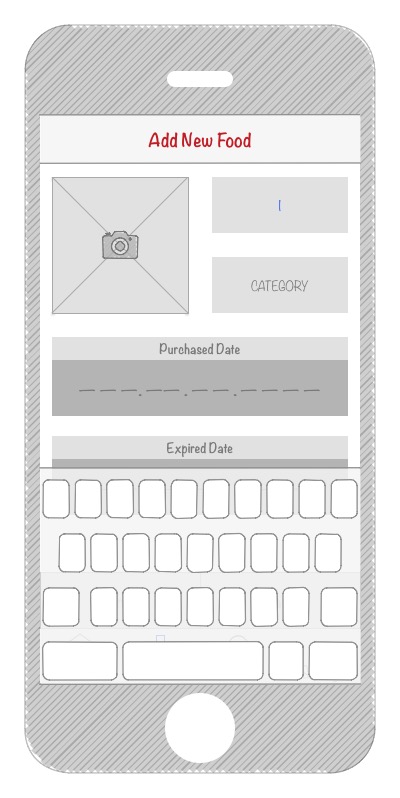
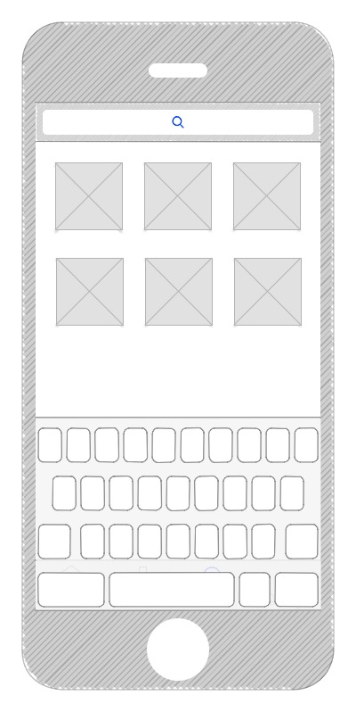
Most of people buy food and groceries regularly. Take myself as an example, I cook my own food and eat at home most of the time, at least breakfast and lunch. However, I sometimes forget what I have in the refrigerator or storage box and leave them in the depths. Of course they are no longer fresh after expired. And it is quite inconvenient to check the expired date frequently. Thus, it would be easier if our smartphones can take care of that for us.
Food Guardian is an app that can helps its users to manage their food and groceries. Users just have to input the info of food, especially the expired date, then Food Guardian will notice you while the food is about to go bad.


–

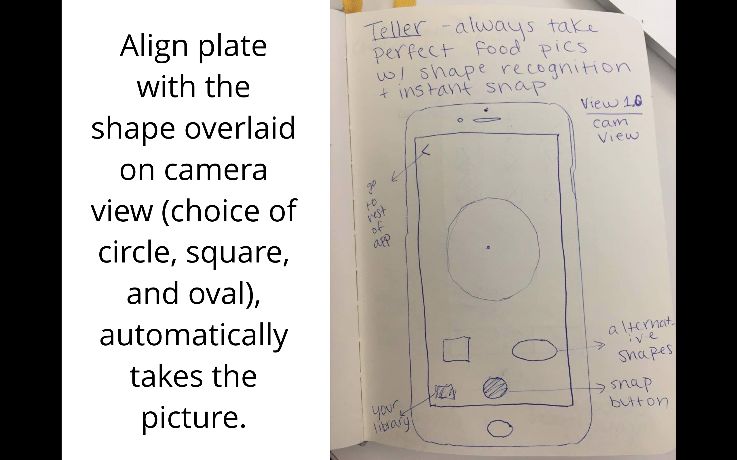

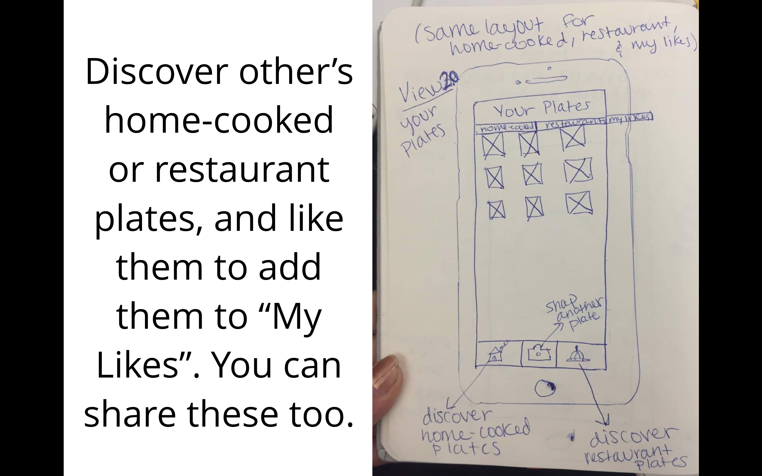
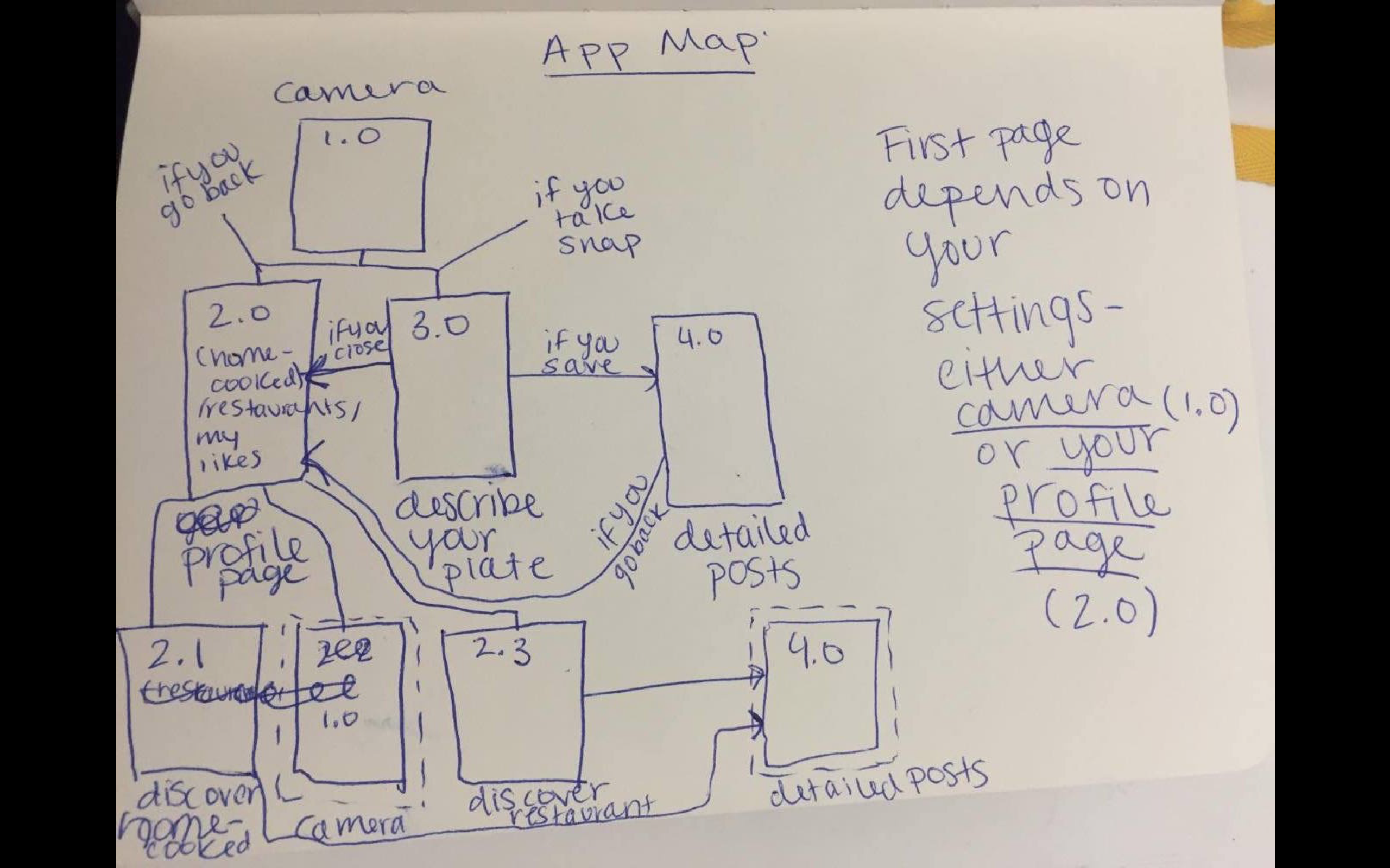 I had a new idea for the organization: instead of segmented controls that then hide some of the content…what about a filter option at the top in the form os a thin slide that has the options: Home-cooked, Restaurants, and Both with a default setting of Both. That way they can be exposed to all content at once on any page. Tab bars would be Discover, Personal Profile, Camera, and My Likes. All of those except camera would have the filter option at the top.
Concept Statement: Cookgram is an interactive recipe app where users can post their recipes as well-designed recipe album. All they need to do is take a picture every step, and then add texts after. It will be a place to explore, collect, make your own, and share recipes.
Based on some user feedbacks from Wireframe presentation and paper prototype, I have updated some of the ux flow in this version.
User Insights (from Wireframe & paper prototype):
Presentation Slides: https://docs.google.com/a/newschool.edu/presentation/d/1ZVXjphTBUieI36Nth3COheS0gaTt7iOpuhys-FMxBBI/edit?usp=sharing
User Insights (from this presentation):