3 things I learned from Apple HIG:
Since I’ve interested in iOS GUI design, I rarely looked up the iOS design HIG in detail and this exercise helped me a lot to find some useful guidelines. Here are some of them that I didn’t know.
01.
Test your app’s color scheme under a variety of lighting conditions
When testing apps, I used to check visuals as well as functions and usability. However, I did not know that lighting also affects how apps look like and it sounds a bit challenging to figure out how to adjust colors and what are the best choices.

02.
Be aware of colorblindness and how different cultures perceive color
This guideline changed my view toward how to define and signify signs in order to consider people’s various color perception. Normally, I’ve designed apps for people who have no trouble with sights and common sense of viewing colors. However, as I found colorblind people’s pain points, I will keep in mind to contemplate the choice of colors and the way of distinguish values and colors.

03.
Action Sheets:
Provide a Cancel button if it adds clarity.
Make destructive choices prominent.
Avoid enabling scrolling in an action sheet.
As the interface was so natural and intuitive, I have overlooked how it guided people to react to it.
– Destructive or dangerous actions among choices should colored in red
– A cancel button should be at the bottom of the options.
– Regarding to the purpose of action sheets, it should be done promptly. Therefore, it should be designed concisely. (Avoid making it scrolling)
Bio
I am Misung Kim from South Korea. My background is Visual communication design and used to work as a UX/UI designer in Korea. From creating graphic interfaces for smart phones to designing accessible education tools for children or non-korean, I focus on playful and interactive design. I really care about communication between people and creating a harmonious environment and always eager to design user-friendly, and which is easy to access.
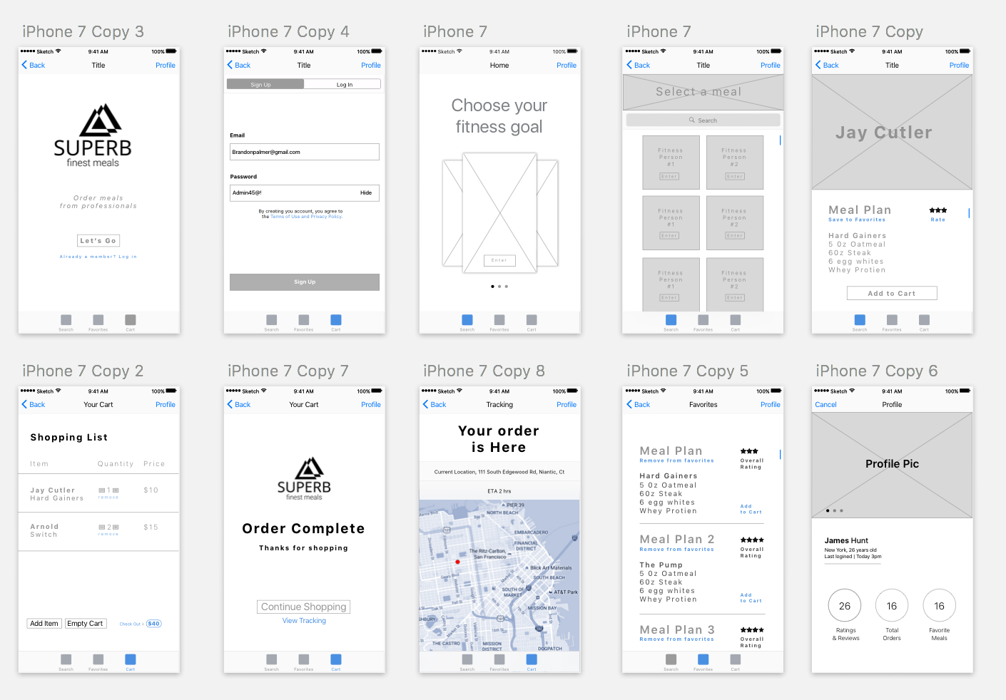
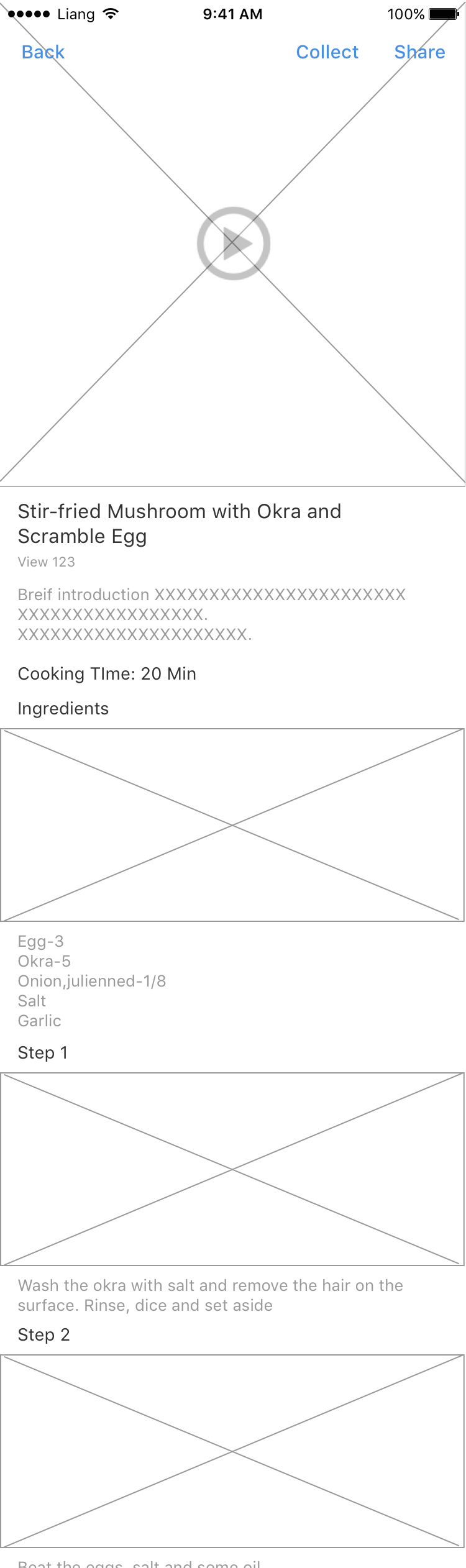
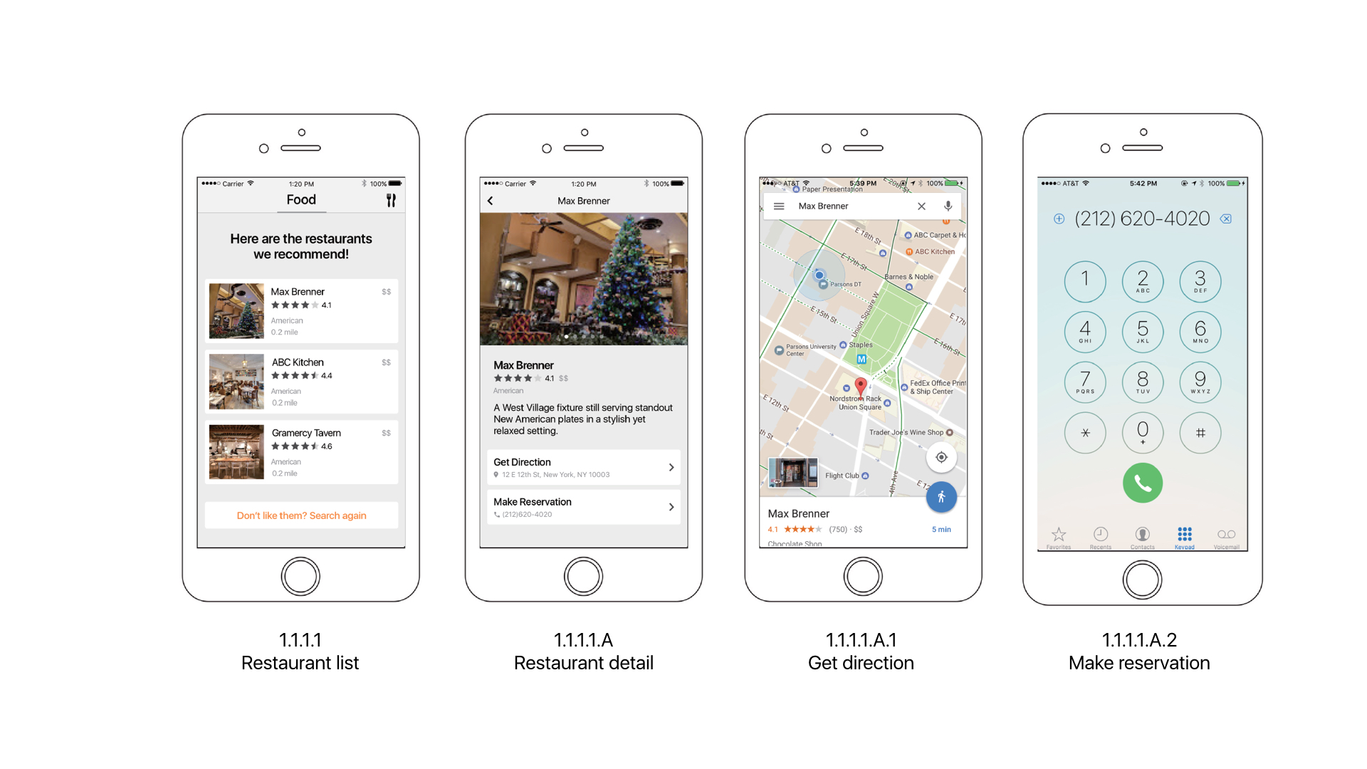
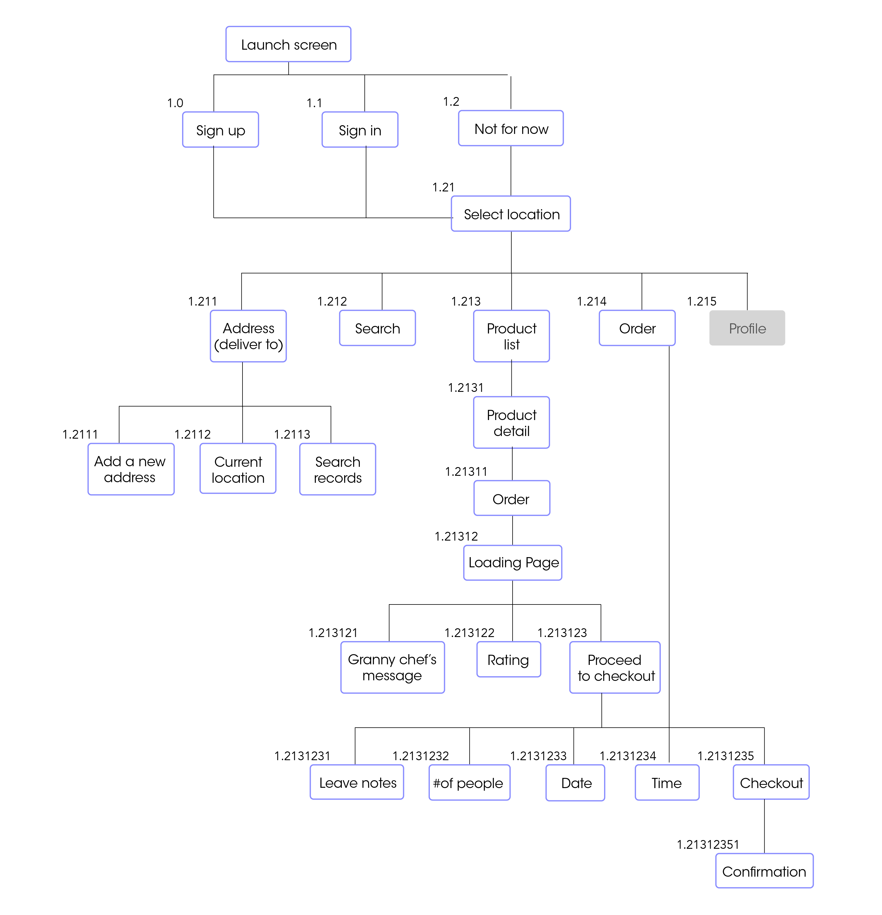
Food app Concept
Granny’s hometown homemade food
It is a homemade hometown food
delivery service for people who are away from their hometown and longing for the food there. Users will be matched with a grandma who has lived in a particular region or is able to cook specific local foods.
It meets individual tastes of different people from various regions in the States.
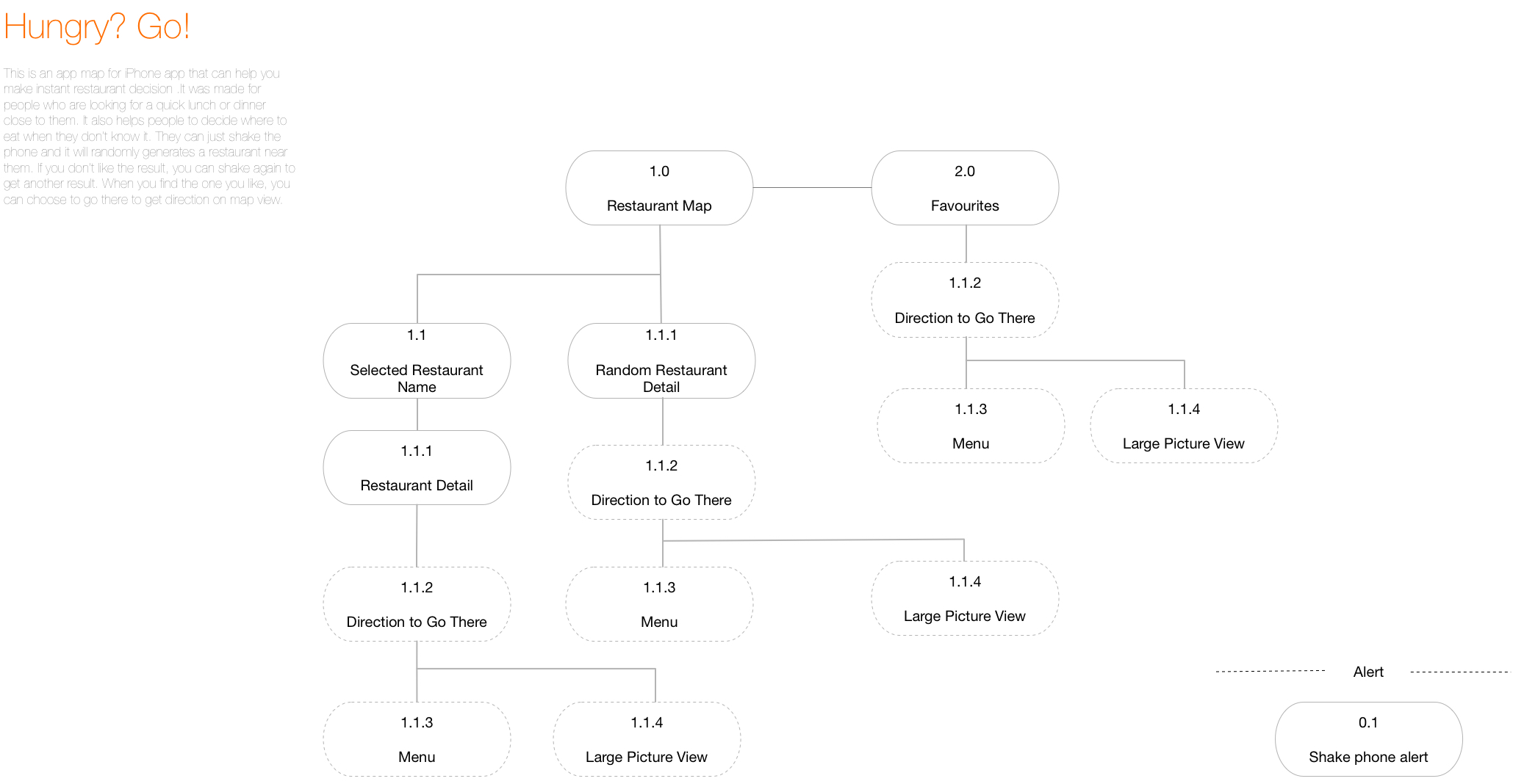
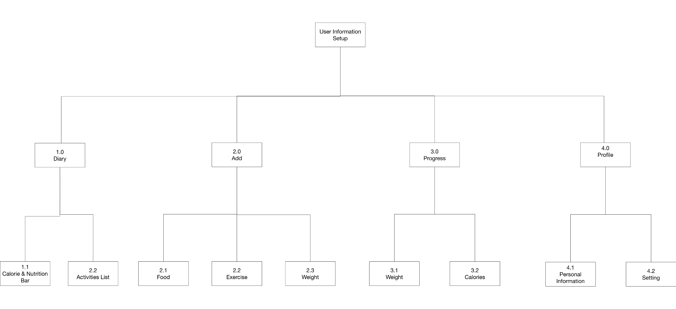
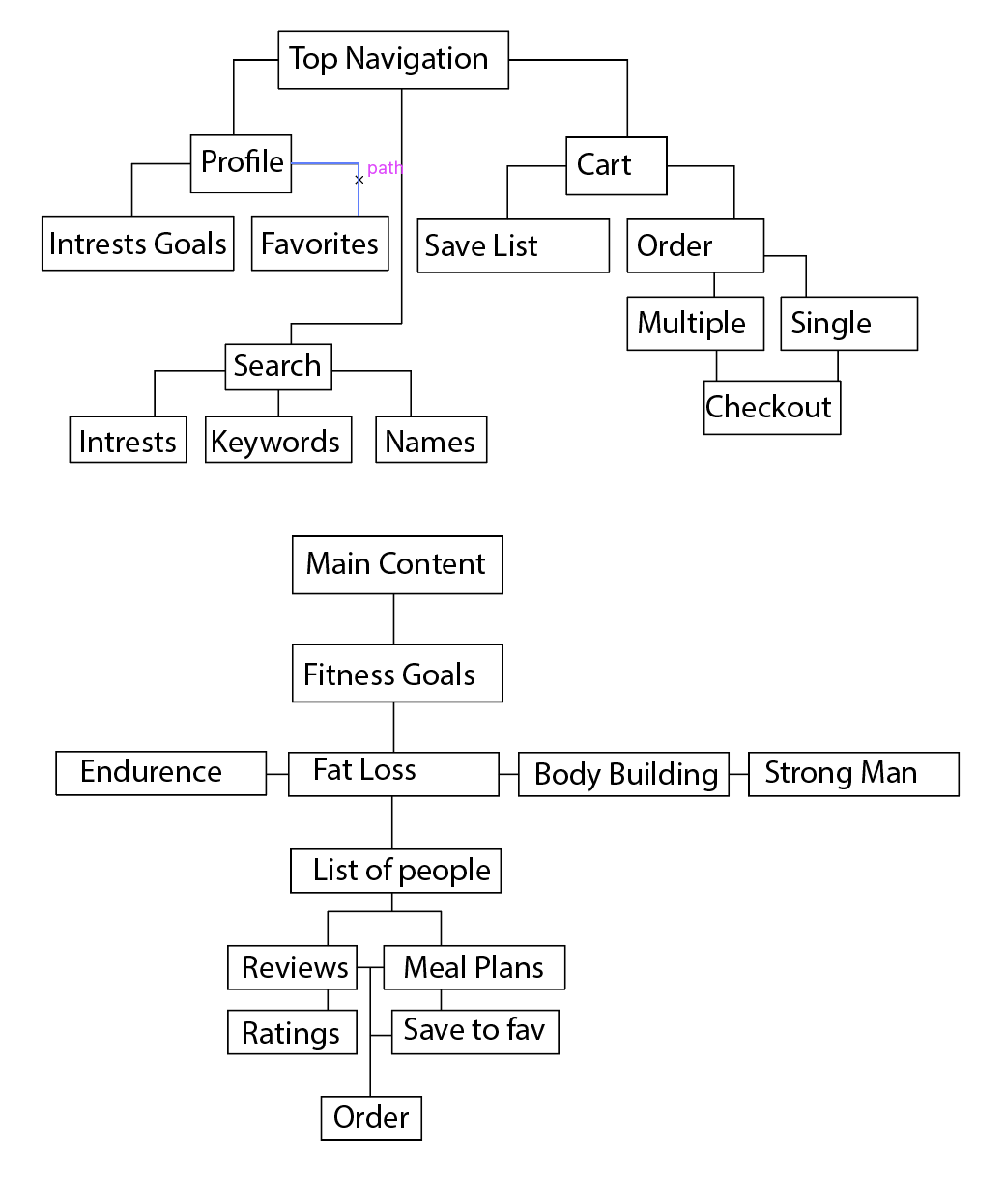
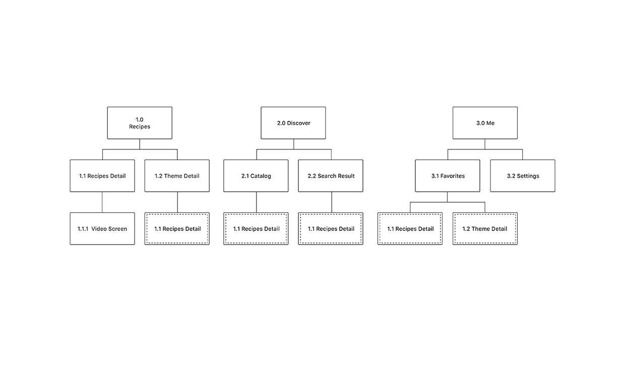
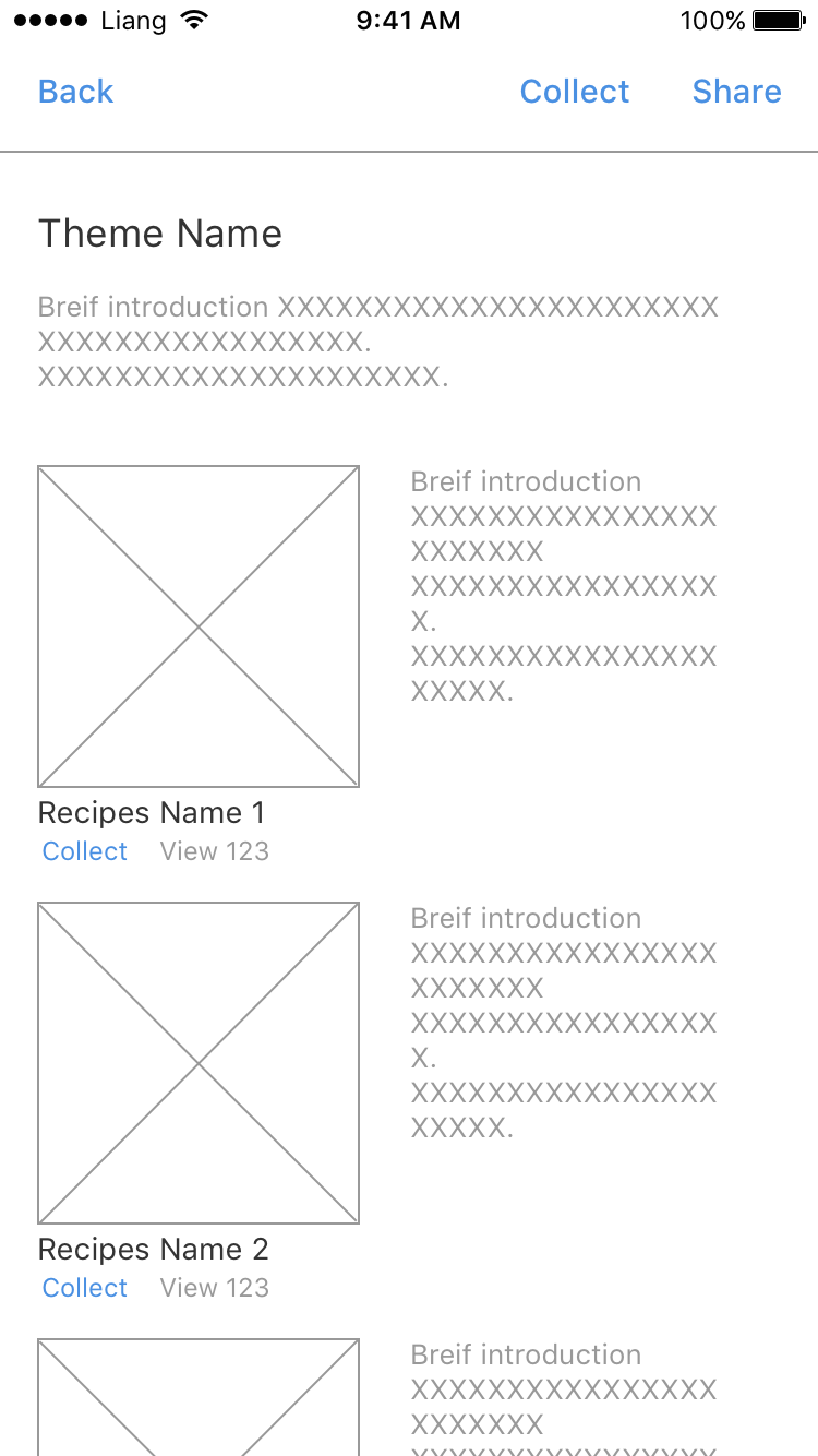
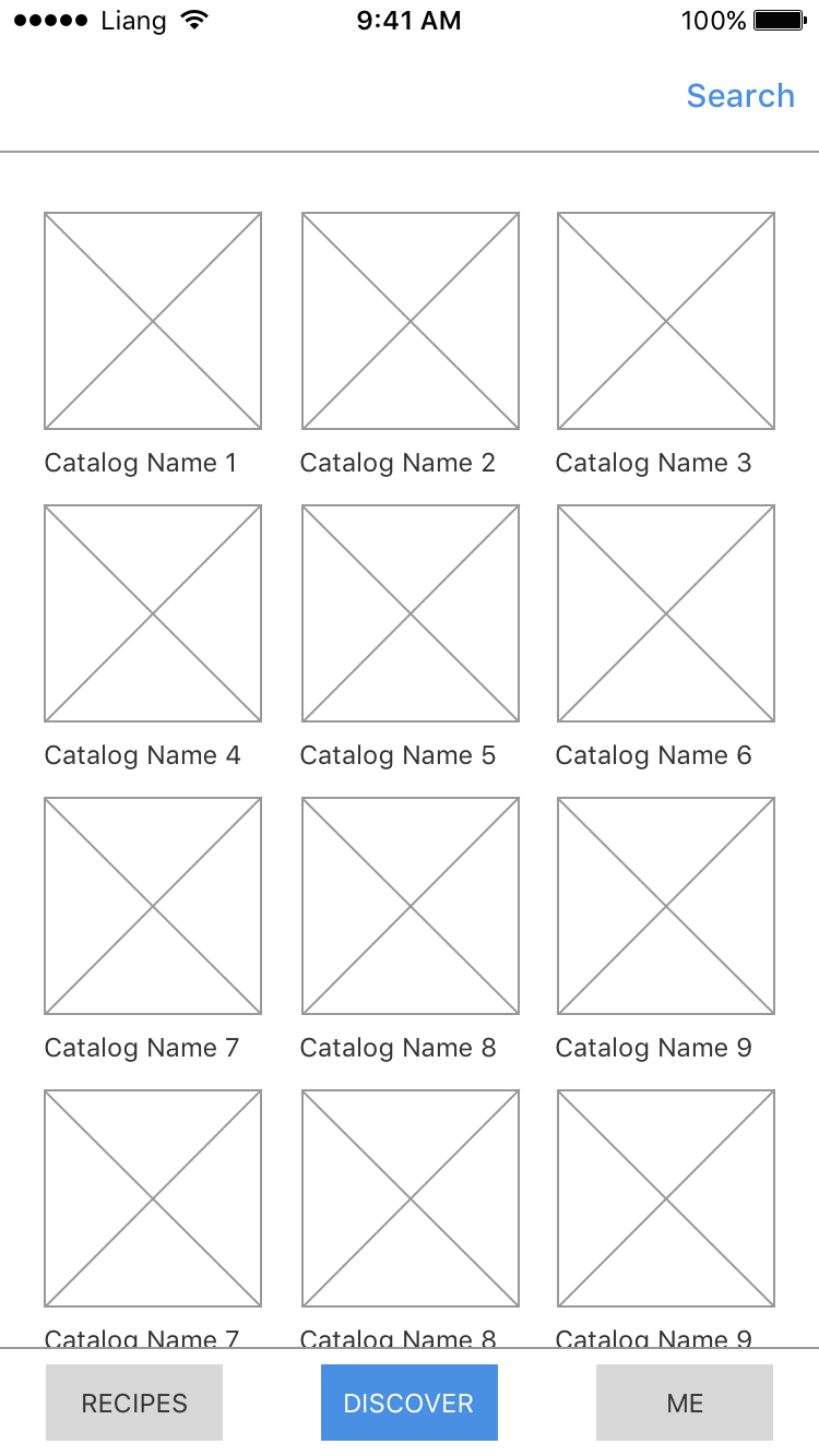
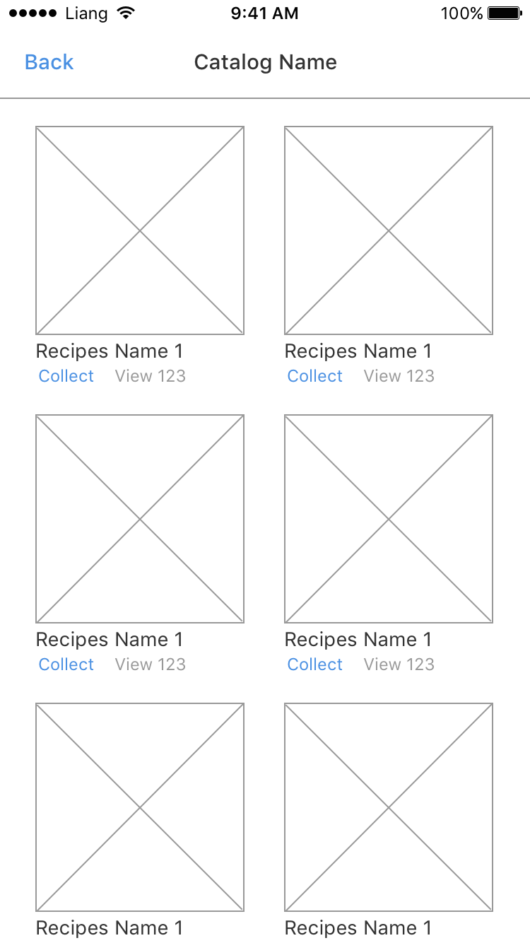
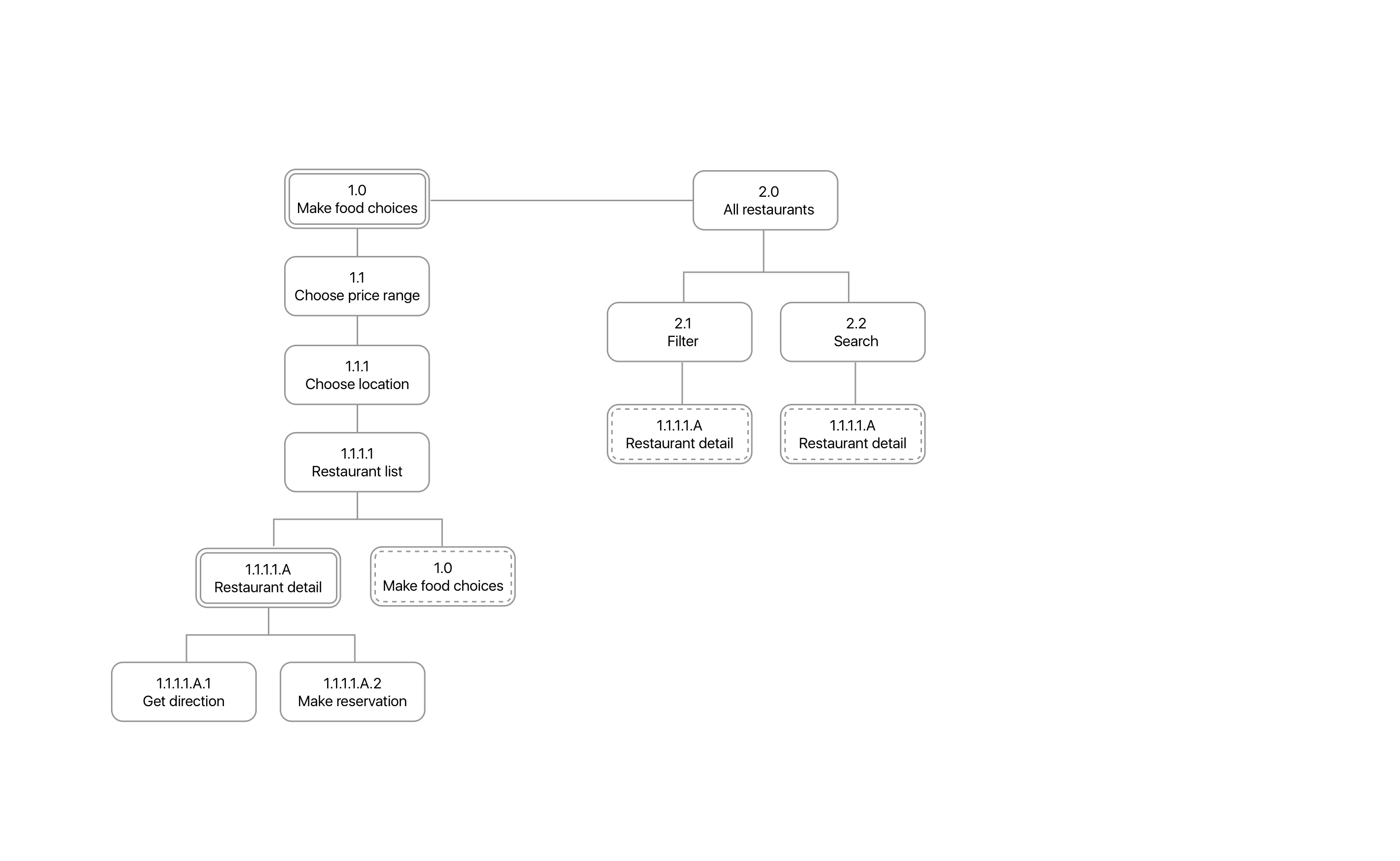
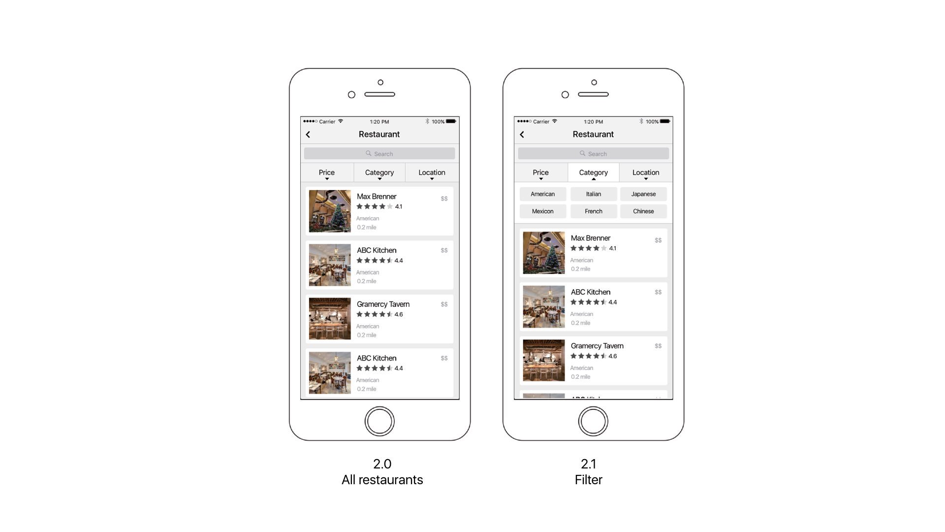
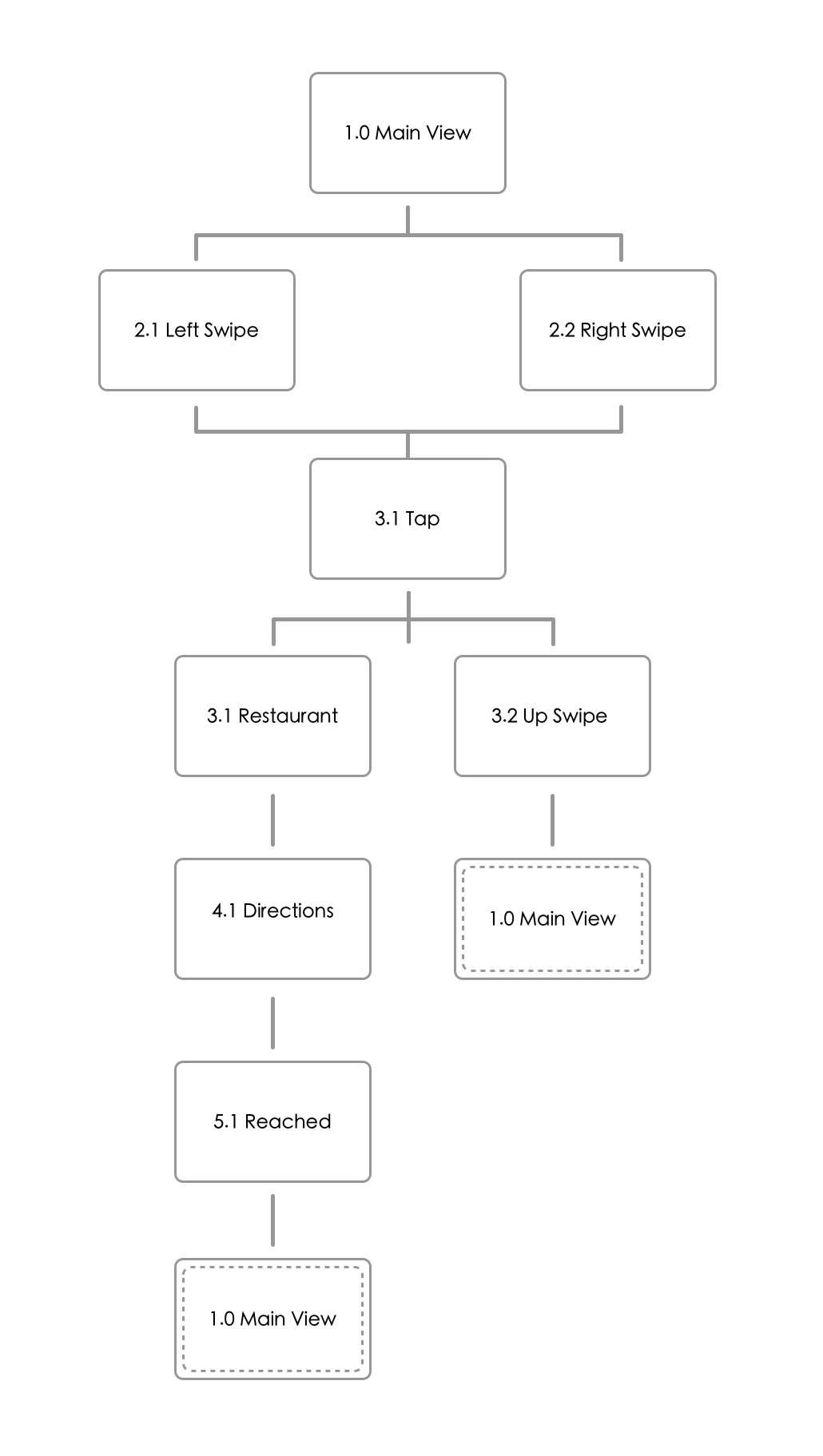
Appmap
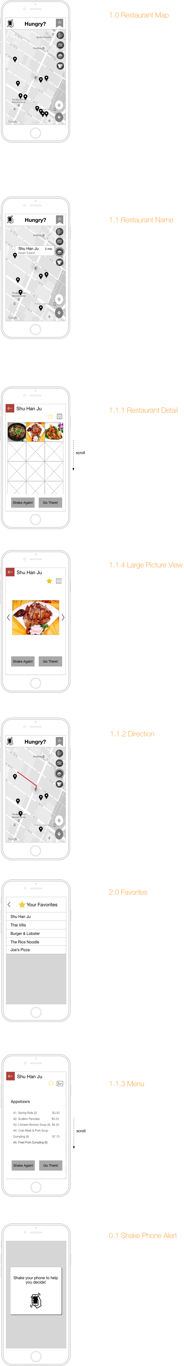
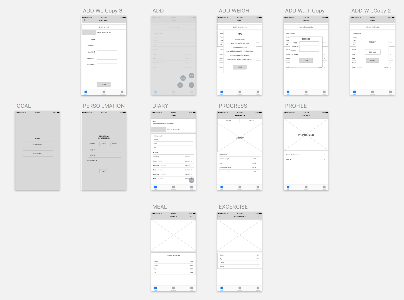
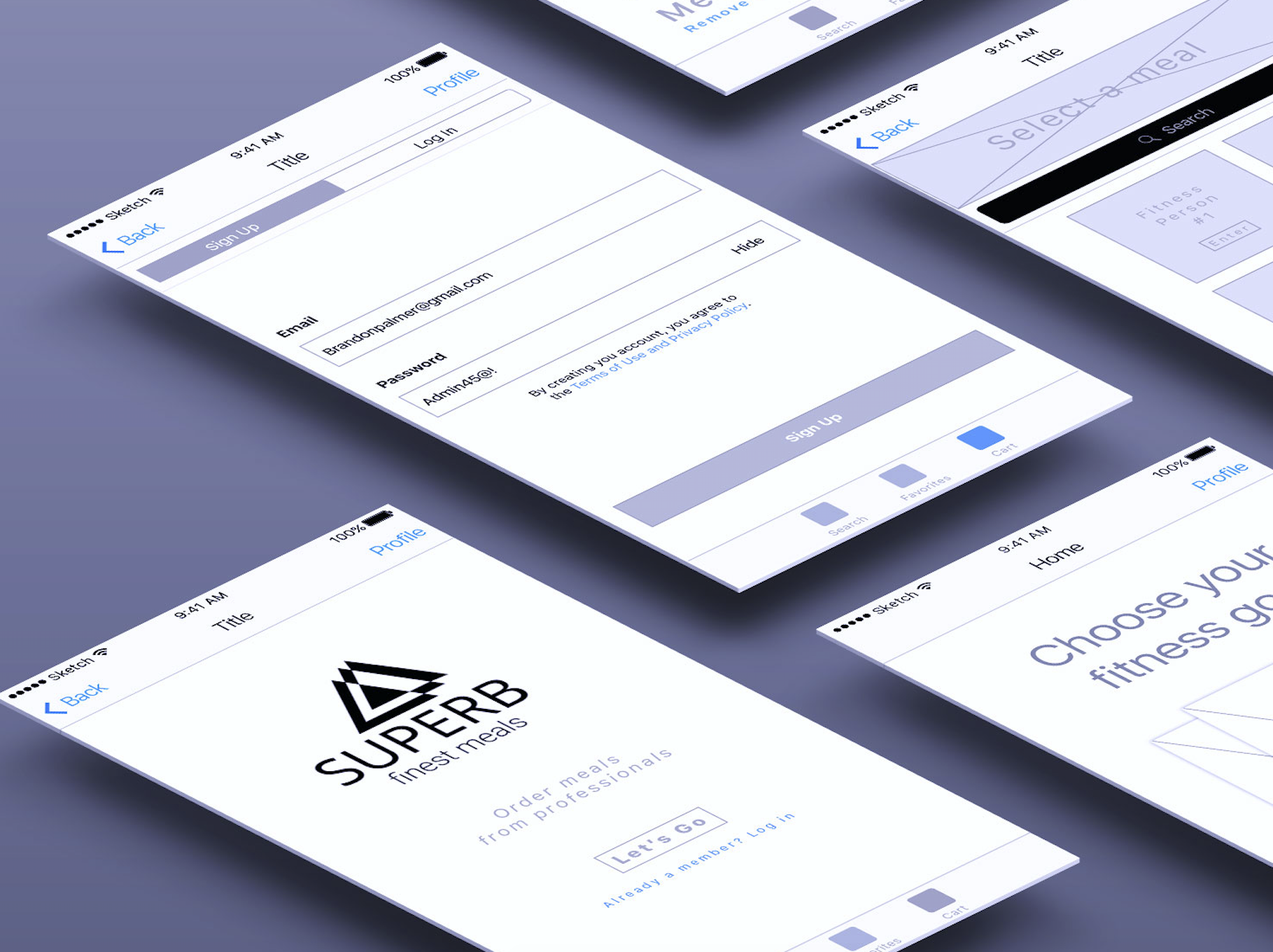
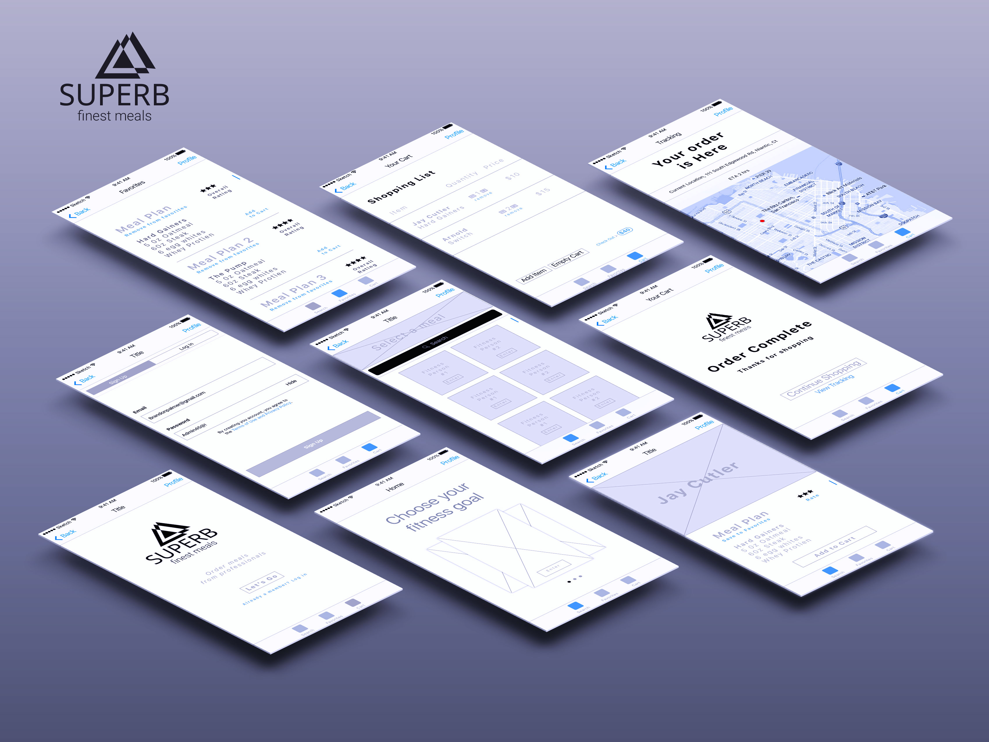
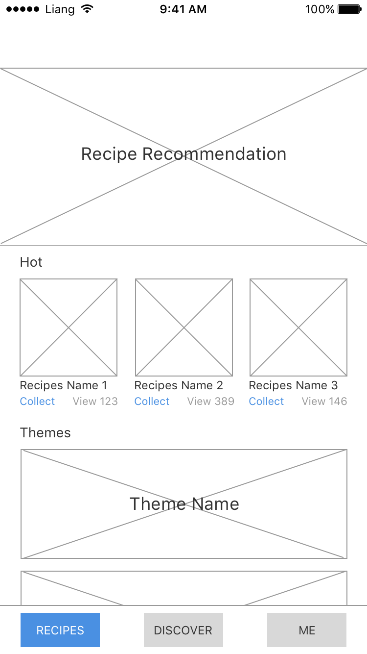
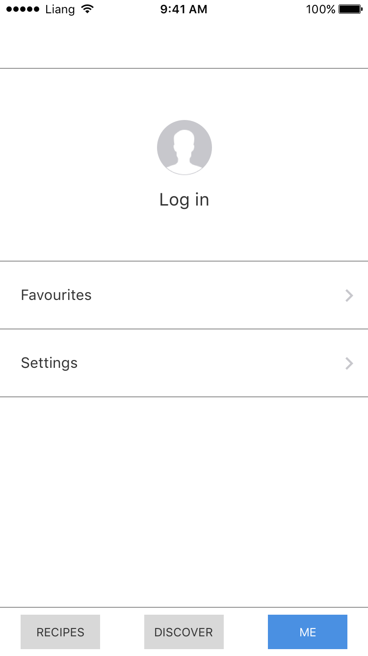
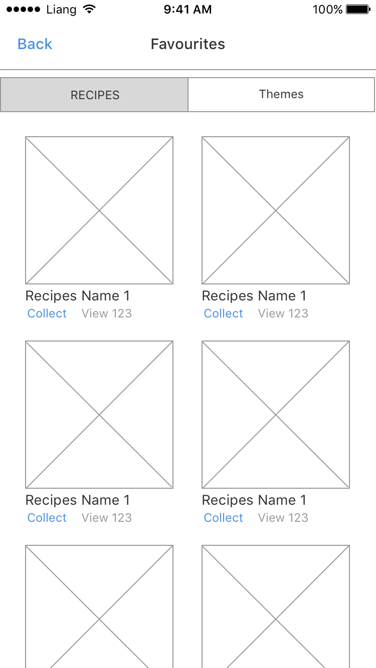
Wireframes
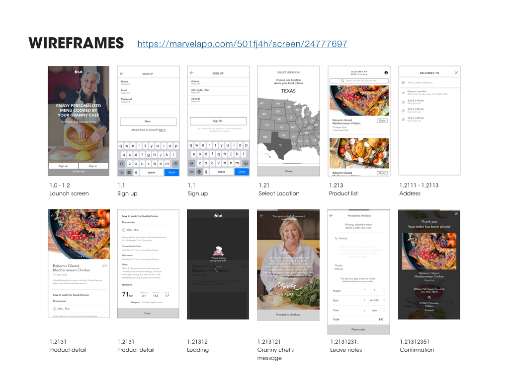
https://marvelapp.com/501fj4h